

A custom metal address sign shouldn't be chosen by enlarging the prettiest farmhouse font in a product preview. If a driver, delivery worker, or emergency responder can't identify your home from the approach road, the sign has missed its most important job. Curb appeal matters, but legibility, contrast, placement, and climate resistance should determine the design before decoration does.
Metal remains a strong choice because its core value has been proven outdoors for generations. Modern custom metal signage grew from European vitreous-enamel manufacturing. Benjamin Baugh patented a commercial enameling process in the United Kingdom in 1859, and the Patent Enamel Company opened a purpose-built sign factory in Selly Oak, Birmingham, in 1889. The process fused powdered glass onto iron or steel and fired it into a hard, weather-resistant surface, establishing the same basic promise buyers still want today, durable information on an outdoor substrate. Historical background on porcelain-enamel signage explains why classic metal signs still influence farmhouse design.
Table of Contents
- Balancing Farmhouse Curb Appeal With Emergency Visibility
- Calculating the Right Size and Character Height
- Selecting Metals and Finishes for Your Specific Climate
- Navigating Personalization Options and Digital Proofs
- Executing a Flawless Installation and Maintenance Routine
- Managing Production Timelines and Shipping Expectations
Balancing Farmhouse Curb Appeal With Emergency Visibility
A beautiful script font isn't automatically a useful address font. From the road, tightly joined numerals can blur together, while copper lettering on a brown background may disappear in shade. A plaque that looks refined in a close-up photograph can become functionally invisible when viewed through a windshield, across a curved driveway, or beneath porch shadows.
Start with sightline engineering, not ornament. Identify where someone approaches from, how far away they need to read the address, and whether the sign remains visible when shrubs, mailbox posts, parked vehicles, or seasonal foliage are present. A large number still fails if the sign sits at the wrong angle or faces only one direction.
Separate decoration from recognition
Use the address as the primary visual element. A family name, established date, monogram, tractor silhouette, or scrollwork can support the composition, but those details shouldn't compete with the numbers. Select a clean typeface with open numerals, generous spacing, and enough stroke weight to remain distinct at a distance.
Lighting deserves equal attention. Daylight visibility doesn't guarantee nighttime readiness. Test the installed location after dark with the lighting normally used around the property. A porch fixture may illuminate the wall while casting the numbers into shadow, and glossy finishes can reflect headlights directly back toward the road.
Practical rule: Design for the worst expected viewing condition, not the best product photograph.
Metal's historical appeal also has a functional basis. Signs became common for street identification, retail advertising, transportation, and farm-equipment branding as manufacturers developed stronger colors and more elaborate graphics around the turn of the twentieth century. That visual language still suits farmhouse properties, but the old lesson remains relevant: information must survive outdoor exposure and remain easy to read.
Keep the surrounding setting legible too. Clean branches, siding, porch surfaces, and nearby fixtures so the plaque doesn't blend into visual clutter. A practical guide to home exterior cleaning can help you maintain the surfaces and landscaping around the sign, while Farmhouse World also addresses illuminated options in its guide to address signs that light up.
Calculating the Right Size and Character Height
The right size starts with the road, not the wall. Measure the distance from the likely reading point to the proposed sign, then account for the approach direction and any bend in the driveway. If the road curves, use the point where a vehicle first has a reasonably direct view, not the shortest distance between the road and the house.
The MUTCD legacy benchmark uses approximately 1 inch of letter height for every 30 feet of legibility distance. At 120 feet, that benchmark implies approximately 4-inch characters. It isn't a universal ordinance, and local emergency-address rules may require more, so use it as a planning baseline and verify requirements before ordering.
A practical sizing table
| Distance from Road | Minimum Character Height | Recommended Sign Width |
|---|---|---|
| 30 feet | 1 inch | Choose a width that leaves clear space around the address |
| 60 feet | 2 inches | Allow room for open spacing and strong contrast |
| 90 feet | 3 inches | Increase width if the address contains several characters |
| 120 feet | 4 inches | Use a broad layout with uncluttered supporting details |
The table's character heights follow the cited legibility benchmark. The width column is intentionally qualitative because the address length, font width, border, mounting orientation, and secondary personalization all change the required plaque width. Don't squeeze a long street number into a narrow decorative sign just to preserve a preferred shape.
Confirm the rule that actually applies
USPS guidance says mailbox address numerals should be contrasting, neat, and at least 1 inch high, but mailbox marking requirements aren't a substitute for municipal emergency-address ordinances. One rural U.S. county ordinance specifies 4-inch characters, a 0.5-inch stroke, reflectorization, unobstructed roadway visibility, and mounting-height requirements. Treat those local rules as controlling where they apply, and check fire, planning, and homeowners-association requirements before production.
Use the custom address sign and post format when a wall plaque can't provide a clear sightline. Then perform a walk-test from the approach path in daylight and at night. Read the sign from both travel directions if responders could arrive from either side, and check it again after lights, landscaping, and mounting hardware are in place.
Selecting Metals and Finishes for Your Specific Climate
“Weather resistant” isn't a material specification. An outdoor sign is a system made from the substrate, edge preparation, coating, fasteners, drainage, and installation environment. Coastal salt, industrial pollution, persistent humidity, UV exposure, and freeze-thaw movement can affect those parts differently.
Match the substrate to exposure
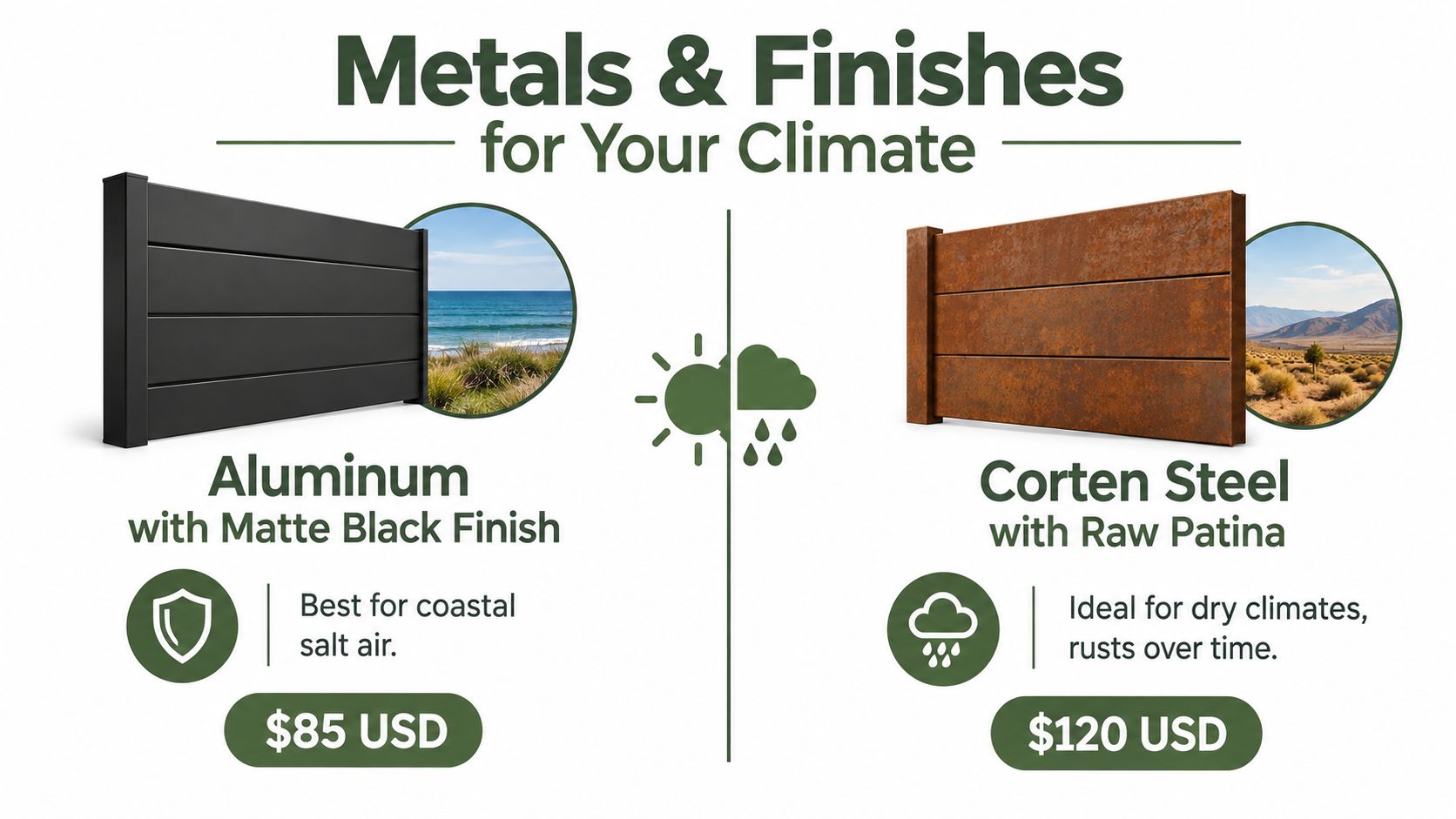
Aluminum is a practical choice for exposed locations because it is lightweight and corrosion-resistant when properly finished. It deserves particular attention near salt air, where a sound coating and sealed cut edges still matter.
Stainless steel can perform well in marine settings, but grade selection matters. The cited materials research found aluminum and 304/316 stainless steel retained structural and aesthetic properties after 12 months of accelerated aging, while galvanized steel showed pronounced corrosion. That result doesn't promise a fixed outdoor lifetime, but it supports treating aluminum and suitable stainless grades as stronger candidates for demanding exposure. The materials research also identifies wind, precipitation, humidity, UV, and moisture as important corrosion and coating factors.
Galvanized steel can be useful in appropriate conditions, but don't assume its zinc layer makes every location safe. Sulfur-dioxide-rich industrial environments can reduce zinc's atmospheric corrosion resistance by up to 80%, according to the same research source. Industrial properties need a more careful specification than a generic outdoor label.
Corten or raw patina steel may suit a dry, rustic setting, but its intentional oxidation can stain adjacent masonry or siding. It isn't a universal substitute for coated aluminum or stainless steel, particularly where runoff reaches a finished wall.
Specify the finish as part of the system
Powder coating can provide a clean farmhouse palette, but scratches, uncoated laser-cut edges, and trapped moisture remain vulnerabilities. Ask the fabricator to document the substrate grade, coating type, nominal thickness or finish specification, fastener material, and repair instructions. Those records are more useful than an unsupported promise of lifetime service.
If the sign includes a logo, monogram, or fine decorative detail, ask how the finish will preserve contrast and edge definition. The same principle applies to other durable personalized goods, including engraving for branded merchandise, where the final surface treatment affects how clearly the design reads. For rust prevention and care, Farmhouse World also provides guidance on how to protect metal from rust.
Navigating Personalization Options and Digital Proofs
Personalization should happen after the sign's functional specifications are settled. Choose the substrate, character height, mounting location, and contrast first. Then add the family name, date, monogram, livestock silhouette, or other farmhouse detail without allowing it to crowd the address.

Proof the actual production file
A digital preview is a layout check, not merely a decorative preview. Review every character at high magnification and compare it with the order form. Look for missing spaces, unexpected capitalization, substituted symbols, and changes in line breaks.
Laser-cut production can have limitations with punctuation. Hyphens and dashes may not render as expected in some designs, especially when they create a fragile connection or an isolated cut element. Periods or slashes may be safer alternatives, but confirm the exact format with the seller before approving it.
Check these details in order:
- Address accuracy: Compare every numeral and street abbreviation with the official address.
- Font clarity: Confirm that open numerals remain distinguishable and that decorative flourishes don't touch critical characters.
- Secondary text: Make sure names and dates remain subordinate to the address.
- Symbols: Remove emojis or unsupported characters unless the production preview shows them exactly as intended.
- Physical proportion: Ask whether the preview reflects the final sign dimensions, not only a scaled screen composition.
Don't approve from a phone thumbnail. A design can appear balanced on a bright display while producing narrow gaps, weak strokes, or excessive density when fabricated in metal. Request a correction before production if anything looks ambiguous.
Executing a Flawless Installation and Maintenance Routine
Installation determines whether water drains away or remains trapped behind the plaque. Before drilling, inspect the wall for its material, identify a level sightline from the approach road, and confirm that the sign won't sit directly against a surface that holds moisture.
Mount for drainage and compatibility
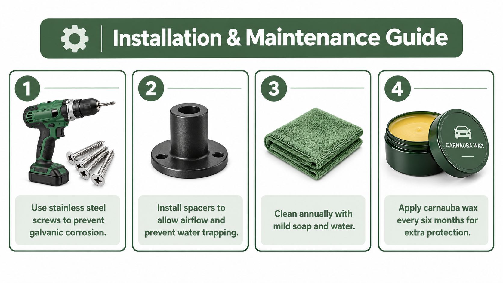
Use corrosion-resistant fasteners matched to the sign and wall. Ordinary steel screws can rust first, leaving stains across a light powder coat or aluminum surface. Dissimilar metals can also create galvanic corrosion when moisture provides a conductive path, so don't pair materials casually.
Install spacers or standoffs where the design allows airflow behind the plaque. Keep mounting holes clean, remove burrs from cut edges, and avoid creating pockets where rainwater can collect. On masonry, use anchors suited to the specific wall rather than relying on a generic screw.
Installation check: Look at the rear face, cut edges, holes, and fastener heads before the plaque goes up. Those overlooked areas often determine whether the visible face stays clean.
Tighten hardware firmly without crushing a coated surface or distorting thin metal. After installation, step back to the road and verify the sign's angle, height, and visibility from each relevant approach. A level plaque can still be unreadable if it faces parallel to the wall while traffic approaches from the side.
Clean without damaging the finish
Use mild soap, clean water, and a soft cloth. Abrasive pads, aggressive solvents, and gritty cleaners can scratch the finish or remove protective layers. Rinse salt residue more often in exposed coastal locations, particularly after windy or stormy conditions, and inspect the lower edge where runoff accumulates.
Touch up scratches with a compatible product recommended for the coating system. Don't cover active rust or damaged edges without first removing loose corrosion and preparing the surface. Inspect the rear face, fasteners, mounting holes, and surrounding wall during routine cleaning so small failures don't become structural problems.
The following installation video provides a visual reference for mounting and care:
Managing Production Timelines and Shipping Expectations
A custom sign moves through several stages before it reaches your porch: personalization review, fabrication, edge preparation, finishing, quality inspection, packing, and transit. Laser-cut and powder-coated pieces commonly require a 7-to-10 business day crafting window, but that production period isn't the same as the delivery date. Confirm the current schedule with the seller before committing to an event or installation date.
Peak holiday ordering can create additional pressure, especially during November and December. Place the order early enough to allow for proof corrections, fabrication, carrier transit, and a possible replacement if the package arrives damaged. A rushed order leaves little room to resolve an incorrect address or finish issue.
Verify the handoff details
Before submitting the order, check:
- Personalization: Confirm the address, name, date, punctuation, and capitalization.
- Delivery information: Use the complete street address and include apartment, unit, or gate details where relevant.
- Package access: Consider whether the carrier can safely leave a long or rigid parcel.
- Inspection timing: Open the package promptly and photograph damage before installation.
- Hardware: Confirm that anchors, spacers, and fasteners match the wall and sign material.
Shipping thresholds can affect how you group purchases, but delivery cost shouldn't outweigh correct specifications. A sign that arrives quickly but lacks the required character height, contrast, or climate-appropriate finish still creates an avoidable replacement problem.
Farmhouse World offers personalized metal signs in multiple sizes, colors, and design formats for address displays and rustic properties. Visit Farmhouse World to compare a decorative design with the practical requirements of your approach distance, local rules, mounting surface, and climate before placing an order.


