

A delivery driver slows at the end of your gravel lane, leans toward the windshield, and squints at a number nailed crookedly to a fence post. Inside, you're waiting for a package, a contractor, or a friend who's already called twice because the house is hard to find. That small moment usually reveals the problem: an address sign and post aren't separate purchases. They're one outdoor system.
The sign face controls contrast, legibility, and nighttime visibility. The post controls height, stability, alignment, and how well the plaque survives wind, snow, wet soil, and roadside maintenance. I've bought the wrong plaque more than once because it looked right in a product photo, then discovered that the post sagged, the finish disappeared in shade, or the numbers couldn't be read from the road. A farmhouse-style sign can look welcoming and still fail its practical job if the complete installation isn't planned together.
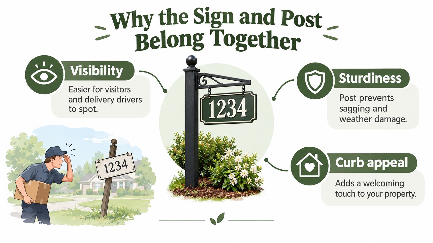
Table of Contents
- Why the Sign and Post Belong Together
- Matching Sign Materials to Your Climate and Style
- Choosing the Right Post Style for Your Property
- Sizing, Height, and Visibility That Actually Work
- Installing Your Address Sign and Post the Right Way
- Personalization Options and Real-World Examples
- Care, Maintenance, and Quick Decision Checklist
Why the Sign and Post Belong Together
The plaque is only half the installation
A heavy metal plaque mounted to a narrow stake may tilt toward the driveway after one hard storm. A beautiful cedar sign attached with ordinary indoor screws can stain, loosen, or rattle when moisture reaches the mounting holes. Conversely, a solid post can't rescue a sign with tiny lettering, weak contrast, or a face hidden behind shrubs.
Start by viewing the installation from the road, not from the porch. Stand where a driver would approach, check both directions, and notice whether the sign blends into fencing, trees, mailbox hardware, or dark landscaping. Rural addressing guidance commonly centers on placement at the driveway entrance or property line, visibility from both directions, and a mounting height around 3 to 5 feet above grade, with reflective or contrasting numbers where nighttime visibility matters. Lincoln County rural addressing guidance illustrates why a decorative sign still needs a compliance-first layout.
Practical rule: Choose the location, post, fasteners, and sign face as a single package before you personalize anything.
The same-side-of-the-road placement usually makes the address easier to find, while a face positioned perpendicular to traffic supports readability for vehicles approaching from either direction. Local standards differ, so check your county, fire authority, road department, and postal guidance before drilling or digging.
Think about the whole route to the house
A responder or delivery driver doesn't see your entry the way you do. They scan the road edge, driveway opening, fence line, and mailbox area while moving through unfamiliar surroundings. A sign behind a fence rail or under a mature shrub may be technically present but operationally useless.
The choices ahead are practical: match the sign material to your weather, select a post style that won't lean, size the numbers for the setback, anchor the base properly, and choose personalization that doesn't crowd the address. The most successful farmhouse installations combine warm materials and restrained detail with a clear line of sight.
Matching Sign Materials to Your Climate and Style
The catalog photograph tells you what a sign looks like on a calm day. Your property will test it with wet soil, sun, salt, wind, frost, dust, and lawn equipment. Pick the material according to the punishment it will receive, then choose a finish that suits the house.
Aluminum is light, naturally resistant to rust, and easy to handle during installation. It's a sensible choice near humid air or where the post has to carry a broad plaque without excessive weight. The trade-off is impact resistance. A mower stone, careless tool, or hard bend can dent it.
Powder-coated steel feels more substantial and can complement black hardware, dark roofing, or a more formal ranch entrance. The coating protects the metal while it remains intact, but a chipped edge can expose the steel beneath it. Seal or touch up damaged areas promptly, especially in wet climates.
Cast iron has the visual weight farmhouse and historic homes often need. It works beautifully with traditional lettering and dark, aged finishes, but it isn't a carefree option. Use a genuine exterior sealant and inspect it regularly for surface wear. If the climate stays damp, plan on periodic touch-ups rather than waiting for visible corrosion to spread.
PVC, HDPE, and high-density composite plaques resist rot and generally need less attention than wood. They're useful where moisture is persistent or where a lightweight sign is preferred. Their weakness is appearance. Some products look convincingly textured, while others read as plastic from the road, which can undermine a carefully built farmhouse exterior.
Wood provides the warmest, most natural appearance. Cedar suits rural properties particularly well, but even durable wood needs an exterior finish and recurring resealing. Unsealed grain absorbs water, and cracks or cavities can also become attractive places for insects.
For metal maintenance, Farmhouse World's guide to protecting metal from rust is a useful companion before you choose a plaque and hardware combination.
| Material | Weather Resistance | Maintenance | Weight | Best Style Match |
|---|---|---|---|---|
| Aluminum | Resists rust and handles moisture well | Clean and inspect for dents or finish wear | Light | Modern farmhouse, coastal, practical rural |
| Powder-coated steel | Strong finish while coating remains intact | Touch up chips and watch exposed edges | Medium to heavy | Ranch, country traditional, black-and-white farmhouse |
| Cast iron | Durable with proper sealing | Regular inspection and finish touch-ups | Heavy | Historic farmhouse, heritage, traditional |
| PVC, HDPE, or composite | Resists rot and moisture | Low routine maintenance, inspect for warping or fading | Light to medium | Simple rural, utility-focused, contemporary |
| Cedar or other exterior wood | Naturally warm, but vulnerable when unsealed | Reseal and inspect the grain regularly | Medium | Farmhouse, cottage, homestead |
Choosing the Right Post Style for Your Property
Post selection changes the character of the entry, but it also determines whether the plaque stays square. A single cedar post feels relaxed and rural, while a double-arm metal frame looks more deliberate. Neither is automatically right for every driveway.
Compare the main post options
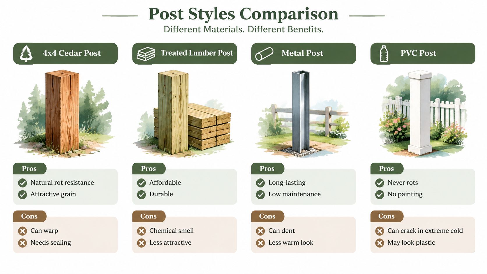
A single 4x4 cedar or treated lumber post is the practical workhorse. It's straightforward to cut, easy to stain, and friendly to farmhouse architecture. Cedar offers a more attractive grain and natural rot resistance, while treated lumber is usually chosen for durability and cost. Both can twist, lean, or deteriorate at the soil line if drainage and anchoring are neglected.
A double-post or A-frame design suits a long plaque, a heavier cast sign, or a prominent entrance where the sign should feel architectural. It spreads the load and reduces rocking, but the holes must be spaced accurately. A small mistake becomes obvious once the plaque is mounted.
A ground stake or shepherd hook works for a seasonal sign, rental property, or lightweight lawn marker. It installs quickly and can be moved, but it's a poor match for a heavy plaque or an exposed, windy driveway. Treat it as a temporary display rather than a permanent addressing solution.
A decorative cast aluminum or PVC-wrapped post gives a finished front-yard appearance with caps, collars, and coordinated details. It's a strong fit for a suburban lawn or a carefully designed corner lot, though the complete system costs more and demands careful leveling. PVC won't rot, but severe cold or impact can still damage it.
For larger rural entrances, compare the proportions and material language used in ranch entrance signs before choosing a post that feels too small for the property.
The property usually decides the winner:
- Rural acreage: A single treated or cedar post works for a modest plaque, while a double-post frame makes more sense for a broad sign exposed to wind.
- Suburban front lawn: A decorative post can coordinate with the porch, mailbox, and house trim.
- Corner lot: Choose a rigid, double-sided arrangement when vehicles approach from different streets.
- Rental: Use a removable stake or a simple post that can be replaced without redesigning the entrance.
A cedar element can also tie the address area to other outdoor details. For example, the Cedar Crafted 3 Tiered Vertical Planter Stand for Outdoor Gardens uses Western Red Cedar and is designed for outdoor use, making it a possible material reference when coordinating a small farmhouse garden zone, though it isn't an address-post component.
Sizing, Height, and Visibility That Actually Work
A sign read from the curb needs numerals that don't disappear into the background. Four-inch-tall characters are a practical starting point for many rural address installations, and local emergency-response standards can require at least 4-inch-tall characters with a 1/2-inch stroke, displayed against a contrasting background. Clallam County's address placard standard shows how specific these requirements can become.
For a long driveway, larger numbers usually make the better choice. A plaque that looks oversized beside the porch can look perfectly proportioned at the road edge, especially when the house sits well back from the pavement. Don't let decorative script replace the actual address. Use a clear, uncomplicated font for the numbers and reserve the family name for a secondary line.
Set the sign where headlights can find it
A useful rural installation envelope places the sign on the same side of the road as the driveway, with the face perpendicular to traffic so it can be read in both directions. Many local standards place the face roughly 48 to 60 inches above ground, or about 4 feet above the road surface, while some target a final mounted height near 40 inches above road level. Requirements vary, so local guidance controls the final measurement.
Reflective numbers or a reflective plaque face matter after sunset. Dark numbers on a light background perform well during daylight, while light reflective numbers on a darker plaque can stand out when headlights reach them. A small solar cap light or a carefully aimed low-voltage downlight can improve nighttime reading, provided the fixture doesn't create glare or throw the sign into silhouette.
Keep branches, tall grasses, and ornamental shrubs from covering the plaque. Also check the viewing angle from a vehicle. A post tucked behind a fence rail may be visible from the porch but disappear completely from the road.
| Setback from Road | Number Height | Plaque Width | Mounting Height |
|---|---|---|---|
| Near driveway entrance | At least 4 inches where local guidance uses that minimum | Wide enough for clear spacing and directional reading | Roughly 3 to 5 feet above grade, subject to local rules |
| Moderate rural setback | Use larger numerals when the house is difficult to see | Allow room for the address and generous contrast | Around 40 inches above road level may be specified locally |
| Long driveway or obscured home | Select the largest legible format the location permits | Broad plaque or double-sided design | Use the local standard and keep the face unobstructed |
Installing Your Address Sign and Post the Right Way
Call 811 before you dig. Utility markings protect more than the installer. They also help you avoid placing the post where a buried line, drainage route, or private service creates trouble later.
Mark the proposed location at the driveway entrance, then walk back to the road and sight along the approach. Check the view from both directions, including the position of a vehicle rather than only a standing person. Confirm the local setback, right-of-way, and height rules before you commit to the hole.
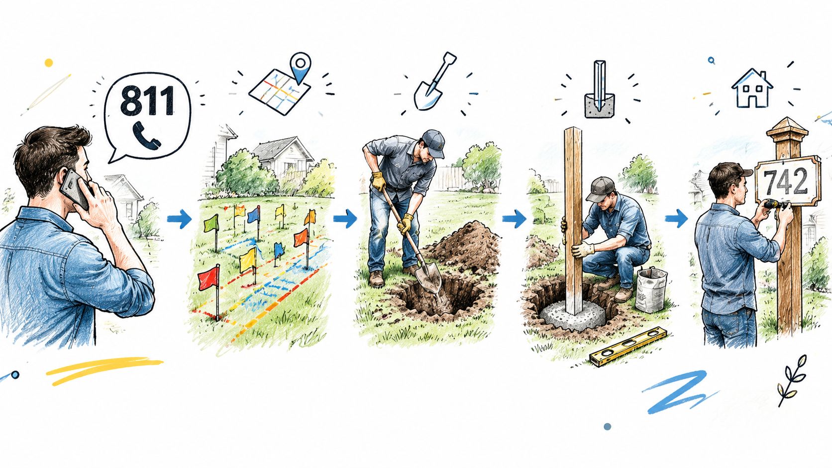
Excavate to the depth appropriate for your soil and frost conditions. A common working approach uses 24 inches for a single post in a non-frost region and 36 inches where frost heave is a concern, but local building and addressing requirements should take priority. A deeper hole isn't a substitute for a properly sized post, and a shallow hole can let a plaque sway or rotate.
Use crushed gravel around the buried portion where drainage is the priority. On sandy or wind-exposed sites, a concrete collar can provide stronger resistance, but brace the post while the mix cures and prevent water from collecting around the wood at the soil line. Plumb the post on two adjacent faces with a level, then sight from the road again before the base sets.
A post that looks straight beside the hole can look crooked from the road. Check both views before the ground locks it in place.
Mount the plaque with stainless or coated exterior screws through pre-drilled holes. Seal the top of a wood post so rain can't soak directly into the end grain. A thin bead of exterior adhesive between the sign and post can stop rattling, but don't use adhesive as the primary structural attachment.
For exposed locations, choose adequate stiffness, embedment, and corrosion-resistant hardware rather than selecting a post by appearance alone. Technical sign references use a 0.5 kN transverse-force check in the UK National Annex, and other wind-loading references apply only within specified conditions such as altitudes below 250 metres and a 25-year return period. Those benchmarks aren't a substitute for local engineering, but they reinforce the practical point that roadside wind can overwhelm a decorative post. Fresno County fire sign standards also reflects the broader emphasis on durable, visible addressing materials.
The installation video below shows the general sequence and tool handling. Adapt it to your local soil, frost, and right-of-way requirements.
Personalization Options and Real-World Examples
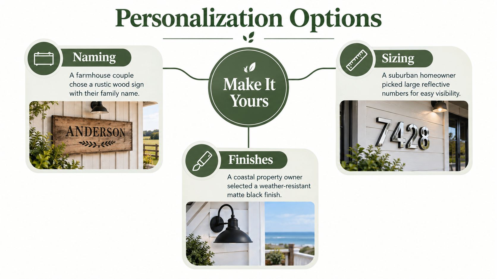
A farmhouse couple chose a 6-by-18-inch cedar plaque with 2-inch laser-cut house numbers and a routed family name along the lower edge. They stained the cedar post to match the porch columns, creating a unified entry instead of a sign that looked added later. The style worked because the family name supported the design without competing with the address.
A corner-lot homeowner made a different trade-off. The driveway sat 90 feet from the road, so a 12-by-18-inch black aluminum sign with reflective white numerals and a steel double-arm post made more sense than a small rustic plaque. The larger face and rigid support favored recognition from the street, while the dark finish still coordinated with the home's trim.
A ranch entrance near a cattle guard called for restraint. A tall cedar stake carried a 4-by-10-inch plaque intended for a single-side read, keeping the marker narrow enough to avoid interfering with the entrance. That kind of sign isn't appropriate for every approach, but it can work when the viewing direction is fixed and the local rules allow it.
Personalization that stays readable
Ask the fabricator how much text the plaque can carry before the lettering becomes crowded. Many shops cap raised text at 16 characters for a clean result, but the usable amount depends on the font, spacing, and plaque shape. A short family name may fit comfortably, while a long name, road name, and full address can turn a charming sign into a busy one.
Use bronze hardware with dark signs when you want an aged farmhouse effect. Matte black screws disappear into matte plaques and create a quieter finish. For a personalized farmhouse or ranch marker, Farmhouse World's personalized family name address sign is one option to compare alongside locally made plaques, especially when you want the name and address treated as one design.
Care, Maintenance, and Quick Decision Checklist
Outdoor signs fail gradually. Soil loosens after spring thaw, concrete bases heave, salt film dulls metal, and fastener holes wick water into wood. A quick seasonal inspection keeps a minor movement or finish chip from becoming a full replacement.
Re-tamp soil around wooden posts after thawing, and check concrete-set bases for frost movement. Rinse salt spray from metal signs, re-caulk around fastener holes where water can enter, oil cedar when the grain looks dry, touch up chips in powder coating, and replace faded vinyl numbers before they become difficult to distinguish.
Use this field checklist before you order or install:
- Material and finish: Choose aluminum, steel, iron, composite, or wood according to moisture, sun, impact, and the look of the property.
- Post structure: Match a single post, double post, stake, or decorative system to the plaque's size and the site's exposure.
- Contrast and lettering: Select clear numerals, a contrasting background, and reflective treatment where nighttime reading matters.
- Placement and height: Confirm local rules, then sight the sign from both directions before digging.
- Anchoring and hardware: Call 811, use appropriate embedment, plumb the post, and install exterior-rated screws.
- Personalization: Keep the address dominant and use names or decorative text only when they don't crowd the numbers.
- Seasonal care: Inspect the base, fasteners, finish, vegetation, and lighting as part of ordinary property maintenance.
The right address sign and post should welcome guests, guide deliveries, and help responders identify the property without asking them to decode your decorating style. Build the system around visibility first, then let the farmhouse details finish the job.
Farmhouse World offers personalized metal signs and farmhouse-style outdoor accents that can help you coordinate an address marker with your entry, porch, or ranch aesthetic. Visit Farmhouse World to compare custom sign styles and complementary rustic pieces before you install your post.


