

You finally find the green throw pillow that seems perfect online. It arrives, you open the package, and the color looks either gray, yellow, blue, or far brighter than the photograph suggested. That disappointment usually isn't caused by green itself. It comes from choosing a shade without checking the room's light, wood tone, nearby fabrics, and the pillow's construction.
A green pillow can be the small detail that connects cream upholstery, weathered oak, black iron, and woven textures. It can also look strangely disconnected when its undertone clashes with those same materials. The most reliable choice comes from three checks: how the pillow is made, which green suits the room, and how the finished arrangement will be styled and maintained.
Table of Contents
- Why the Right Green Throw Pillow Changes a Room
- Choosing Size, Fabric, Fill, and Closure
- Picking the Green Shade That Fits Your Room
- Mixing Green With Farmhouse Palettes and Patterns
- Placing and Styling Pillows in Your Space
- Caring for Your Green Throw Pillow So It Lasts
- Your Green Throw Pillow Checklist
Why the Right Green Throw Pillow Changes a Room
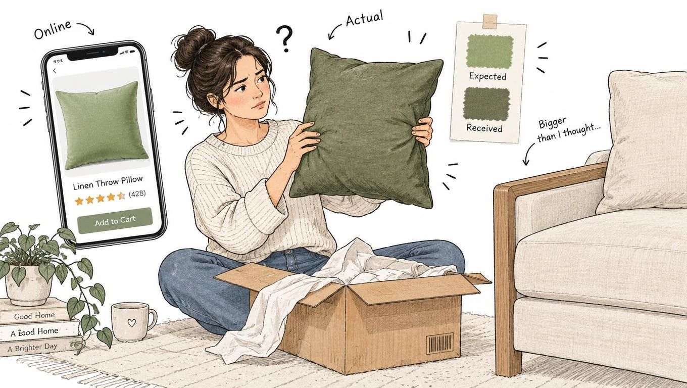
A throw pillow takes up little physical space, but it sits at eye level and often becomes the strongest color note on a sofa or bed. In a farmhouse room, that makes it more important than its size suggests. A muted sage can soften a crisp cream sofa, while a saturated emerald can become the focal point before anyone notices the vintage frame or reclaimed wood table.
Green needs more attention than a neutral because “green” covers a wide range of visual behavior. Sage may look gray and quiet in north-facing daylight, olive can become warmer beside honey-toned oak, and forest green can look almost black against a shadowed wall. A clear emerald may appear jewel-like under cool LEDs but heavy beneath warm bulbs. The same product can therefore look intentional in one room and misplaced in another.
A small accent with a large visual job
The right green throw pillow doesn't need to match every object. It needs to repeat or bridge something already present. A moss pillow may echo a botanical print, olive may connect a leather chair to a rust throw, and forest may give black metal accents a softer natural counterpoint.
That's why a product photograph isn't enough. Before ordering, compare the color with a fabric swatch, wall paint card, flooring, and the room's dominant light. If possible, view the swatch in the morning, afternoon, and evening. A green that works only under one bulb isn't a dependable choice.
Practical rule: Choose the green after checking the room, not before. The best shade is the one that looks connected to your existing materials in real light.
A pillow also changes how a room feels without demanding a large furniture purchase. The broader furniture and furnishings waste stream has grown substantially, and the U.S. Environmental Protection Agency's durable-goods data records furniture and furnishings rising from 2.2 million tons in 1960 to 12.1 million tons in 2018, with 80.1 percent landfilled in 2018. That figure doesn't isolate throw pillows, but it supports a useful buying principle: select a cover, insert, and shade you can live with for a long time rather than treating the pillow as a disposable seasonal fix.
For broader inspiration on balancing clean lines with rustic warmth, Farmhouse World's guide to modern farmhouse living room decor is a useful companion. The practical question remains simple: will this particular green make the room feel more settled, or will it create one color note with nowhere else to go?
Choosing Size, Fabric, Fill, and Closure
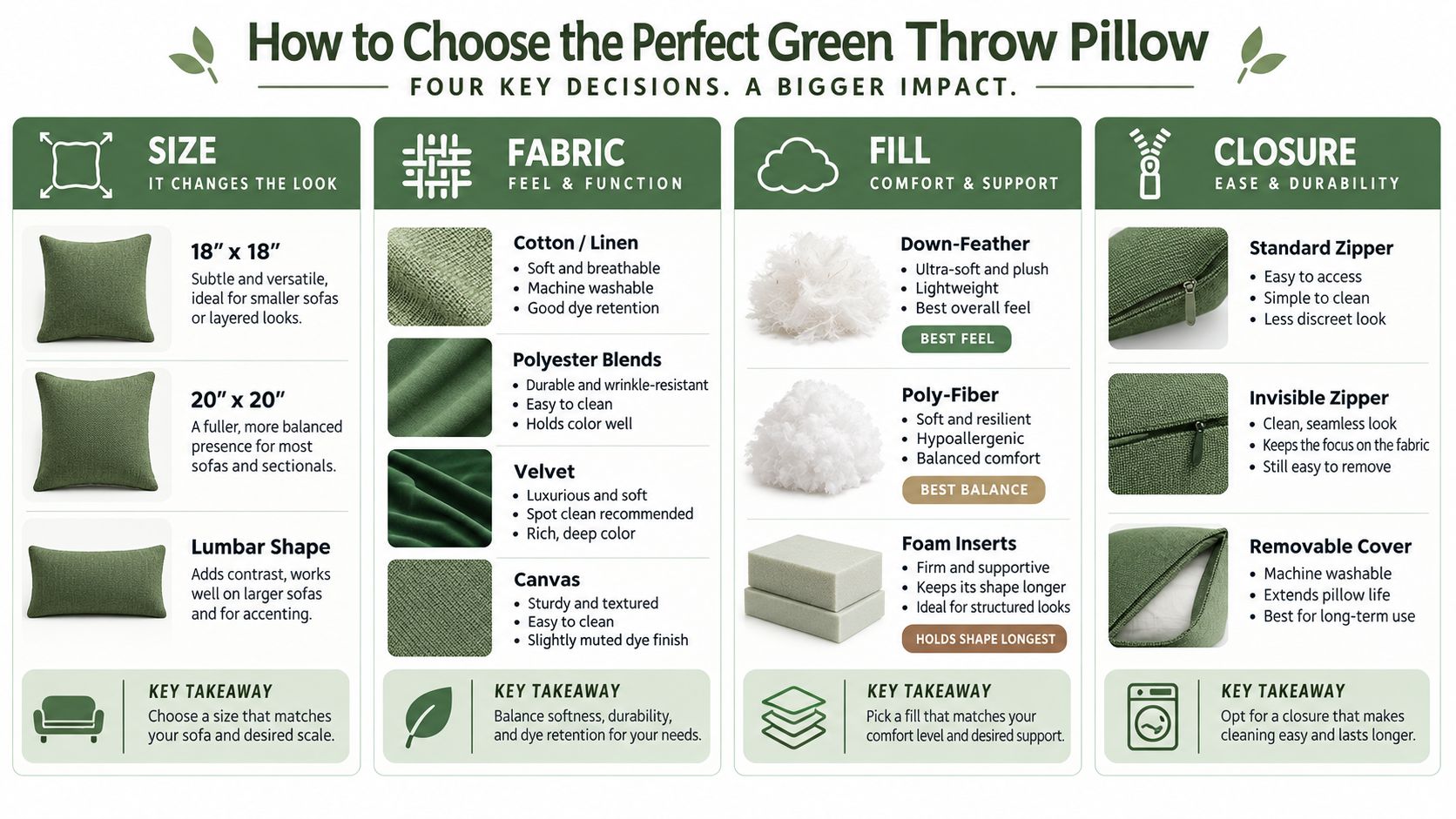
Color comes after four physical specifications. A beautiful green won't rescue a pillow that is too small for the sofa, uncomfortable to lean against, impossible to wash, or permanently misshapen.
Start with scale
An 18-by-18-inch cover is a versatile choice for a chair, apartment sofa, or layered arrangement. A 20-by-20-inch cover has more presence and usually looks better on a deeper sofa or at the back of a generous grouping. A lumbar pillow adds horizontal support and breaks up a row of squares, especially on a bed or reading chair.
Look at the finished measurements, not only the product photograph. A cover that appears generous online may look lost against a deep sectional. Conversely, several oversized squares can crowd a narrow bench and leave little usable seating.
Let the fabric set the mood
Cotton and linen suit relaxed farmhouse rooms because they have a breathable, tactile surface and generally feel less formal than velvet. Linen can crease and show texture, which is part of its appeal, while cotton is often easier to live with when the cover is washable. Polyester blends can offer dimensional stability and practical stain resistance, but they may feel less natural and raise separate environmental questions.
Velvet holds a rich, saturated shade and works well when one pillow needs to act as the room's focal point. Canvas brings a sturdy, casual character, though its firmer hand can feel less comfortable behind the back. Fiber production and finishing matter even for a small accent. Historical EPA analysis found that home furnishings consumed 25.3 percent of all fibers in 1960, 30 percent in 1970, and an estimated 33.1 percent in 1971. The EPA textile-industry analysis helps explain why fiber choice and product longevity deserve attention.
For a broader overview of proportions and comfort, compare this practical guide on how to pick a pillow before choosing a cover and insert combination.
Choose the fill for the way you sit
Down-feather inserts usually provide the most relaxed, luxurious feel and can be karate-chopped or reshaped, but they need regular fluffing and may not suit people who prefer a firm, stable cushion. Poly-fiber inserts offer a useful middle ground. They're lighter, generally easier to maintain, and hold a fuller silhouette with less daily attention.
Foam inserts keep their shape longest and work well for a lumbar pillow in a reading chair, though they can look rigid and feel less relaxed on a decorative sofa. For square covers, check that the insert fills the corners without stretching the seams.
Don't overlook the closure
An exposed standard zipper can work, but an invisible zipper gives the cover a cleaner finish and reduces visual distraction. A removable cover makes spot cleaning, seasonal rotation, and eventual replacement realistic. Check that the zipper runs smoothly, the stitching is even, and the product description clearly identifies whether the listing includes a cover, an insert, or both.
Picking the Green Shade That Fits Your Room
Shade selection starts with undertone, not trend appeal. Hold the pillow against your wall, sofa, and largest wood surface. If the green makes the cream look yellow, the oak look orange, or the gray look purple, the issue may be undertone rather than the color's depth.
A room-by-room shade guide
| Shade | How it reads | Farmhouse pairing | Best room use |
|---|---|---|---|
| Sage | Gray-washed, soft, and quiet | Cream linen, natural oak, pale blue | Bedroom or light living room |
| Olive | Warm, earthy, and slightly brown | Rust, tan, jute, warm wood | Living room or dining space |
| Moss | Muted, organic, and grounded | Oatmeal, woven textures, aged brass | Entryway or reading nook |
| Forest | Deep, cool-to-neutral, and dramatic | Black metal, ivory, leather | Living room accent chair or sofa |
| Emerald | Clear, saturated, and jewel-like | Navy, warm white, walnut | Formal living room or bedroom |
| Lime | Bright, sharp, and energetic | Use sparingly with restrained neutrals | Contemporary farmhouse accent |
Sage is the safest starting point for a pale bedroom, cream upholstery, or a room with abundant daylight. In warm evening light, it may become softer and more beige. Under cool LEDs, its gray component can become more noticeable, so check it beside the room's actual bulbs.
Olive belongs with warm farmhouse materials. It looks comfortable beside honey oak, leather, rust, and woven jute. A yellow-heavy olive can clash with cool gray paint, but a browner olive can make a gray sofa feel warmer when a cream pillow bridges the two.
Moss is useful when you want nature without the formality of forest green. It suits a reading nook with a rattan basket, a weathered side table, or a hallway bench. Forest creates stronger contrast. Use it where black iron, ivory, or dark wood can give it structure rather than placing it beside many other saturated colors.
Emerald is a deliberate accent, especially in velvet. One emerald pillow can carry the arrangement, while several saturated pillows may overwhelm a quiet farmhouse room. Lime is the least forgiving option. A 2025 survey of design professionals found that 73 percent identified lime green as especially off-putting to prospective buyers, while another survey placed emerald first among green-family choices at 22 percent. These findings come from the Fixr interior design color trends report, but your room still matters more than a general preference.
Check the color before it fades
A pillow near a sunny window, balcony door, or covered porch needs a lightfastness specification. A recognized test such as AATCC 16 Option 3 compares exposed and unexposed fabric using a blue-wool-style scale from 1 to 8, where 1 indicates poor retention and 8 indicates excellent resistance. ACT recommends at least grade 4 after 40 hours of exposure for commercial-grade textiles, as summarized by Kvadrat's fabric performance guidance.
Ask for the test method, exposure duration, and rating. “Fade resistant” alone doesn't tell you enough. Approve a physical swatch beside the piping and backing, and test a hidden seam allowance if washing is part of the care routine.
Mixing Green With Farmhouse Palettes and Patterns
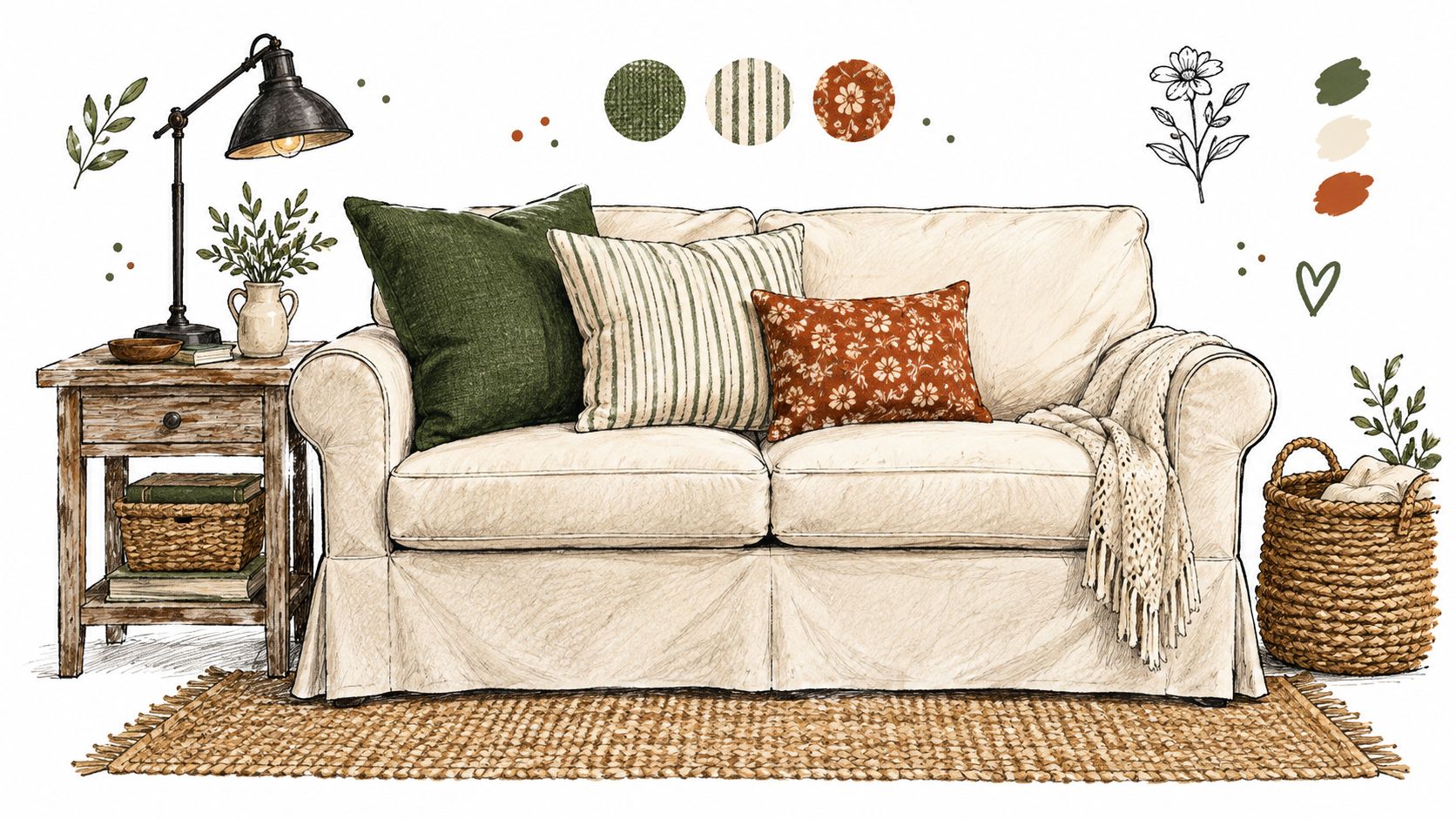
A green pillow looks settled when the surrounding palette gives it a role. Warm white walls make sage feel airy, while weathered wood deepens olive and moss. Black iron adds definition to forest green, and galvanized metal can make a warmer green look more deliberate rather than accidental.
Build the arrangement by contrast
Use one solid pillow to give the eye a resting place. Add a large-scale pattern, such as a botanical or oversized floral, then introduce a smaller pattern, such as ticking stripe or narrow plaid. The patterns shouldn't compete at the same visual volume.
Try these combinations:
- Forest green solid, cream ticking stripe, and soft rust floral: A dependable sofa arrangement with depth and warmth.
- Sage solid, oatmeal nubby texture, and faded blue stripe: Calm for a bedroom or pale living room.
- Olive solid, natural linen, and small botanical print: Works with leather, oak, and woven baskets.
- Emerald velvet, warm ivory, and restrained navy: Better for a formal corner than a heavily rustic room.
A simple odd-numbered grouping often feels less rigid. On a sofa, place larger neutrals behind the colored pillows, then finish with a lumbar that repeats either the green or one of its companion colors. On a bed, keep the strongest pattern away from the sleeping pillows so the arrangement remains comfortable.
| Green shade | Best farmhouse pairings | Room it suits |
|---|---|---|
| Sage | Cream linen, pale blue, natural oak | Bedroom |
| Olive | Rust, tan, jute, warm leather | Living room |
| Moss | Oatmeal, rattan, aged brass | Reading nook |
| Forest | Ivory, black iron, dark wood | Sofa or accent chair |
| Emerald | Navy, walnut, warm white | Formal living room |
| Lime | Quiet cream and natural textures | Small contemporary accent |
Connect the pillow to the rest of the room
Repeat green once elsewhere, but don't scatter identical green objects across every surface. A botanical detail in wall art, a small ceramic vessel, or a muted textile can be enough. If you're combining inherited pieces with newer accents, Farmhouse World's guide to mixing vintage and modern decor offers useful context for keeping the room collected rather than themed.
The most common mistake is matching the pillow to a photograph instead of to the room. A Pinterest image may use cool daylight, a different wall color, and a different wood finish. Match undertones first, then vary texture and pattern so the arrangement looks assembled over time.
Placing and Styling Pillows in Your Space
A sofa usually looks more comfortable when the pillows create a gentle progression rather than a perfectly symmetrical wall. Put the largest squares toward the arms or back, place the green throw pillow slightly forward, and finish with a lumbar where someone can still sit without moving everything.
Use the shape that supports the furniture
Squares bring fullness to a sofa or bed. A lumbar works well in a reading chair, on a bench, or at the front of a bed arrangement because its horizontal shape supports the lower back and interrupts repeated square forms. On a sectional, anchor pillows at the corners first, then fill the inside junction with a smaller shape.
An accent chair rarely needs more than one substantial square or one lumbar. Lean it into the arm rather than balancing it on the front edge. For a wooden sign, canvas print, or blanket ladder, keep the pillow in front of the furniture or wall feature, not perched where it can slide and obscure the display.
Styling note: If the pillow looks staged, remove one piece before adding another. Farmhouse rooms need breathing space around their texture.
Fluff down-feather and poly-fiber inserts before styling. Rotate the green pillow periodically so one corner doesn't take all the compression, especially if the sofa is used daily. Seasonal changes can happen around the green: use rust and plaid in cooler months, then switch to cream linen, faded blue, or lighter botanical patterns without replacing the core pillow.
For ideas on balancing a sofa with the wall behind it, see Farmhouse World's guide to farmhouse wall decor behind a couch.
Caring for Your Green Throw Pillow So It Lasts
Care starts with the label. A removable cover is only convenient if the fabric, dye, zipper, and seams can tolerate the cleaning method you plan to use.
Establish a simple routine
Fluff the insert when the pillow begins to look compressed. Down-feather needs more frequent reshaping, while poly-fiber generally holds its profile with less attention. Rotate the cover so the same face, edge, and corner don't remain against direct sun or the busiest seat.
Spot-clean first. Blot spills instead of rubbing them deeper into the weave, use a mild cleaner appropriate to the fiber, and test an unseen area before treating the visible face. For cotton and linen, cold water and a gentle cycle are sensible starting points when the care label permits them. Blends usually benefit from a gentle cycle and restrained detergent.
Protect the cover and zipper
Close the zipper before washing. A zipped cover is less likely to snag, and the teeth are less exposed to stress. Avoid high heat unless the label specifically allows it. Lay the cover flat or reshape it while damp to reduce shrinkage and prevent the fabric from pulling against the zipper.
Drying matters as much as washing. Direct heat can affect color, surface texture, and dimensional stability, while a damp green textile can transfer dye onto pale upholstery. Keep a white cloth nearby for a discreet colorfastness check after cleaning, particularly with dark forest or emerald shades.
Know what to replace
Replace the cover when the fabric is faded, permanently stained, or no longer suits the room. Replace the insert when it stays flat after fluffing, develops lumps, smells persistently musty, or no longer fills the cover's corners. A sound insert can support several different covers, which makes a removable cover more useful than a permanently sealed decorative pillow.
Households with pets should consider texture as well as color. Nubby linen and canvas can disguise everyday irregularity, while velvet may show directional marks and flattened areas. Smooth blends can be easier to wipe, but “natural” doesn't automatically mean easier-care or lower-impact, and synthetic content can involve different environmental trade-offs. A practical textile-care and sustainability perspective is especially relevant as sustainability becomes a recognized interior-design consideration, with 21 percent of experts identifying it as a major trend.
Your Green Throw Pillow Checklist
Before you click buy, check the product page and the room together.
- Measure the space: Confirm whether an 18-by-18, 20-by-20, or lumbar shape will suit the sofa, chair, or bed.
- Read the material line: Compare cotton, linen, canvas, velvet, and blends for softness, washability, texture, and dye behavior.
- Verify the insert: Check whether the listing includes one, then choose a fill that matches your preferred feel and maintenance routine.
- Inspect the closure: Prefer a reliable zipper and a removable cover when regular cleaning matters.
- Test the shade: View a physical swatch beside the wall, sofa, wood, and metal in both daylight and evening light.
- Plan the palette: Pair sage with cream and oak, olive with rust and jute, or forest with ivory and black iron.
- Vary the arrangement: Combine one solid with different pattern scales and textures rather than matching every pillow.
- Protect the investment: Follow the care label, close the zipper before washing, dry gently, and rotate the cover.
A small collection works better when each green accent has a job. Let the pillow establish the color, then repeat it subtly through wall art, a seasonal textile, or a natural botanical detail instead of buying unrelated green objects.
Farmhouse World offers farmhouse-style wall decor, custom metal signs, textiles, seasonal accents, and personalized gifts that can help connect a green throw pillow to the rest of your room. Browse Farmhouse World to find complementary rustic pieces for living spaces, entryways, and porches.


