

You've painted the living room, the sofa's finally in the right spot, and the wall above it still looks empty in a way that makes the whole room feel unfinished. A piece of living room metal wall art seems like the obvious fix, until you're standing there wondering if it'll look lost, glare under the evening lamps, or pull out of the drywall. Those aren't style worries. They're scale, light, and load problems, and they're solvable with a tape measure and a few honest checks before you order anything.
I would treat every metal piece as a physical object first and a decoration second. Get the width, height, weight, and finish right, and the style mostly takes care of itself. Get one of them wrong, and even a beautiful sign looks like a mistake you're stuck with.
Table of Contents
- Sizing Metal Wall Art to Your Sofa and Wall
- Choosing Finish, Style and Personalization
- Placing Metal Art at the Right Height
- Hanging Metal Art Safely on Different Walls
- Lighting Metal Art to Control Glare
- Caring for Metal Wall Art Over Time
- Confirm the Layout Before You Drill
Sizing Metal Wall Art to Your Sofa and Wall
Say a long sofa sits under a small metal sign that covers barely a third of its back. The sofa doesn't look intentional. The sign looks like it wandered in from a hallway. Reverse it, with art nearly as wide as the sofa, and the whole wall feels crowded before you've added a lamp.
The reliable middle is simple. Art that's roughly two thirds of your sofa width reads as deliberate. Half that width or less disappears. That rule gives you a target before you browse designs, which matters because personalization makes returns awkward.
| Sofa or wall width | Target art width | Layout suggestion |
|---|---|---|
| Under 60 inches | 24 to 36 inches | One piece centered on the sofa |
| 60 to 72 inches | 40 to 48 inches | One wide piece or a close pair |
| 72 to 84 inches | 48 to 56 inches | One wide piece centered on the seat |
| 84 to 96 inches | 56 to 64 inches | One statement piece or a symmetrical pair |
| Sectional over 96 inches | 64 inches or more | Two to three pieces spanning the seat |
Work the Math Before You Shop
Start with the sofa, since it anchors the wall. Run these steps in order:
- Measure the sofa at its widest point: Include the arms, not just the seat cushions.
- Multiply that width by 0.67: That's your target art width, rounded to the nearest available size.
- Mark the outline with painter's tape: Add the bottom edge 8 to 10 inches above the sofa back.
- Live with the tape for a day: Walk past it, sit across from it, and check it in morning and evening light.
Here's the trade off many buyers miss. Farmhouse World personalized metal signs commonly come in 12 to 36 inch sizes, so a 36 inch sign is the largest stock option for a sofa of about 54 inches. On an 84 inch sofa, that same sign covers less than half the target width. Your fixes are a pair of pieces, a grouping with smaller accents, or a different wall where the sign can be the right scale.
A small piece can still earn its place off the main wall. The Rustic 'Be Kind' Wreath Farmhouse Wall Art Sign - 6x6 Inches measures 6 inches by 6 inches with a whitewash background and hand printed lettering, so it works on a tabletop or as a small accent rather than as the anchor above a sofa.
Why Paint Comes First
Art is often layered onto a finished wall, and the numbers reflect this trend. A Houzz survey of more than 1,700 homeowners in the United States and Canada found that 91% planned to use paint on their walls, while 22% planned to use art prints and 17% original art. Metal art fits this layered approach. It is sized against a painted backdrop and furniture, not used to cover the wall.
If you're still deciding what belongs on that wall, the guide to farmhouse wall decor behind the couch covers the wider mix of pieces that can share the space. Whatever you choose, tape it first. Tape is cheap, and it tells the truth about scale faster than any product photo.
Practical rule: If the tape outline looks slightly too big on an empty wall, it's probably right once cushions, throws, and a lamp are back in place.
Choosing Finish, Style and Personalization
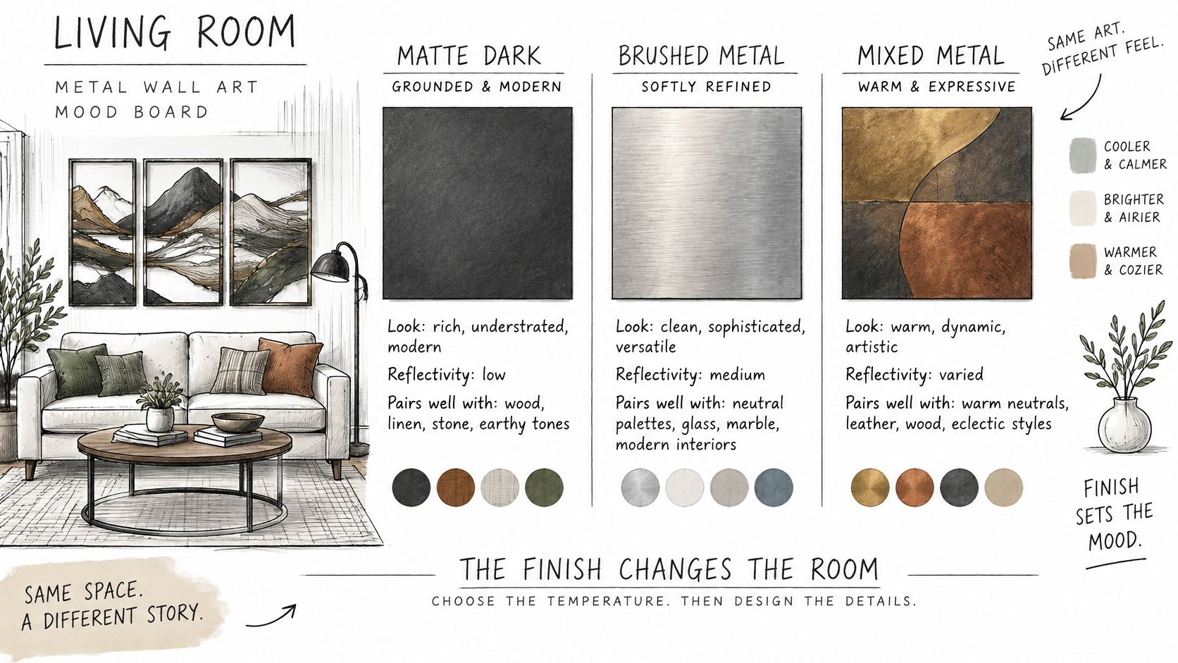
Pick the finish before the design. The motif catches your eye in a photo, but the finish sets the room's temperature every day, in every kind of light. Black can ground a pale wall. Copper can warm up a room that feels cold. Silver can sharpen a space or make it feel clinical, depending on what's already there.
This mood board shows how different the same idea reads across three finishes.
| Finish | Look and undertone | Reflectivity | Pairs well with |
|---|---|---|---|
| Black | Grounded, iron like, neutral cool | Low, matte to satin | Wood beams, brass lamps, white walls |
| Copper | Warm, rosy, rustic | Medium, mellows with age | Cream, sage and leather |
| Gold | Soft, warm yellow glow | Medium to high | Black or walnut furniture |
| Silver | Cool, clean, slightly industrial | High when polished | Greige walls and chrome hardware |
| White | Airy, soft, coastal | Low | Shiplap, blue textiles and driftwood |
| Red, Blue or Green | Single accent color | Low to medium | One accent room with neutral walls |
The One Dominant Finish Rule
You don't have to match every metal in the room, and matching everything exactly often looks flat. Trend coverage from 1stDibs on 2025 interior design reports that bronze and brass each ranked as the most favored materials among 18% of surveyed designers for 2025, while mixing different metal finishes is described as increasingly acceptable. The shift isn't toward more metal. It's toward more deliberate contrast.
Use a framework that keeps that contrast under control:
- One dominant dark structural finish: Let black steel carry the largest piece, a floor lamp, or table legs.
- One warm repeat in smaller accents: Echo brass or copper in a lamp base, a single frame, or hardware so the accent looks chosen, not orphaned.
- Three finishes at most: A fourth finish usually turns contrast into clutter.
- Mind the sheen, not just the color: Polished surfaces read modern. Distressed and matte surfaces read farmhouse, even in the same color family.
The room style points you toward a starting palette. Rustic farmhouse suits black steel beside wood. Coastal farmhouse suits white, blue, and silver, which is the direction explored in the modern farmhouse wall decor for living rooms roundup. Contemporary rooms can carry a cooler polished finish, while traditional rooms take warmer, softer metals better.
Personalization Checks
Custom text is where excitement outruns proofreading. Farmhouse World signs can carry a name, date, or monogram in Black, Copper, Gold, Silver, White, Red, Blue, or Green. The preview shows the exact text that will appear, so read it letter by letter. Hyphens do not print, so use periods or slashes in dates instead.
This short video walks through finish choices in a real room setting, which is worth watching before you commit to a swatch.
Finally, test the finish twice. Look at any sample, photo, or existing metal object in the room in morning and evening light. Reflective surfaces shift warmer, colder, or more dominant as daylight changes, and a finish that looks perfect at noon can shout under warm lamplight at night.
Placing Metal Art at the Right Height
Most living room metal wall art gets hung too high. You hold it up while standing, it looks fine from six feet away at eye level, and then it floats above everyone's sightline once they're sitting down. The fix is to hang for the seated view, because that's how the room gets used.
A few heights cover almost every living room situation. These aren't arbitrary. They keep the piece visually connected to the furniture below it instead of drifting toward the ceiling.
| Placement | Height reference | Clearance | Gap between pieces |
|---|---|---|---|
| Single piece over sofa | Bottom edge set by sofa back | 8 to 10 inches above sofa back | n/a |
| Single piece over fireplace | Center at 57 to 60 inches from floor | 6 to 8 inches above mantel | n/a |
| Grouped pieces | Group center at 57 to 60 inches from floor | Group within sofa width | 2 to 3 inches |
| Over a console | Bottom edge above surface | 6 to 8 inches above console top | n/a |
Hang for the Person on the Sofa
Work through the placement in this order:
- Find eye level: Mark 57 to 60 inches from the floor as your reference line for centers.
- Set the bottom edge by the furniture rule: Use the clearance for your sofa, mantel, or console from the table.
- Mark two points with a pencil: Two points keep a wide metal piece from rotating on a single hook.
- Sit down and look: From the sofa, the piece should sit in your sightline without crowding a lamp shade or the ceiling line.
That last step is the one people skip. Standing judgment is misleading because you're taller, closer, and looking slightly down at the wall. From the seat, a piece hung even a few inches too high breaks away from the sofa and reads as separate from the seating group.
If you have to lift your chin to take in the whole piece from the sofa, it's too high, no matter how level it is.
Groupings Need a Floor Rehearsal
Grouped pieces fail on spacing more often than on height. Lay the arrangement on the floor first, or cut paper templates to size. Tape the full layout to the wall with 2 to 3 inches between frames and the group's center on the 57 to 60 inch line. Measure the outer edges against your sofa width so the group doesn't spill past the arms.
Only once the taped version works from the seat should you transfer the hanger positions. Metal pieces are less forgiving than light prints here, because moving a drilled anchor leaves a bigger hole to patch. Ten minutes with tape saves you that repair.
Hanging Metal Art Safely on Different Walls
Most failures happen here, and they rarely happen on hanging day. A piece holds for three weeks, then a door slam or a kid bouncing on the sofa works a weak anchor loose. The look of the sign tells you nothing about this risk. The load path does.
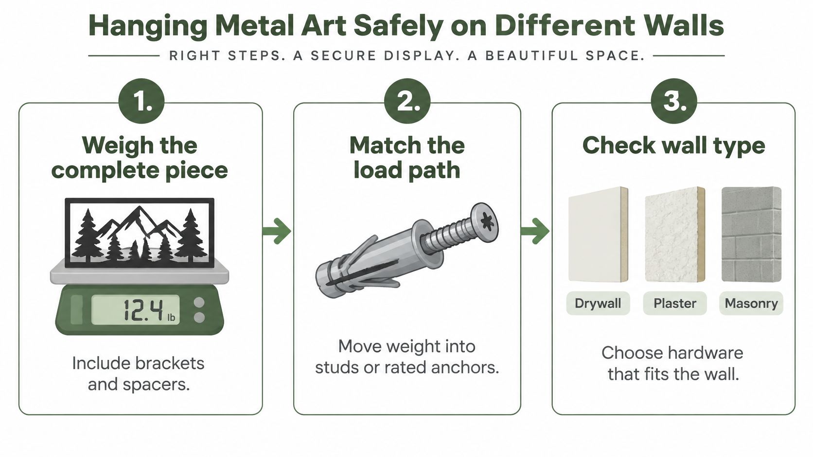
Think of the load path as the route the weight travels, from the sign bracket through the screw and anchor into the wall structure. Every link in that chain has to carry the load. The weakest link is the one that fails.
The Load Path Method
A professional picture hanging guide from Colorado Art Services recommends dividing an anchor manufacturer's stated shear rating by four as a conservative working load, then adding a 25 to 50% margin for movement and installation variability. That means a 100 pound rated anchor should be treated as supporting approximately 25 pounds in service, not 100 pounds. The same guide notes that some 1/2 inch drywall anchor tests reach roughly 97 lbf ultimate pull out, but warns that wall condition and installation quality reduce real world performance.
Apply that thinking step by step:
- Weigh the complete piece: Include brackets and spacers, not just the sign itself.
- Identify the wall: Wood stud, drywall, plaster, brick, or concrete each behave differently under load.
- Choose the fastener for that wall: Fasten into a stud or masonry when you can. Otherwise use a metal toggle bolt rated for the wall thickness.
- Calculate the working load: Divide the stated rating by four, then confirm the result still beats your piece's weight with margin to spare.
- Mark and drill: Use two attachment points spaced evenly when the design allows.
- Test before you step away: A light downward pull tells you more than a visual once over.
| Wall type | Best fastener | Load note | Check first |
|---|---|---|---|
| Wood stud | Lag screw or stud mounted hanger | Hit the stud center; use two points for heavy pieces | Stud finder marks both edges |
| Drywall with no stud | Metal toggle bolt rated for wall thickness | Drywall alone may hold only 5 to 10 pounds | Wall thickness and hollow sound |
| Plaster | Toggle bolt or plaster rated anchor | Use the divide by four working load rule; brittle plaster needs the full margin | Solid plaster or plaster over lath |
| Brick or concrete | Masonry or sleeve anchor | Anchor grips the masonry itself; confirm each point carries its share with the 25 to 50% margin | Pilot hole depth and dust clearance |
The Failures I Would Warn You About
Three mistakes account for most dropped metal art. Plastic anchors under heavy or projecting pieces creep and pull out. Ignoring hollow wall thickness means a toggle can't open fully behind the drywall. Treating lab pull out numbers as guarantees ignores the crooked hole, the aging drywall, and the outward force a piece on spacers creates.
Older homes add one more wrinkle. Plaster over lath can crack if you drill aggressively, and stud spacing may not be where you expect. Drill a small pilot hole, go slowly, and stop if the wall crumbles rather than cutting cleanly. For a deeper walkthrough of hardware choices by wall type, the Colorado Art Services installation guide is a useful reference to keep open while you shop for anchors.
Two practical notes before you start. Farmhouse World signs ship without mounting hardware, so buy it separately. Magnetic hanging hardware for signs is listed on the site. And if your lease forbids drilling, don't rely on adhesive hooks for a heavy piece. Check the lease first, then lean the art on a console or mantel with a stable base, away from pets and children, since a leaning piece can tip. A drilled, rated fixing is the safer choice wherever you're allowed one.
Lighting Metal Art to Control Glare
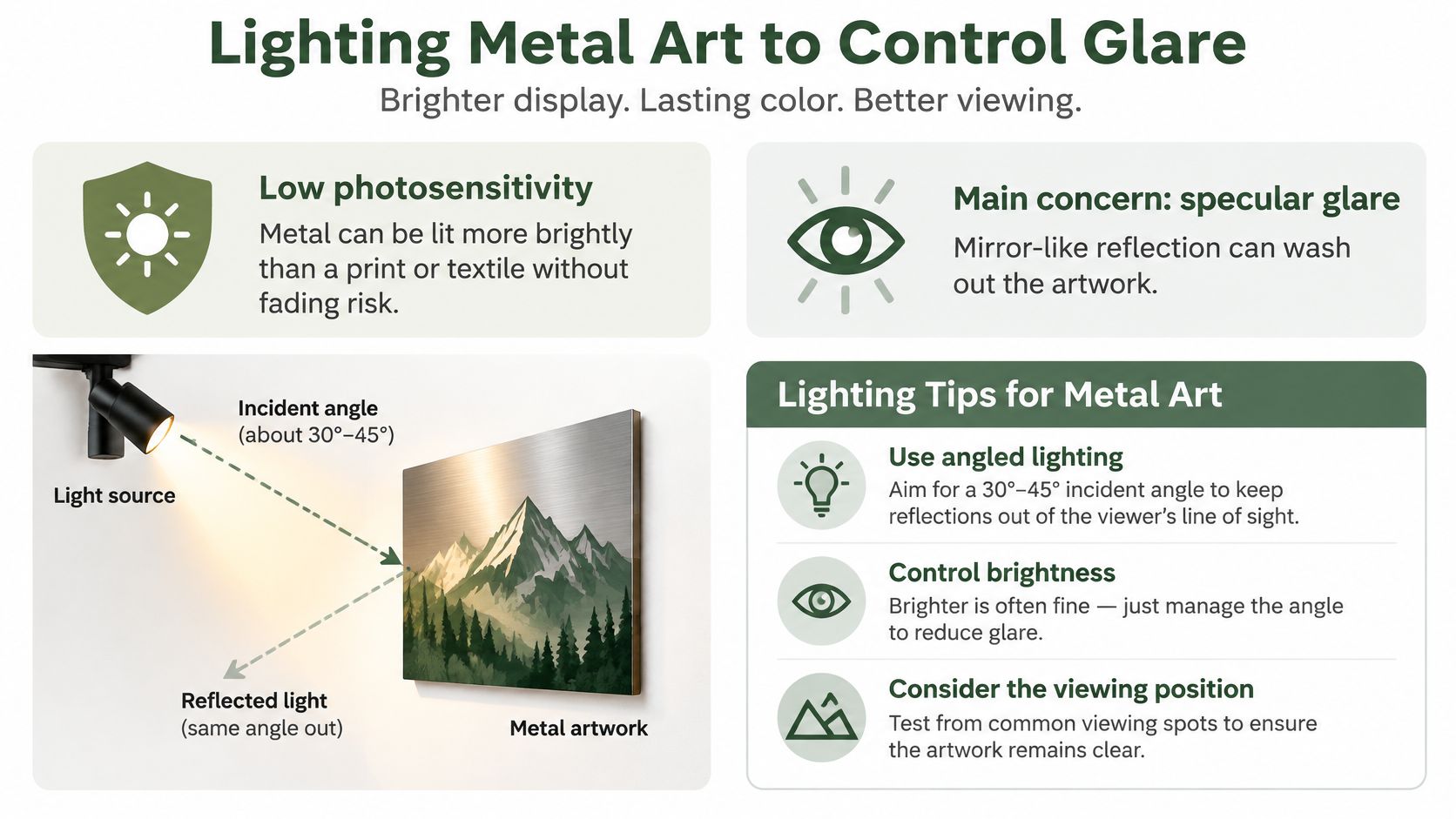
People assume a dim looking metal piece needs more light. Usually it needs better angled light. Metal isn't like a watercolor or a textile. It's a low photosensitivity material, so you can light it relatively brightly without the fading risk that limits organic artwork.
The main issue is specular reflection, the mirror-like bounce that sends a bright image of your lamp or ceiling light directly back at the viewer. Increasing brightness often results in a more intense reflection. The detail you wanted to highlight becomes obscured behind a white hotspot.
Check Reflections From Every Seat
Work through four steps, in this order:
- Set the art at its intended height: Temporary hanging is fine for this test.
- Check from the sofa, the doorway, and the walking path: Look for bright reflected shapes, not just overall brightness.
- Move or shield the light source: Shift the lamp, angle the track head, or add a shade until the reflection leaves the sightlines.
- Repeat the check at night: Recessed and point source fixtures glare harder after dark, when there's no daylight to balance them.
Reference values give you something concrete to aim for when you're choosing bulbs and fixtures. Research guidance in the International Journal of Low Carbon Technologies study on metal display lighting recommends a glare rating of UGR no greater than 19, ideally no greater than 16, with a color temperature around 4000 to 5000 K for metal displays and controlled incidence angles such as 10°, 20°, or 40°.
| Setting | Target |
|---|---|
| Glare rating | UGR 19 at most, ideally 16 or lower |
| Color temperature | 4000 to 5000 K |
| Light incidence angle | 10°, 20°, or 40° off axis |
Finish Changes the Lighting Job
Matte and low sheen surfaces are forgiving. They scatter light rather than mirroring it, so fixed lamps usually work. Polished copper, gold, silver, and glossy black are not forgiving. Aim a high luminance point source straight at them and you'll see the fixture instead of the artwork.
For reflective finishes, you've got three levers. Adjustable track lighting lets you change the angle until the reflection moves out of the seating zone. Diffusion, through a shade or frosted cover, softens the reflected image. Off axis placement of the light, to one side rather than in front, keeps the bounce away from viewers entirely.
The night test: If you can see the shape of a ceiling light in the metal from your usual seat, the angle is wrong, regardless of how good it looks at noon.
Don't judge any of this from one standing spot. Reflection geometry changes with every step, so a piece that looks perfect from the doorway can glare badly from the corner of the sofa where someone sits every evening.
Caring for Metal Wall Art Over Time
Maintenance is light. Powder coated steel shrugs off the knocks that would dent a frame or tear a print. The habits below protect the finish and the fixing, which are the two things that age.
- Dust weekly with a dry microfiber cloth: Dry is the key word. You're lifting grit off the surface before any wiping can drag it across the coating.
- Wipe fingerprints with a damp cloth and a drop of mild dish soap: Dry the piece at once afterward. Standing water leaves spots and works into edges.
- Skip abrasive pads and strong solvents: They dull powder coat and matte finishes, and the damage doesn't polish back out.
- Check hanging hardware every six months: Toggle bolts in drywall can loosen with door slams and vibration. A quarter turn and a firm test pull take a minute.
- Watch direct afternoon sun: A window that hits a painted finish daily can fade it over years. Move or rotate the piece if one edge is lightening.
- Decide how you'll treat patina: Copper and brass change with age. Clean for a fresh shine or leave them to settle, but pick one direction so the piece doesn't end up patchy.
- Re level after a season change: Humidity shifts wall materials slightly, and a tilted piece is usually a five second fix at the hanger.
What Actually Wears Out
It isn't the metal. Indoors, the finish fails first through scratches and harsh cleaners, and the fixing fails through slow loosening nobody checks. Outdoor pieces face a harder life, and the advice on how to protect metal from rust covers that exposure in detail.
Indoors, your two real enemies are moisture left sitting on the surface and grit ground in by dry wiping a dusty piece too hard. Both are easy to avoid. Dust first, wash gently when needed, dry straight away, and put the hardware check on the same mental list as changing a smoke alarm battery. Twice a year is enough.
Handle the piece by its edges when you take it down for cleaning. Skin oils on polished finishes show as prints you'll just have to wipe off again, and gripping a wide sign in the middle can flex thin cut sections. Lay it face up on a towel, never face down on a hard table.
Confirm the Layout Before You Drill
Everything comes down to one go or no go check that takes about ten minutes. Run it with the tape outline still on the wall, because once holes exist, changing your mind gets expensive in filler and repainting.
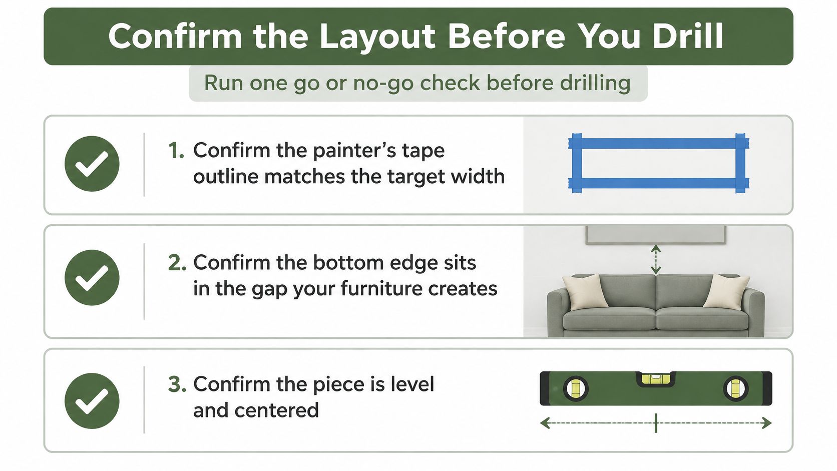
Work through the checks in this order:
- Confirm the tape outline matches your target width: Measure it, don't eyeball it. It should reflect the two thirds of sofa width calculation.
- Confirm the bottom edge sits in the right gap: Match it against the clearance your sofa, mantel, or console needs.
- Judge finish and glare from the seat: Check in morning light, evening light, and once more at night from where people sit.
- Weigh the piece with its brackets: Choose anchors by the working load rule, with two points where the design allows.
If the outline works from the sofa and passes the night glare test, order or drill. If it fails, change the size first, then the finish, and choose hardware last. That order matters. A different finish won't fix a piece that's the wrong width, and no anchor selection makes a badly scaled sign look right.
For personalized signs, add one final proof. Read the preview text exactly as it'll be cut, and swap hyphens for periods or slashes since hyphens don't print. Then write down the approved outline dimensions and hanger positions before you make any holes. That small record saves arguments with yourself if you pause the project for a week and come back to a wall of tape you've half forgotten.
Measure your sofa, tape your outline, and pick a finish you've checked in evening light, then browse the personalized metal signs at Farmhouse World in sizes from 12 to 36 inches and finishes from matte black to copper and gold. Each piece can carry your family name, date, or monogram, so you can match the exact width and finish your wall measurements call for.


