

You're at the mailbox with a package in one hand, looking back at the porch. The plaque looked sharp when you hung it beside the door. From the road it is a dark shape, and the driver who just missed the driveway is already gone. House name number plaques fail that way more often than they fail from weather. A script font, a shiny brass face, or a small plaque on a wall set far back will not give a courier, a guest, or a fire crew the number in two seconds.
Treat the plaque as a wayfinding device first and a decoration second. Size it for the distance, choose a finish that keeps contrast after sun and rain, and mount it where a driver can see it without turning their head. Style still belongs on the house. It has to sit around the number, not on top of it.
Table of Contents
- Plaque Sizes Matched to Viewing Distance
- Materials Compared for Weather and Legibility
- Contrast, Lighting and Night Legibility
- Personalization Layouts That Stay Readable
- How to Mount a Plaque Securely and Visibly
- Maintenance Schedule and Signs to Replace
- Pre-Order Checklist and Next Step
Plaque Sizes Matched to Viewing Distance
A plaque that is too small fails before finish, font, or hardware get a chance. A working rule in sign work is about 1 inch of numeral height for every 10 feet between the viewer and the plaque. Use it as a starting point, not a guarantee. Then choose a face large enough to hold those numerals with a margin. Flourishes do not count as height. Measure the plain number.
Farmhouse World sells these plaques in six sizes: 12, 15, 18, 24, 30, and 36 inches. Match the named size to the viewing distance. A screen mockup makes every plaque look larger than it will on a wall.
| Plaque size | Best placement | Reads clearly up to | Numeral height to aim for |
|---|---|---|---|
| 12 inches | Side door, gallery wall, small entry | About 10 feet | 1 inch |
| 15 inches | Smaller porch, apartment entry, gate post | About 15 feet | 1.5 inches |
| 18 inches | Front door, smaller exterior wall | About 20 feet | 2 inches |
| 24 inches | Porch, garage, larger entry | About 30 feet | 3 inches |
| 30 inches | Gate, patio, barn, large house front | About 40 feet | 4 inches |
| 36 inches | Statement exterior wall, long set-back driveway | About 40 feet on the wall, farther with a post | 4 inches or more, or add a roadside marker |
A 40 foot setback worked out
Say the front wall sits 40 feet from the pavement. Under the working rule, the numerals need to be around 4 inches tall, so the number has to fill most of the face. A 24 inch plaque can hold a 3 inch number plus a name, and that number is short for the road. A 30 or 36 inch face gives the digits room. If a curve or a hedge still hides the wall, add a second, larger marker at the drive. The porch plaque cannot do both jobs well.
A 15 inch plaque fits a smaller porch, an apartment entry, or a gallery wall where people stand close. 18 inches is the usual front door and smaller exterior wall. Step to 24 inches for a porch, a garage, or a wider entry. Use 30 inches at a gate, patio, or barn. Keep 36 inches for a statement wall or a long approach where the number is the whole point of the face.
The two second curb test
If you cannot read the number in two seconds from the road, the plaque is too small.
Walk to the curb and look the way a driver would, without stopping to study it. If you hesitate, move up one size or add a post mounted sign. Do that before you order. If you cannot read it from the car, the plaque is the wrong size.
Materials Compared for Weather and Legibility
A south-facing wall is the hardest test a plaque faces. Morning sun, driving rain, and a sprinkler that hits the same spot every week will show whether the finish still reads after two winters. Judge a material on three things: how it handles weather, how much contrast it keeps after exposure, and how often it needs attention.
| Material | Outdoor durability | Legibility | Upkeep |
|---|---|---|---|
| Powder-coated mild steel | Strong outdoors while the coating is intact; chips expose rust | High when letters are cut or painted in strong contrast | Touch up chips and wipe clean |
| Aluminum | Corrosion-resistant and light for its size | Good with dark-on-light or light-on-dark finish | Wipe clean; no coating to maintain |
| Brass or bronze | Durable, but weathers to a dark patina and can stain stone | Low when polished; weathered finish reduces contrast | Polish for clarity or accept the patina |
| Painted or sealed wood | Good under a porch; swells and cracks in full weather unless sealed | Good when numerals are bold and painted | Repaint or reseal every few years |
| Stone or ceramic tile | Very durable; heavy and can crack from impact | Best with a matte glaze; glossy glaze washes out | Clean with mild soap and water |
| Acrylic | Weatherproof only when UV-rated; cheap versions yellow and fade | Strong when printed in solid colors | Replace when faded |
Powder-coated mild steel is common for custom address signs, and it holds up while the coating stays whole. Watch the edges and the mounting holes. A chip there lets bare steel meet rain, and rust starts at the nick and creeps under the paint. Touch up chips early, before the rust spreads. Durability is strong while the coating is intact. The practical trade-off is that one neglected chip can cost you the face.
Aluminum is the low-upkeep choice. It resists corrosion and stays light enough for a gate or a tall post. Its weakness is the finish. The metal itself will outlast many paint schemes. A faint print or a low-contrast color scheme disappears from the road even though the sheet stays sound. Dark on light or light on dark keeps it readable.
Brass and bronze look right beside traditional door hardware, and they also darken. A polished face throws glare in morning sun, and a patina can pull the numerals into the same tone as the background. Lost contrast is the main failure. The metal can remain sound for years while the number stops reading from the curb. Polish if you want clarity, or accept the patina and plan the background around it.
Wood works under a covered porch and costs less there. In open weather it swells, cracks, and lifts paint unless the sealer stays current. Repaint or reseal every few years, or keep wood off the exposed wall. Stone and ceramic last, but they are heavy and a hard knock can crack a tile. A glossy glaze flares in sun; a matte glaze is the one that still reads. Acrylic holds up outdoors only when it is UV-rated. Cheap sheet yellows, the print goes pale, and polishing will not bring the number back. Replace the face when the color shifts.
Practical rule: Put raised or cut letters on a solid matte background. Skip polished metal lettering on a polished metal face. Glare wipes out the contrast.
Choose the material that suits the siding, the porch, and the hardware. Then look at the numerals in morning light and again after dark. If they vanish in either, change the finish before you change the font.
Contrast, Lighting and Night Legibility
At dusk, headlights sweep the front wall, and the house number either resolves into clear digits or merges into the siding. A driver, a courier, and a crew all need that view to work before they can appreciate the lettering. The plaque is a wayfinding device first, so test it from the road, with the porch light on and a shrub in the way.
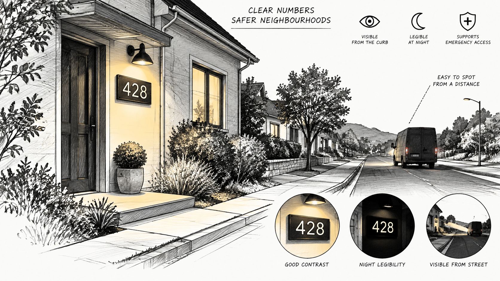
After sunset, the face needs light.
The NFPA guidance on building access covers how responding crews find and reach a building. It favors numbering that is visible from the street and contrasts with the building or mounting post, plus a roadside marker when the building is hidden. Local fire and addressing codes can set character height, stroke, visibility distance, and night illumination, so check them before cutting.
The U.S. Access Board sign guide explains contrast as light characters on a dark field or dark characters on a light field. Ordinary house addresses generally fall outside the full tactile-sign rules, so the contrast decision stays with you. A decorative outdoor plaque also does not replace an interior accessibility sign.
Light that helps the number
Use bold, simple Arabic numerals and a hard split between character and background. Low-contrast polished metal fails that test. A small downlight or solar fixture aimed at the face keeps a distant plaque readable, with the lamp kept out of the driver's eyes. For the walk and porch around it, layered lighting for outdoor spaces shows how a tight beam on the number can sit with softer light on the path, so the plaque is clear without glare across the whole facade.
Reflective faces help when headlights hit them and the bounce still separates digit from background. A house set far back often needs a lit plaque at the entry and a larger marker at the road.
Stand at the curb after dark and look at the plaque with the porch light on. If the digits merge, increase the stroke, change the finish, or aim the light.
The video below shows how address visibility works from the street.
Three checks before the font
- From the car: Read the number from the driver's seat on the addressed street, without leaning.
- At night: Repeat the look after dusk with the lamp on. Hesitation means a thin stroke or a badly aimed light.
- Past the shrubs: If a branch covers any digit, move the plaque. Fix the placement before you change the font.
Size, mounting height, reflective treatment, and illumination are set by the local rule, not by a product photo.
Personalization Layouts That Stay Readable
A driver gets a quick look from the road. The layout has to put the number in that look before the name or script registers.
Four layouts cover the common requests: address only, family name, house name plus address, and a name stacked under the number. They do not read equally well from the street.
Address only is the clearest. The number gets the height, the stroke, and the eye. Family name suits a gift or a house people already know by the family. House name plus address fits a cottage or a farm, but every extra line steals height from the digits. Words such as farm, ranch, or cottage add character, and they hurt when they sit between the viewer and the number. Stacking the name under the number protects the digit size; putting it above pushes the number down.
A last name sign for home can carry the family line when the address stays the dominant mark. Match the plaque to the architecture, the mailbox, the door hardware, and the porch light. Trend-driven wording dates fast, clashes with a later sale, and makes the address harder to read.
Four questions, in order
- How far is it read? If the view is the road, the number stays the largest line. Close-up gallery walls can carry more words.
- How many names must fit? One surname is easier than a list of first names. Shared houses get cluttered fast.
- Owned or rented? Renters should use surface screws or a freestanding post, not holes in masonry they do not own.
- Gift or permanent? A gift can lean sentimental. A permanent face should still work for the next occupant.
On the same 24 inch face, "The Martins Est. 2024" in a fancy script loses to "128 Country Lane" in plain numerals. The name version looks personal on the porch. From the road, the address version is the one a stranger can use.
A name works best as a secondary line; the number needs to be the first thing a driver reads.
Check whether a later owner can swap only the face and leave the mount. Before the order goes to the cutter, proof spelling, capitalization and the house number. Treat the proof as the last cheap fix.
How to Mount a Plaque Securely and Visibly
Careful mounting is what keeps the contrast you already chose. A crooked, leafy, or shadowed plaque fails even when the digits are the right size.
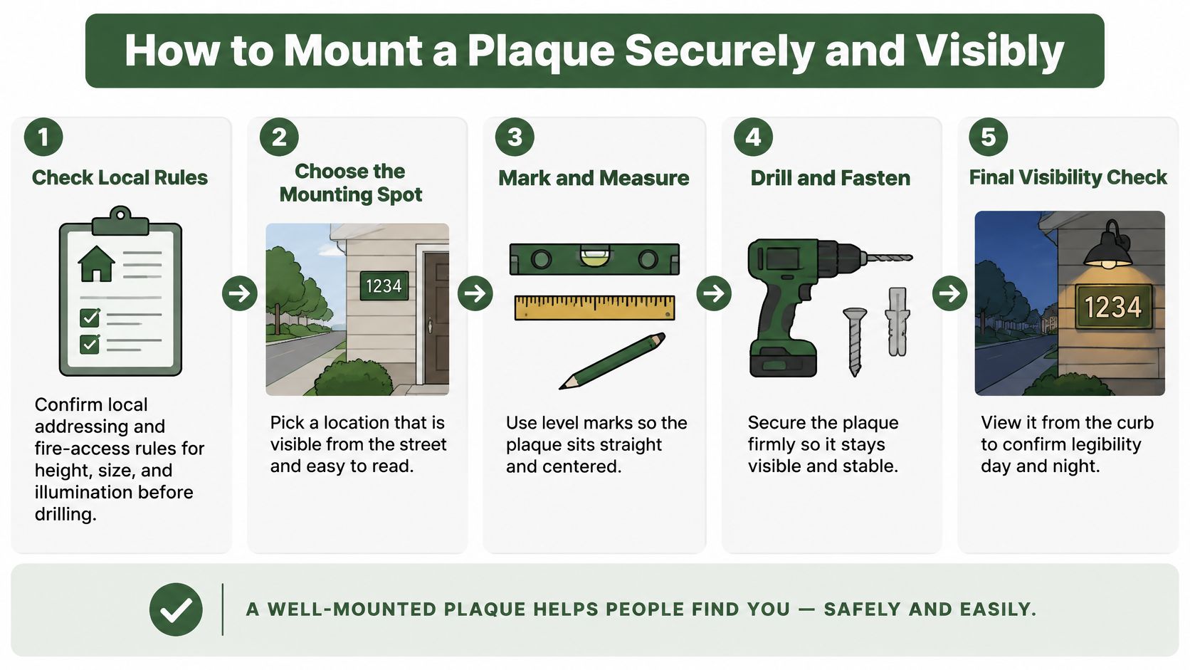
The Presidio addressing standard expects the identifier to face the addressed street or the fire-apparatus access road, stay plainly visible, and be kept clean. Vegetation, posts, distance, and a bent driveway can justify a second sign at the drive entrance. Check the spot from both travel directions when the road allows it. At night, some fire-site guidelines want continuous light or a set lighting level, and reflective material is acceptable only when the returned light still separates numerals from the background.
Seven steps, each with a reason
- Confirm the local rules before you drill. Height, size, and illumination are already set by the jurisdiction. A hole in the wrong spot is wasted work.
- Face the addressed road. Set the plaque near a driver's eye line, with no porch post or shrub in the line of sight. People should not have to crane their necks.
- Mark from the curb, then level the holes. Hold the plaque up, look from each approach, and only then mark. A level keeps the lines from looking drunk in a photo and in headlights.
- Match the fastener to the surface. Use masonry anchors in brick or stone, exterior screws into solid wood, and stand-off hardware on vinyl or lap siding so the face does not pinch the cladding. For stainless hardware that will not rust in the hole, browse Fastgrip 300 series fasteners.
- Isolate dissimilar metals. A nylon washer or gasket between steel and brass or aluminum stops galvanic corrosion at the contact point.
- Snug the screws, then seal the holes. Tight enough to stop wobble, not so tight that the powder coat cracks. Seal keeps water out of the wall.
- Look again at dusk with the lamp on. If a set-back house still disappears, add the roadside marker. A gate that carries the address needs its own readable face, which is the point of a sign for a gate.
Treat the plaque as an exposed exterior part. Inspect it for coating failure, rust staining, fading, loose hardware, and plants that grow across a digit. The check people skip is the one at dusk from the curb. That is the view that matters.
Maintenance Schedule and Signs to Replace
A plaque stays readable because someone wipes it, cuts the plants, and catches chips early. Dirt is a legibility problem, not only a looks problem.
| Task | How often | Warning sign | Action |
|---|---|---|---|
| Wipe face and numerals | Monthly, or after storms | Dirt, pollen or water spots on the letters | Wipe with mild soap and water |
| Trim vegetation | Every growing season | Shrubs or vines covering any part of a numeral | Cut back until the full number is clear from the road |
| Check coating | Twice a year | Chips, rust bloom or flaking paint | Sand, prime and touch up within a month |
| Tighten hardware | Once a year | Loose screws or a wobble when touched | Retighten; replace corroded fasteners |
| Test lighting | Before the darkest months | Numerals hard to read at night | Adjust or add a fixture as local rules allow |
| Replace the plaque | When the coating or metal fails beyond repair | Faded, cracked or perforated numerals | Swap the face and keep the mount if it is sound |
Pollen and water spots turn crisp edges grey, so a monthly wipe with mild soap and a soft cloth brings the contrast back. Skip abrasive pads and close-range pressure washing on the lettering. Those cut the coating you are trying to save.
Shrubs and vines do not care about your layout. Once they cover any part of a digit, the number is wrong from the road. Cut them back each growing season until the full figure is clear.
Rust under a chip spreads beneath the paint, which is why a twice-yearly coating check matters. Sand, prime, and touch up within a month of finding a nick. If the bloom is already running, use a straightforward way to protect metal from rust before you repaint over active corrosion.
When a wipe is not enough
Letters that look grey instead of sharp, a number you cannot read at night, or a plaque that wobbles when you touch it are past "wait until spring." Retighten sound screws once a year and replace corroded ones. Test the lamp before the darkest months, and add or aim a fixture only as local rules allow.
Touch up small chips at once. Replace a face whose numerals have faded past recognition or whose metal is cracked or perforated. The mount often outlasts the face, so you can swap the plaque and leave a sound post or wall fixing in place.
Pre-Order Checklist and Next Step
The order form is the last place a readable plaque goes wrong. By this point the size and material are settled. What remains is entering the text exactly, choosing the variant you tested, and confirming the mounting plan before the cart closes.
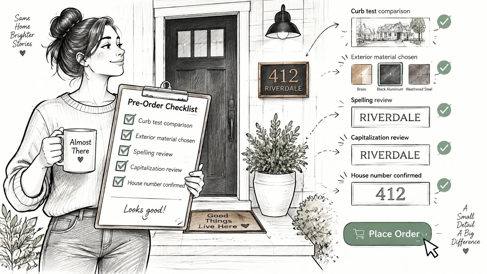
- Proof the text character by character. Spelling, capitalization, punctuation, and the house number print exactly as entered, including any date or monogram.
- Check the number against your address once more. Transposed digits are easy to miss in a preview and expensive to fix after the plaque is cut.
- Confirm the variant in the cart matches the sample or proof you approved. Color names can look different on screen.
- Choose a delivery address where someone can receive the parcel and inspect the face before install.
- Confirm what the listing includes for mounting. Anchors and stand-offs vary by wall, and a missing bracket is easier to solve before the box arrives.
One option that fits this sequence is the Personalized Family Name Address Metal Sign, Custom Monogram House Number Sign. It is laser cut from mild steel and powder coated for indoor or outdoor display. The listing shows it in stock at $46.95, with several size and color variants. A layout like a surname, a center initial, and a bottom line such as "128 Country Lane" can work when the number stays large enough for your distance. If your plan calls for address-only type, keep the name line out of the layout.
If the text, the variant, or the mount still feels uncertain, call 888-886-1005 before you submit. Order only after the proof matches your address and the delivery details are correct.
Farmhouse World makes custom metal address and family-name plaques for porches, gates, barns, and entry walls. If you are ready to match a face to your distance, your light, and your mount, visit Farmhouse World and start with the size you already measured.


