

You've found the perfect distressed wood sign, measured the sofa by eye, and ordered it before checking the wall. Then it arrives, looks too small above the couch, and leaves you wondering whether to add three more signs or start over. Rustic wall art works best when you treat it less like a spontaneous accessory and more like a measured part of the room.
The right piece should fit the wall, relate to the furniture, survive the room's conditions, and still make sense after your decorating style evolves. Use the following process to choose rustic wall art for your living room with fewer returns, fewer unnecessary holes, and a much calmer result.
Table of Contents
- What Counts as Rustic Wall Art Today
- Measure the Wall Before You Fall in Love With the Sign
- Choose Materials and Finishes That Actually Last
- Layouts That Work Above a Sofa, Mantel, and TV
- Personalization, Gifting, and Shopping Without Regret
- Hang It Safely Without Damaging the Wall
- Care, Styling, and When to Refresh the Look
What Counts as Rustic Wall Art Today
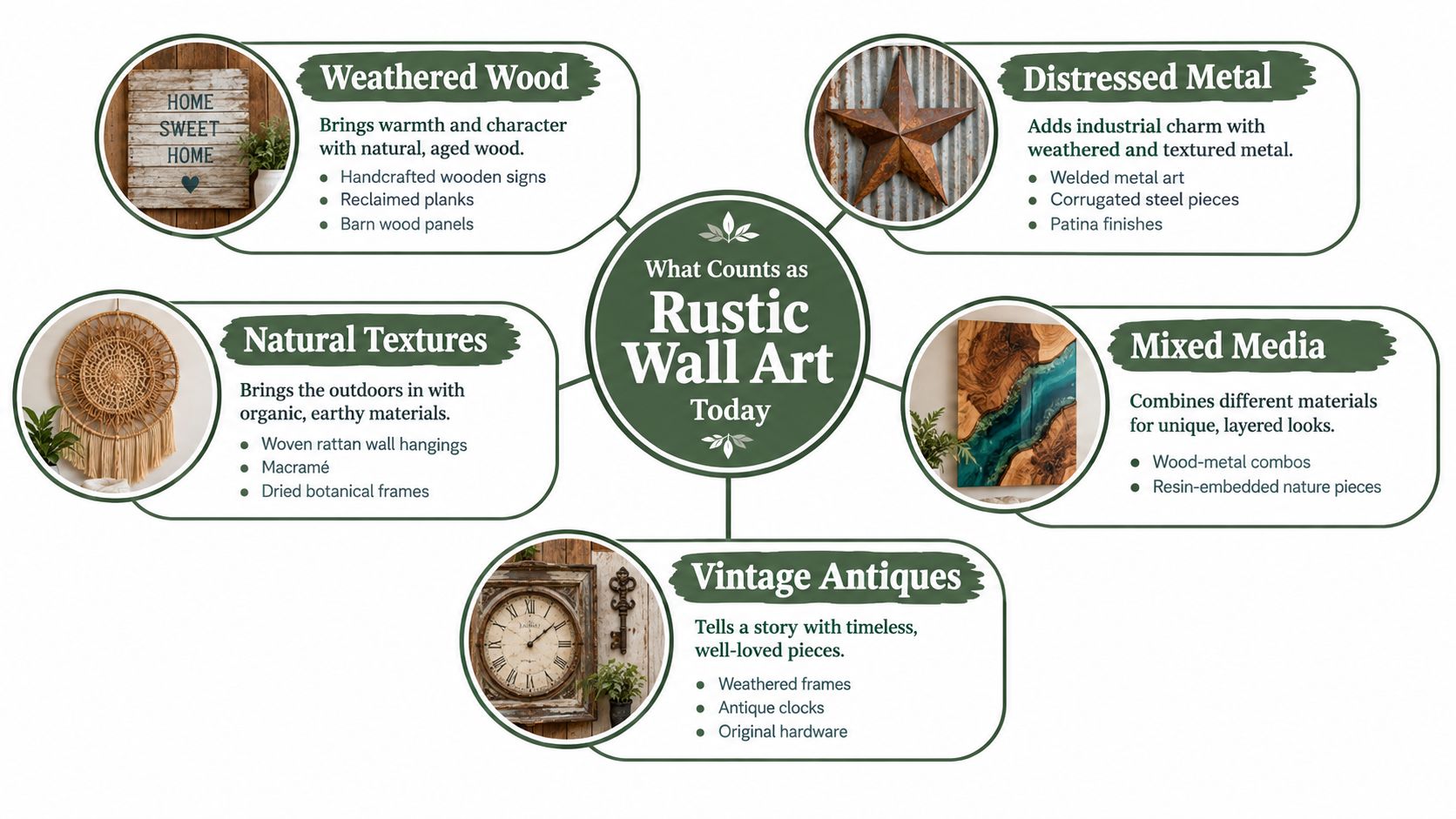
Rustic wall art is a material language, not one fixed product category. It can be a weathered wood sign, a laser-cut metal plaque, a framed scene, a cross, a botanical print, or a mixed-media piece that combines timber with metal lettering. The common thread is visible texture, natural material, aged character, or a clear connection to home and place.
Start by sorting pieces into five practical families:
- Weathered wood: Reclaimed planks, natural-grain boards, distressed paint, and handcrafted signs bring warmth and softness.
- Distressed metal: Powder-coated steel, brushed copper, patina finishes, and welded shapes add sharper outlines and darker contrast.
- Canvas and framed prints: Scenic views, botanicals, animals, and earth-tone abstracts provide rustic atmosphere without making the wall feel overly themed.
- Traditional and novelty signs: Crosses, family names, address plaques, and typography signs communicate faith, identity, humor, or hospitality.
- Mixed media: Wood backers with metal lettering, resin with natural inclusions, and layered frames combine texture with stronger visual depth.
Rustic and farmhouse are related, not interchangeable
Farmhouse style often uses rural references, practical materials, white or neutral finishes, and familiar imagery such as barns, windmills, roosters, or family phrases. Rustic style is broader. It can lean toward mountain, lodge, Western, vintage, organic modern, or minimalist interiors without using obvious farmhouse symbols.
A piece reads as rustic when its material and finish carry the character. A black metal family-name plaque with a clean silhouette can feel rustic because of its material and personalization. A distressed sign covered in slogans may read as strongly farmhouse or novelty decor, even if it uses reclaimed wood.
Finish changes the room before the wording does. Distressed white paint feels casual and bright. Deep natural grain adds weight. Brushed copper warms a dim corner, while matte black powder coating creates definition against cream walls. If you're building a restrained room, choose one strong rustic texture and let neighboring pieces stay quieter.
For more context on combining textures and proportions, review these wall art layout ideas from Slone Brothers before you shop. You can also compare the material mix in these modern rustic home decor ideas.
Measure the Wall Before You Fall in Love With the Sign
Measure the wall, sofa, and viewing position before you browse products. The wall's full width isn't always usable width. Windows, corners, lamps, door casings, shelving, and the visual edge of a fireplace all reduce the area where art can sit comfortably.
Use this quick method:
- Measure the open wall span from the left visual boundary to the right.
- Measure the sofa or console beneath it.
- Note the height from the floor to the ceiling, then mark the furniture's top edge.
- Sketch the available rectangle on paper.
- Test the art's actual dimensions inside that rectangle, including the frame and any raised hardware.
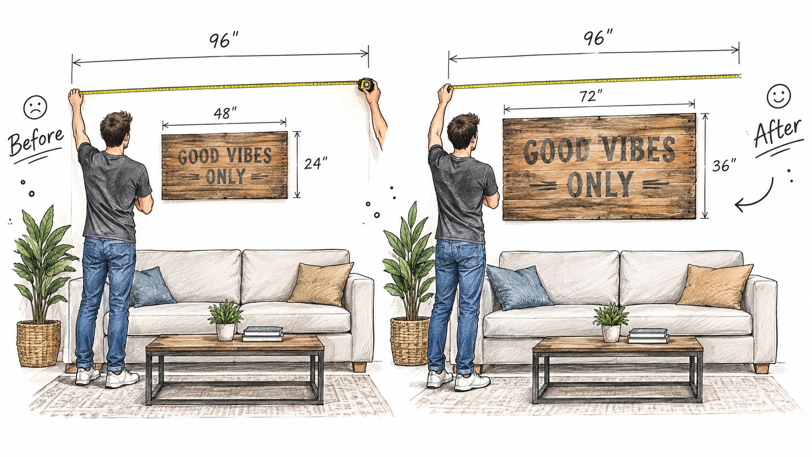
A 72-inch sofa beneath a 96-inch open wall gives you a useful working example. A single 30-inch sign would leave substantial empty space on both sides, so it may work as a deliberate quiet accent but probably won't feel like the room's main anchor. A wider focal piece, a balanced pair, or a compact grouping would relate more convincingly to the sofa.
Choose the arrangement before choosing the product
A solo sign suits a wall with one strong focal point, especially when the sign has enough width and visual weight to hold the space alone. Two related pieces work when you want symmetry without the busyness of a gallery wall. A small grouping is useful when the wall is broad, the individual pieces are intentionally modest, and the artwork shares a clear palette or subject.
Don't fill a large wall with several tiny pieces just because each one looks attractive online. Small rustic signs often have strong lettering and busy edges, so a collection can become noisy faster than a collection of quiet framed prints.
Practical rule: Tape paper rectangles at the proposed dimensions and view them from the sofa. If the paper looks weak or crowded, the finished art won't rescue the layout.
A listing's advertised size may exclude the frame, brackets, or projecting elements. Filter by the complete installed footprint, not the product title. Leave room for the composition to breathe, and keep the arrangement related to the furniture below rather than forcing every inch of wall to carry decoration.
Choose Materials and Finishes That Actually Last
Material should follow the room, not just the photograph on the product page. Wood gives you grain and warmth, canvas softens a composition, and powder-coated metal gives you crisp edges with a more durable surface. Each option solves a different styling problem.
| Material | Best For | Durability | Watch Out For |
|---|---|---|---|
| Wood | Warm focal signs and natural interiors | Depends on board quality, seal, and exposure | Direct sun, moisture, and inconsistent grain |
| Canvas | Landscapes, botanicals, and softer compositions | Generally suitable for normal indoor use | Sagging, weak stretcher bars, and color fading |
| Powder-coated metal | Personalized plaques, graphic shapes, and higher-impact accents | A resilient finish when properly applied | Sharp edges, glare, and heavy mounting requirements |
Wood works particularly well above a sofa, beside a fireplace, or in a room that already has timber furniture. Look for a stable substrate, a cleanly attached back, and a finish that doesn't feel artificially flaky. A direct-to-wood print is usually a more integrated choice than a vinyl decal placed on a board, because the image becomes part of the surface rather than sitting visibly on top of it.
Canvas belongs between wood and metal visually. It adds color and subject matter without introducing another hard edge, which makes it useful beside a dark leather sofa or a substantial metal sign. Check the frame tension, edge finishing, and whether the print is intended for indoor use.
Powder-coated steel is the practical choice when you want thin visual lines, personalization, or a piece that can tolerate a more demanding setting. It can still be damaged by harsh cleaners, abrasion, or poor storage, so avoid treating the coating as indestructible.
Read the listing like a buyer, not a browser
Before ordering, find five details:
- Substrate: Identify the actual wood, canvas, steel, or composite base.
- Finish: Look for powder coating, sealant, printed surface, or an unspecified finish.
- Room rating: Confirm whether the product is intended for indoor, covered outdoor, or exposed use.
- Hardware: Check whether brackets, wire, screws, or anchors are included.
- Origin: Review the stated country of manufacture if material traceability matters to you.
A sustainability claim should come with specifics. Ask where the material came from, how it was finished, how it was packaged, and whether the piece can be repaired or moved. A durable personalized sign may remain relevant longer than disposable seasonal decor, but the product page should give you enough information to judge that for yourself. For a closer look at natural materials and styling applications, browse this guide to wood wall art.
Layouts That Work Above a Sofa, Mantel, and TV
The museum-style starting point places the artwork's midpoint approximately 57 to 60 inches above the floor, as described in this placement guidance from Martha Stewart. In a living room, that benchmark needs adjustment because people often view the wall while seated. The sofa, mantel, television, ceiling height, and sightline matter more than a rigid number.
Treat a pair or gallery wall as one rectangle. Find the outside edges of the complete arrangement, calculate its midpoint, and center that visual unit. Don't center every sign independently if the overall grouping ends up drifting toward one side.
Use this three-layout decision shortcut
Choose one focal sign when the wall is visually simple and the piece has enough presence to stand alone. Center it over the sofa or mantel, then leave breathing room around it. This is the cleanest choice for a compact room or a rental where you want fewer holes.
Choose two pieces when you want balance without a full gallery wall. Use complementary subjects, finishes, or dimensions. Equal spacing matters more than identical artwork, and the total composition should feel connected to the furniture beneath it.
Choose a small gallery wall when the wall is broad and you already own several pieces that share a palette. Lay the arrangement on the floor first, photograph it from the sofa, and adjust the outer silhouette before you drill.
Above a mantel, center the composition on the mantel's architectural width, not necessarily the entire wall. Above a sofa, center it on the sofa unless a nearby window, corner, or built-in feature creates a stronger boundary. Leave enough separation between the furniture and artwork for the two to read as one zone rather than unrelated objects.
A TV creates a different problem. Its black rectangle already dominates the wall, so placing several dark rustic pieces beside it can make the entire zone feel heavy. Keep the surrounding art simpler, use lighter wood or canvas to soften the contrast, and avoid competing typography directly beside the screen. For additional ideas around sofa placement, see this guide to farmhouse wall decor behind the couch.
Personalization, Gifting, and Shopping Without Regret
Personalized rustic art earns its place when the wording matters. A family name, address, established date, homestead name, or meaningful location gives the wall a reason to exist beyond filling empty space. It also makes mistakes more expensive, so slow down before you approve the order.
Run this pre-order check
- Preview: Confirm that the seller provides a design preview or proof when available.
- Spelling: Compare every name, street, abbreviation, and capitalization character by character.
- Punctuation: Check whether commas, apostrophes, ampersands, and line breaks are supported.
- Proportion: Judge the lettering against the full sign shape, not only the text box.
- Returns: Read the policy for personalized products before payment.
- Timing: Allow extra production time during the holiday shopping season.
- Hardware: Verify how the finished sign mounts and whether the hardware suits your wall.
A custom metal sign is usually the strongest choice when the recipient has a settled home, a clear family name, and a decorating style you understand. Ready-made novelty signs are safer when the gift needs to ship quickly or the recipient enjoys changing seasonal displays. A digital gift card makes more sense when you don't know the correct spelling, address, preferred finish, or available wall space.

Match the product to the relationship
For yourself, buy around the room you currently have. Measure the wall, inspect the finish beside your sofa and rug, and choose wording that won't feel dated after a furniture change. A family name or address usually has more staying power than a phrase tied to a temporary trend.
For a gift, avoid guessing when the personalization affects the entire design. Ask for a photo of the intended wall, request the exact text in writing, or give the recipient control through a gift card. Farmhouse World offers custom metal signs with name, address, monogram, and design variations, along with digital gift cards for shoppers who prefer flexible selection.
Don't confuse personalization with visual complexity. A simple black or copper plaque can carry more meaning than a crowded sign with multiple fonts, icons, and decorative borders. Let the recipient's home determine the finish, scale, and amount of wording.
Hang It Safely Without Damaging the Wall
A beautiful sign is only successful if it stays where you put it. Weigh the complete assembly first, including the frame, backing, wire, brackets, and hardware. Then identify the wall substrate. Drywall, plaster, brick, concrete, and wood studs require different fixing methods.
For heavier pieces, a stud is the most dependable target. If no stud sits where you need it, choose an anchor rated specifically for your drywall thickness and installation direction. Don't treat the number printed on an anchor package as the everyday load you should place on it. One drywall anchor guide from EYBY explains that ultimate test loads should be reduced for practical service planning, and gives a conservative example in which a 265-pound tested toggle is treated as approximately 66 pounds.
Use this installation sequence
- Locate studs with a detector.
- Check for possible electrical or plumbing hazards before drilling.
- Weigh the finished artwork.
- Match the hardware to the wall substrate and thickness.
- Select a rating comfortably above the measured load.
- Install the anchor to the manufacturer's listed depth.
- Hang the piece level and check that the hardware engages fully.
- Apply a gentle downward-and-outward stability test before stepping away.
Two anchors don't automatically provide twice the capacity. Alignment, spacing, level installation, anchor engagement, and the outward pull created by a thick frame all affect performance. A dense metal sign projecting from the wall puts more strain on its fixing points than a light canvas sitting flush.
Renters need a different standard. Use removable hooks or adhesive mounting systems only within their stated weight and surface limits, and remember that textured paint, dusty walls, humidity, and repeated repositioning reduce reliability. For a large or heavy piece, choose a lighter alternative rather than forcing a renter-safe product to carry an unsuitable load.
Before drilling, compare your paper template with this detailed guide to measure and hang artwork right. Accurate placement protects both the wall and the composition.
Care, Styling, and When to Refresh the Look
Rustic finishes age differently, so care should match the material. Dust wood with a soft, dry cloth and avoid soaking unfinished boards. Canvas needs gentle surface dusting rather than wet cleaning. Powder-coated metal usually needs a soft cloth and mild, diluted cleaning solution, not abrasive pads, strong solvents, or aggressive scrubbing.
Direct sunlight can gradually change wood tone and fade printed surfaces. If the wall receives strong afternoon light, use window treatments, rotate vulnerable pieces when practical, or choose a finish designed for the room's exposure. Keep wall art away from concentrated fireplace heat and areas where condensation or humidity regularly collects.
Make the wall belong to the room
- Repeat one finish: Echo black metal in a lamp, table base, or curtain rod.
- Connect the palette: Pull a color from the art into a cushion, throw, or rug.
- Balance texture: Pair rough wood with a smoother textile or ceramic object.
- Control lighting: Use side lamps or accent lighting so the sign doesn't disappear at night.
- Edit nearby decor: Remove competing phrases, frames, or small objects that interrupt the focal piece.
Check the wall from the sofa, not only while standing beneath it. If the composition feels calm from the main seat, stop. If your eye jumps between too many signs, remove one before adding another. Rustic rooms look collected when materials repeat with restraint, not when every available surface carries a reference to farmhouse life.
Refresh the look when the room's furniture, lighting, or daily use changes. Swap a seasonal print, move a small accent, or replace a novelty sign with a personalized piece that has longer relevance. Keep the strongest material, the clearest sightline, and the artwork that still feels like your home.
Farmhouse World offers personalized metal signs, canvas prints, wood signs, crosses, frames, and related farmhouse accents for living-room walls and other spaces. Visit Farmhouse World to compare rustic materials, personalization options, and gift choices before you drill.


