

Say you're standing on your own front walk at dusk, candy bowl in one hand, phone flashlight in the other, trying to decide if that sign you love online will read from the sidewalk. From the curb it looks charming. From the porch step the letters vanish into a distressed background, and the tapered candle you set beside it is already leaning toward a dried corn shock.
That's the moment scary Halloween signs stop being a shopping problem and become a hospitality decision. You need a phrase guests can read where they stop, a finish that survives a wet October, and a spot that keeps the door, the path, and every small vampire moving safely. Size it to the stop point, tone it so it stays spooky without overwhelming kids, and keep it clear of heat and exits. The rest is styling.
Table of Contents
- Why Scary Halloween Signs Still Work
- Letter Heights That Still Read After Dark
- Materials and Finishes Built for Wind and Rain
- Porch Placement That Stays Spooky and Passable
- Three Scenes From Curb to Candy Bowl
- How to Store the Sign Until Next October
- Order the Size and Finish Together
Why Scary Halloween Signs Still Work
A visitor reaches your porch at dusk and reads the sign before she notices the pumpkins. One short warning beside the door does the work a whole yard of props tries to do, because the language is old and instantly familiar.
Halloween's scary sign tradition is rooted in a history more than 2,000 years old, traced in The Providence Journal's history of Halloween to Samhain, the ancient Celtic festival marking the end of summer and the beginning of a new year around November 1. Celtic tradition held that the boundary between the living and the dead became thinner on the night of October 31, allowing spirits to roam. Ghosts, graves, protective symbols, and ominous warnings still read at a glance for that reason. Irish and Scottish communities first carved frightening faces into turnips and other roots, and pumpkins later replaced them in North America because they were larger and easier to carve.
That recognition now fills a long decorating season. In the National Retail Federation's 2025 Halloween survey, 78% of Halloween shoppers said they expected to purchase decorations, up from 72% in 2019, and expected spending on decorations reached $4.2 billion. Treat your sign as a multi-week porch piece, then make three decisions in order. Pick the size for the guest's stop point, choose a finish for the weather on that wall, and place it so the door and path stay clear.
Letter Heights That Still Read After Dark
Start with one rule before you open a product page. Federal Highway Administration conspicuity research provides the benchmark that high-contrast lettering is generally legible with approximately 1 inch of character height for every 30 feet of viewing distance, so a sign read from 15 feet should use lettering around 0.5 inches high as a minimum starting point, with larger type preferred at night.
That number is a floor, not a target. At dusk you're competing with porch glare, moving costumes, and a child who's looking at the candy bowl, not studying your wall. If the rule says half an inch, choose three quarters. If it says one inch, choose one and a quarter. You'll never regret letters that are slightly too big on a short phrase.
Measure From Where Guests Stop
Walk out and stand where a guest pauses. Don't measure from the wall where the sign will hang. Measure from the bottom step, the bend in the front walk, or the sidewalk edge where parents wait while kids go up alone.
Say your front walk curves and parents stop about 20 feet out while a seven year old continues to the door. Your sign has two audiences. The child needs a clear, friendly spooky cue at close range. The parent needs to read that this house is participating, lit, and safe to approach. Size for the farther reader and the nearer one will be fine.
Sign size and letter height by where guests stop
| Where the guest stops | Typical distance | Minimum letter height | Practical sign size |
|---|---|---|---|
| Door or sidelight | 8 to 15 ft | 0.5 in | 12 in |
| Front walk | about 20 ft | 0.75 in | 24 in |
| Porch steps | about 30 ft | 1 in | 18 in |
| Sidewalk or driveway | 40 to 60 ft | 1.3 to 2 in | 30 to 36 in |
Circle your row before you look at finishes. A sidelight at close range can carry a 12 inch sign if the phrase stays short. A sidewalk read needs a 30 to 36 inch sign, and no amount of distressing or orange paint will rescue small letters at that distance.
Sizing rule: If you have to squint in daylight from the stop point, nobody will read it after dark in a costume.
Contrast Does the Night Work
Use a dark matte background with light lettering and reserve the strongest contrast for the main warning. Keep generous space around a skull, ghost, or bat silhouette so the picture doesn't crowd the words. A large pictorial element helps from far away, but only if it sits beside the phrase, not behind it.
Keep distressed texture in the border. When whitewash streaks, faux cracks, or splatter run directly behind critical words, they break up letter shapes and force the eye to work. On a farmhouse porch that texture belongs on the frame, where it reads as rustic without costing legibility.
- Keep it to one line: Enter If You Dare beats a paragraph every time.
- Put light beside it: Reflective or indirectly lit letters read without an exposed flame.
- Let the phrase scare: Don't rely on darkness itself to create the mood.
Test it. Tape a paper mockup at full size, turn on the porch light you will use, and walk to your stop point after sunset. If you can read it in two seconds without stopping, you've sized it right.
Materials and Finishes Built for Wind and Rain
Four sign bodies show up again and again, and they don't belong in the same places. Scan the comparison first, then match the material to the weather that wall gets, not the weather you hope for.
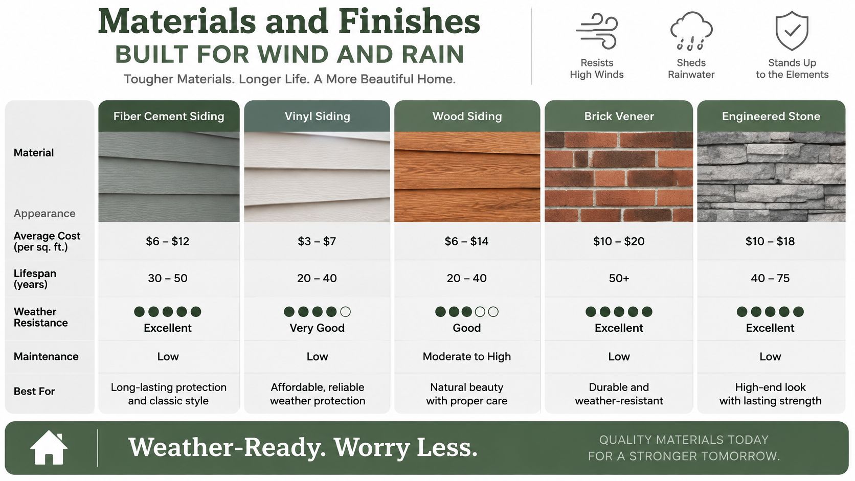
Which sign body belongs where
| Material | Weather | Typical finish | Best spot | Watch-out |
|---|---|---|---|---|
| Powder-coated mild steel | Full outdoor season | Matte black, copper, gold, silver, white | Porch wall, fence, yard | Cut edges rust if the coat chips; hardware often separate |
| Wood box sign | Covered porch only | Whitewash with ink lettering | Entry or mantel | Grain varies; vinyl lettering peels |
| UV-printed MDF | Indoor or deep cover | Printed face | Party table, interior wall | Edges swell if rain hits them |
| Foam or thin plastic | One season outside | Painted prop colors | Temporary yard stake | Fades, cracks, and blows away |
Coated Metal for Exposed Walls
Powder-coated mild steel is the outdoor default. It holds a short custom phrase, takes matte black, copper, gold, silver, or white, and shrugs off a wet October if the coating stays intact and the edges are smooth. Bare or thinly painted steel will flash rust first at cut letters, where the finish is thinnest and water sits longest.
Check a new piece by running a fingertip lightly along the cut edge. You want a sealed, even coat, not a sharp burr with bright metal showing. Our guide on how to protect metal from rust walks through touch-ups if a chip does appear.
Wood and MDF Under Cover
A wood box sign with a rustic frame suits a covered entry. Ink printed into the face lasts better than a vinyl sticker, which lifts at the corners in sun and cold. No two pieces match exactly because grain and whitewash vary, and that variation is the farmhouse charm, as long as it stays out of direct rain.
Keep UV-printed MDF inside or under a deep porch roof. You'll see it in slim panels and small squares meant for shelves and party tables. Once a wet edge swells, it doesn't shrink back flat. Foam and thin plastic yard stakes are one-season props. They're light and cheap, and they're the first thing a gust takes across the neighbor's lawn.
Exposed wall or yard gets coated metal. Covered door gets wood. Tabletop gets a small box sign.
Wording That Fits the Body
Personalization should stay short. A family name, a house number, or one warning line works. In metal lettering, hyphens often drop out, so use a period or a slash instead, preview the exact text, and skip emojis. Keep any phrase under about six words so letters stay large enough for your stop point, whether you choose Enter If You Dare, Ghosts Welcome Inside, or Wipe Your Feet, Spirits.
Finish matters after dark, too. A matte dark coat with pale letters wins at night. Gloss and metallic finishes look rich by day but can glare under a porch light, so aim that light beside the sign rather than straight at its face. Confirm mounting hardware before you order, because it's often sold separately.
Porch Placement That Stays Spooky and Passable
Say a family reaches your porch at dusk with a child on one side and a bowl of candy in hand. A sign should catch their eye at the place they naturally pause, while leaving the door, steps, and walking lane clear.
Set the sign's visual center near 57 to 60 inches for standing adults, or a little lower when children are the main audience. Keep it clear of the door's swing. A sign on an outward-opening door can swing toward a visitor.
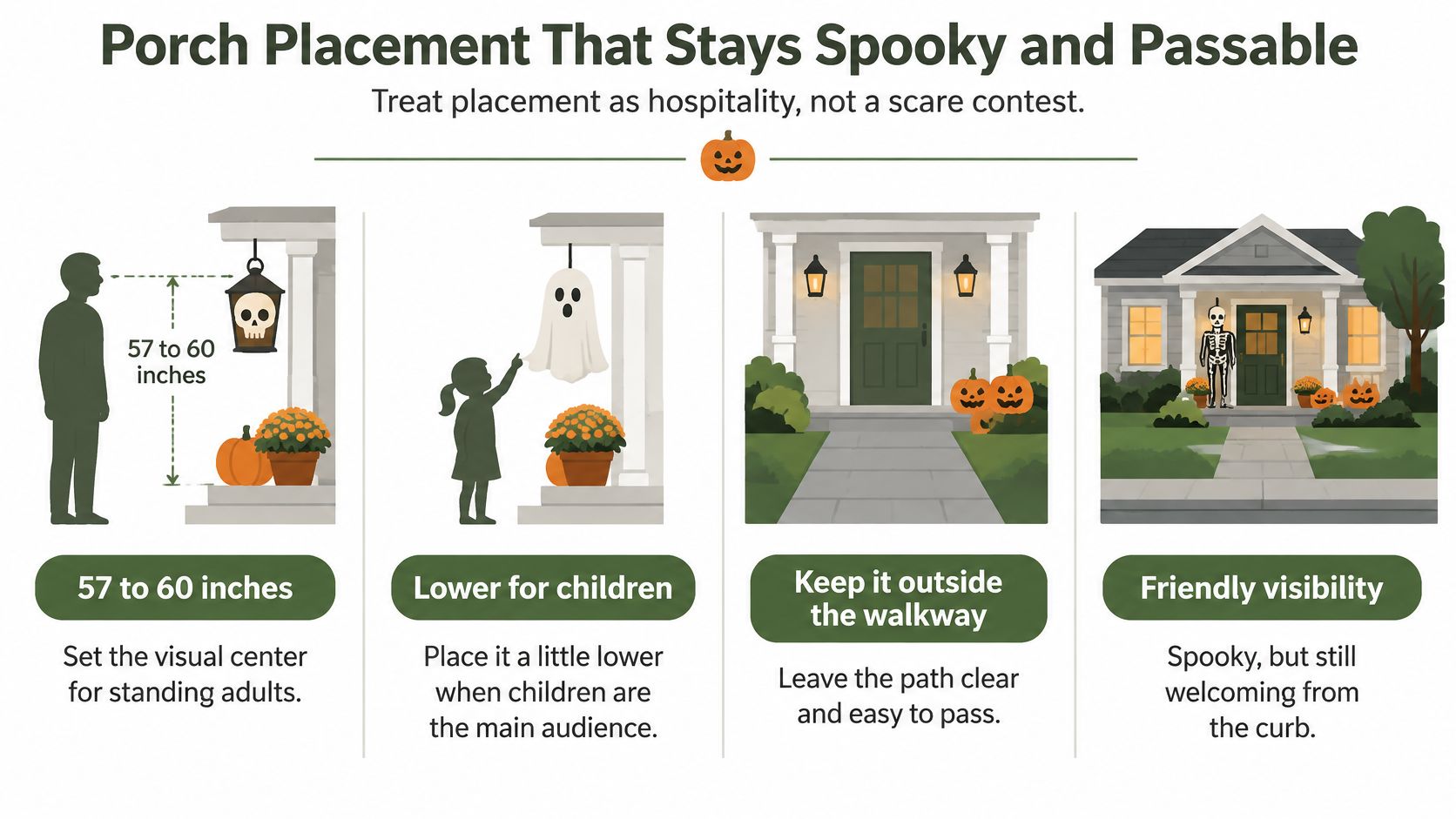
Keep the Walking Lane Open
Give wheelchair users and trick-or-treaters a clear, lit route to the candy bowl. Keep foam gravestones, extension cords, and corn shocks out of the lane, and leave the steps free of pumpkins. If you're rearranging the whole approach, ai front yard design can help you preview the layout before moving planters.
Secure the sign with screws into a stud, exterior-rated anchors, or magnetic hardware made for metal signs on a metal door. For ideas on arranging the wall, browse porch wall decor ideas. Keep the exit easy to spot from inside.
Keep Heat Away From Decor
Keep signs and nearby decorations away from candles, heaters, open flames, and hot incandescent bulbs. The Illinois State Fire Marshal's Halloween safety guidance reports an average of 832 U.S. home structure fires per year from 2019 to 2023 in which decorations were the first material ignited, causing approximately 3 civilian deaths, 28 injuries, and $17 million in direct property damage annually. The guidance also reports that nearly 47% of those fires began because decorations were too close to a heat source, while candles initiated about 33%.
Choose battery-operated or LED lighting, check cords for fraying or heat, and keep dried cornstalks and crepe paper away from the sign. Mount it on a surface where heat and flame won't reach it.
- Swap the flame: Use a cool LED lantern for a soft glow.
- Check the cord: Replace sets with cracked insulation or cords that feel warm.
- Clear the cluster: Leave flammable accents out of the sign's immediate frame.
Keep the walking path at least three feet wide, even on Halloween night.
A Quieter Kind of Scary
For a sensory-considerate route, skip strobes, sudden motion, and loud audio. A high-contrast phrase and a still silhouette give younger or sensory-sensitive children a spooky scene they can approach at their own pace.
At dusk, read the sign from the sidewalk, then walk the route with the lights on and your hands full. If a cord catches your foot, a step edge disappears, or the doorbell is hard to find, adjust the setup before guests arrive.
Three Scenes From Curb to Candy Bowl
Say a family is approaching from the sidewalk, another is already at the door, and the candy bowl waits inside. Give each group a sign sized for where they stop, with a spooky tone that welcomes kids rather than overwhelming them.
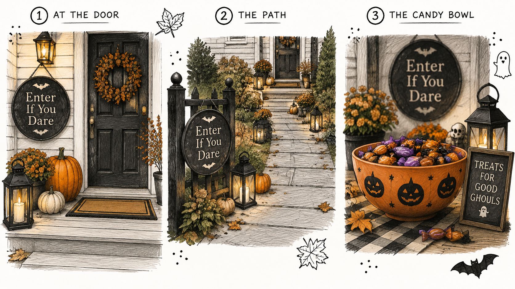
The Farmhouse Porch
Beside the door, hang an 18 inch matte black metal sign with pale Enter If You Dare lettering, clear of the door swing and walking path. Set two real pumpkins below it and place a cool LED lantern to the side, angled so its light grazes the letters.
Repeat black and cream in a porch textile for a pulled-together look. Keep the phrase visible from the step, where guests pause before knocking.
The Sidewalk Read
For guests coming from the curb, mount a 24 or 30 inch sign on a fence or porch post facing the street. Pair one large ghost silhouette with a three-word line. The silhouette catches the eye first; the words come into focus as guests approach.
Keep yard decorations below the sign so they do not compete at eye level. Repeat a copper finish on a lantern or planter rim, then echo the sign's black and cream palette in a porch textile. For a coordinated handmade accent, spooky quilt precuts for sewing can carry those colors into the fabric. Leave an inflatable out of the sign's sightline. Its movement and glow can pull attention from the message.
The Party Table
At the candy bowl, set a small wood box sign with its saying printed in ink. Guests read it at arm's length, so a short phrase suits the spot. It marks the bowl as open without adding another large display.
Choose the sign for each guest's stopping point, then keep the route to the door clear.
How to Store the Sign Until Next October
Take the sign down well and next September starts with hanging, not repairing. Work through these steps in order on a dry day.
- Clean it dry-ish: Wipe powder-coated metal with a damp cloth, then dry it completely. Don't soak wood or MDF, since water in the edges causes the swelling you're trying to prevent.
- Inspect the cut edges: Touch up chips on metal before rust starts in storage, and let any touch-up cure fully before you pack the piece away.
- Sleeve it in cloth or paper: A breathable sleeve protects the face without trapping moisture the way tight plastic can. Store metal flat or upright where other decor can't bend the letters.
- Keep wood off damp floors: Store box signs indoors, raised off a garage floor, and don't stack heavy bins on the frame ledge, which can crack or bow.
- Separate the lights: Coil LED cords on their own, discard frayed sets instead of packing them for next year, and take batteries out of every prop.
- Label the sleeve: Write the phrase and size on the outside so next year's plan doesn't start with unwrapping three similar signs on the porch.
A coated metal sign can live outdoors for the season, but it shouldn't spend the other eleven months in weather. Sun, freeze, and standing water shorten any finish, and storage indoors costs you one flat spot on a shelf.
Hang it again in September, before the early October rush, and redo the dusk check. Shrubs grow, porch bulbs change, and last year's clear path may now hold a new planter. Two minutes from the sidewalk confirms the letters still read and the route still works.
Order the Size and Finish Together
Say a café owner wants a Halloween sign beside the candy bowl. A small sign suits guests who stop at the counter; a larger one can greet people from the sidewalk. Choose the size for that viewing distance, then match the finish to the sheltered or exposed spot.
For a personalized design, check the listing for current production and shipping details. The Personalized Classic Tractor Metal Sign is one example of a customizable metal sign. Review the displayed text carefully before ordering, and confirm mounting details in the listing so you can plan how to hang it safely.
Spell out the exact wording in the preview, and check punctuation and character options before placing the order. The same care helps when ordering custom name decals for car windows: read the design details closely, then choose a placement that suits the surface.
For more sizing and color choices, explore the Farmhouse World metal sign collection. Personalized Chicken Coop Sign Rounds come in sizes 12, 15, 18, 24, 30 and 36, with colors including Black, Copper, Gold, White, and Silver. Farmhouse World sells custom metal signs, rustic home accents, and personalized gifts.
Measure the guest's stopping point, choose a finish suited to the spot, and keep the sign clear of heat, exits, and the walking path. Browse Farmhouse World for a sign that fits the porch and the welcome you want to offer.


