

You've found a weathered frame you like, but you're not sure what belongs beside it. A botanical print seems right, an iron sign might work, and suddenly your shopping list looks more like a country gift shop than the calm room you wanted.
French country wall decor works best as a relationship between palette, material, and light, not a collection of rustic objects. Once you understand those relationships, you can bring the style into a modern kitchen, a small bathroom, or a rental without making the room feel staged.
Table of Contents
- What Makes Wall Decor Read as French Country
- Color Palettes That Anchor the Look
- Materials, Durability and Buying Checks
- Wall Layouts and Lighting That Show the Finish
- Farmhouse, Coastal and Modern Variations
- Plan One Focal Wall Before You Buy More
What Makes Wall Decor Read as French Country
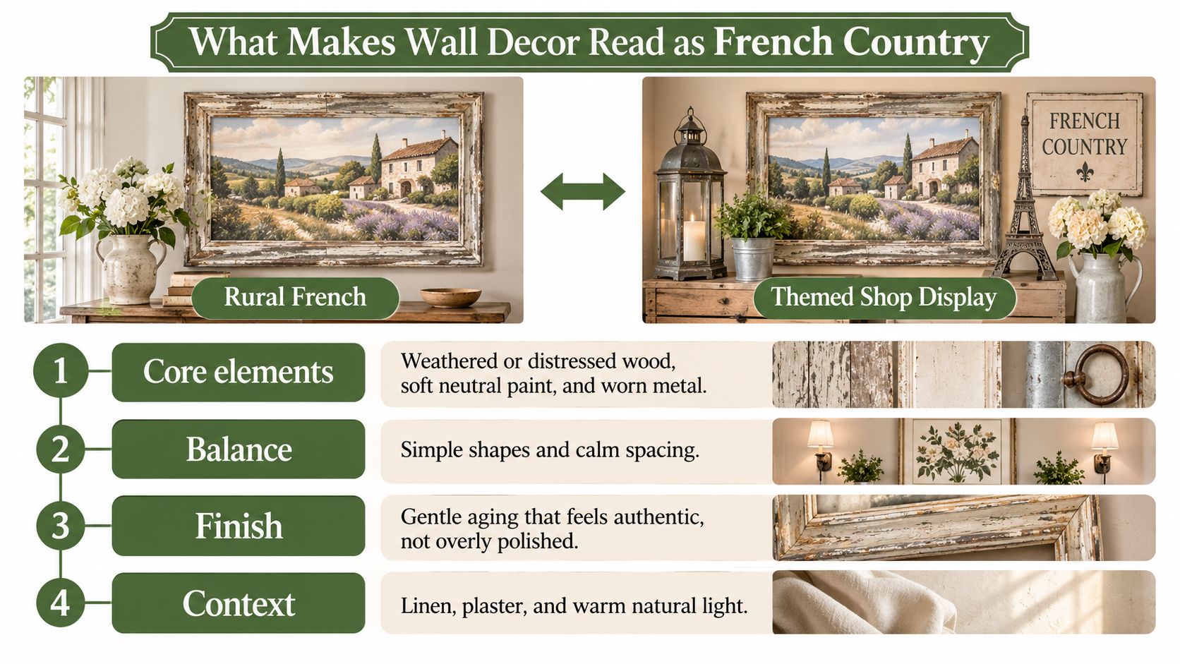
Hang the same worn frame on different walls and it can tell different stories. Against warm plaster, beside linen curtains, it feels rural French. Surrounded by bright slogan signs and heavily distressed accessories, it starts to resemble a themed shop display.
The difference is context and hierarchy. You don't need every recognizable French country motif. You need a clear order of importance.
Start with the strongest signals
Choose the main elements before adding decorative details:
- Core elements: Weathered wood, botanical or pastoral imagery, muted finishes, and restrained iron accents establish the character.
- Supporting elements: Symmetrical plaques, classical motifs on rustic surfaces, and worn ornamental frames add refinement.
- Elements to leave out: Glossy finishes, bright slogan signs, and complete matching assortments can make the wall feel packaged rather than personal.
A matching pair of frames can be useful. The problem is buying an entire coordinated scene, then displaying every piece together without considering the room.
Use this hierarchy to assess the whole setting, not just the object.
Why rustic pieces carry refined details
French country's roots help explain that balance. As described in Visual Arts Cork's history of French furniture, French Provincial design developed during the 17th and 18th centuries, adapting metropolitan styles for practical rural homes in Provence, Normandy, the Loire Valley, and Bordeaux. Local materials and everyday usefulness mattered more than courtly display.
Oak, beech, walnut, and fruitwood provided substance. Wrought iron, floral carving, and scalloped edges supplied decoration without requiring a room full of elaborate furnishings.
One decorative chronology in Westland London's guide to antique French furniture places Louis XIV at 1661–1700, Louis XV at 1730–1760, and Louis XVI at 1760–1789. The shift from curving Rocaille forms toward symmetry and straighter lines helps explain why country pieces can combine graceful ornament with simple structure.
You don't need to identify a historical period when shopping. Look instead for that useful tension: a plain wooden surface with a delicate botanical image, or an ornate frame whose softened finish keeps it informal.
Think of a worn linen jacket rather than a costume. The shape is considered, but nothing looks too precious to use.
Before choosing a piece, ask whether it could look collected over time. If it needs its matching accessories to make sense, it may be too dependent on a theme.
Color Palettes That Anchor the Look
Use a low-saturation field with a moderate-contrast accent. The field is the broad area your eye reads first, such as the painted wall, a print's background, or a large pale panel. The accent is the smaller, darker or richer detail that gives you somewhere to look.
Low saturation means softened color, not necessarily beige. Sage, dusty blue, and muted lavender can all feel restrained when they lack the intensity of their brighter counterparts.
Interior-environment findings discussed in the Journal of Architectural Research and Design identify lightness, saturation, and contrast as variables affecting perceived openness, complexity, and comfort. Lighter values can support a more open impression, while stronger saturation increases visual complexity.
Choose the background before the accent
Start with the largest surface. In a compact entryway, a cream wall and a pale botanical background leave room for a dark iron detail without making the arrangement feel heavy. In a dining room with substantial wooden furniture, sage or softened ochre can connect the artwork to the furnishings without matching their brown tones.
These palettes are starting points, not fixed room assignments.
French country palettes, base tones and best rooms
| Palette | Base tones | Accent | Best room |
|---|---|---|---|
| Cream and warm white | Cream, warm white, linen | Dark iron or charcoal lettering | Living room, entryway |
| Pale blue | Pale blue, warm white | Aged gold or cream frame | Bedroom, coastal-leaning spaces |
| Sage and ochre | Sage, softened ochre, cream | Walnut-brown wood frame | Dining room, kitchen |
| Muted lavender | Muted lavender, grey-green | Natural wood or iron silhouette | Bedroom, reading corner |
Look at the table horizontally. The accent should sharpen the base tones, not introduce a separate color story. A walnut frame around a sage botanical feels connected because both belong to an earthy palette.
Give contrast a specific job
Contrast is useful when it establishes a focal point. It becomes distracting when every sign, frame, and print demands equal attention.
Say your kitchen already has dark cabinet handles and a black range. You may not need another dark border around every picture. A pale print with a modest wood frame can relate to the room without repeating its strongest contrast.
Likewise, avoid combining vivid lavender, strong yellow, bright blue, and heavily weathered brown just because each appears in French-inspired decor. Together, they can compete with the textures you want to notice.
Practical rule: Choose a quiet foundational piece, then add an accent that helps you see it more clearly.
Lay prospective purchases beside a sample of your wall paint and a photograph of nearby furniture. Judge the background color as carefully as the image itself. Choose a palette for your next purchase before adding another decorative color.
Materials, Durability and Buying Checks
Solid wood has grain that runs through the board; a printed wood effect reproduces grain on the surface of another material. Whitewash can leave natural wood grain visible, while powder-coated metal has a painted surface. An aged-metal look may come from color alone, so check whether the finish is actual patina or just an effect.
Match the material to the room
A material's appearance is only part of its suitability. In a dry hallway, paper prints and wood frames may work well. In a bathroom, moisture and condensation can shorten the life of a piece, much as steam can cloud a mirror.
Wall decor materials compared for French country use
| Material | Look it gives | Durability and repair | Care |
|---|---|---|---|
| Solid wood, distressed or whitewashed | Visible grain, weathered edges | Can move or warp with humidity; often refinishable | Dust; keep away from steam and splashes |
| Engineered wood with printed grain | Consistent wood effect, often at lower cost | Weight depends on construction; printed grain can't be sanded back like solid wood | Use a dry cloth; protect edges from moisture |
| Powder-coated steel or iron | Crisp silhouettes or aged-metal effects | Strong; coating helps resist corrosion while intact | Dust; address chips with a compatible coating |
| Aluminum or metal sign | Matte or enamel-like appearance | Aluminum is relatively light; outdoor suitability depends on the finish and hardware | Use mild soap and water where the finish permits; dry afterward |
| Stretched canvas print | Soft, painterly botanicals | Lightweight; canvas tension may loosen over time | Dust gently; avoid direct sun and damp locations |
| Paper print in wood frame | Vintage botanical, map, or pastoral image | Glazing offers protection; frame and backing can be replaced | Keep out of direct light and away from condensation |
For a steamy bathroom, choose a finish described as suitable for moisture, and keep decor outside splash zones. Coating damage, exposed fixings, and trapped condensation can all affect metal.
Studio Contour's guide to room-by-room material choices can help you coordinate wall decor with cabinetry, flooring, and worktops. For a single wall, wood and iron can balance one another: wood adds visible variation, while metal provides a cleaner outline. The guide to wood and metal wall decor explores this pairing.
Vintage-looking isn't automatically sustainable
An artificially aged finish says little about sourcing, production, or how long an object will last. A newly made piece still uses materials and requires processing, even when its surface looks old.
A consumer sustainability study published by the University of Urbino reports that 52% of surveyed consumers considered sustainability somewhat or very important for home products. Price, durability, quality, availability, and limited information were among the barriers they identified. Clear material descriptions and repair options can help you judge a purchase beyond its appearance.
For a rental or secondhand piece, focus on two checks:
- Check repairability: Look for a replaceable frame or backing, and consider whether scratches or chips can be touched up.
- Inspect condition and hanging points: For secondhand decor, examine frame joints, corrosion, backing, and fixings. For a rental, compare the piece's weight with the hanging system's rating and the wall surface.
A repairable or easily rehung piece can remain useful even as your room or living situation changes.
Wall Layouts and Lighting That Show the Finish
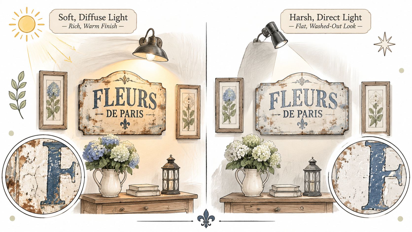
Lighting can make a distressed surface look rich, flat, or excessively rough. Before moving the artwork, check whether the light is causing the problem.
A National Institute of Standards and Technology study found that the amount and distribution of illumination affected impressions including apparent room size and friendliness. Under the tested conditions, illuminance influenced subjective room impressions more strongly than correlated color temperature.
The comparison below illustrates why the direction and spread of light deserve attention.
Let light reveal rather than dramatize
Diffuse daylight or broad wall-washer illumination is a useful starting point for wood grain, matte paint, and worn metal. A narrow spotlight can produce glare on glazing and deep shadows around distressed edges.
Grazing light, directed close along a surface, is better reserved for texture you deliberately want to emphasize, such as relief work or textured plaster. It can make incidental dents look more prominent than intended.
Move a table lamp temporarily or observe the wall with curtains open and closed before deciding to replace a finish. Sometimes the artwork is right and the lighting arrangement needs adjustment.
Choose a layout with a clear anchor
Treat the whole arrangement as a shape. Its relationship to the console, window, or seating below matters more than whether each picture sits in isolation at an ideal position.
Wall layout patterns for French country decor
| Layout | Best wall | Spacing rule | Main risk |
|---|---|---|---|
| Large focal piece over a console | Broad wall with clear furniture below | Keep a visible gap above the console; relate the artwork's width to the furniture | An undersized piece appears disconnected |
| Symmetrical pair flanking a window or mirror | Wall with a central feature | Match dimensions and leave equal gaps beside the feature | Unequal placement weakens the symmetry |
| Gallery grid of matching frames | Long hallway or suitable stair wall | Keep gaps consistent and align the outer edges | Identical imagery can feel impersonal |
| Asymmetrical cluster around an anchor | Kitchen or living room feature wall | Position the largest piece first; keep smaller pieces visually connected | Too many unrelated outlines create clutter |
For a grid, matching frames needn't mean identical subjects. Related botanical studies can share a frame finish while retaining individual character. The guide to farmhouse picture frames can help you compare frame approaches without defaulting to an entire matching display.
Use this video as an additional visual reference while considering your arrangement.
In a dining area, judge the wall from a seated position as well as the doorway. Critelli Furniture's guidance on choosing comfortable stools and dining chairs is a useful companion when furniture selection and sightlines are being planned together.
Trace the frames onto paper and tape the templates to the wall before making holes. Place the visual center near a comfortable viewing height, adjusting for furniture and the way people use the room. Finally, inspect the proposed arrangement in daylight and under warm-white evening light before committing.
Farmhouse, Coastal and Modern Variations
Where does French country stop and farmhouse begin? The boundary isn't a single object. It's the balance between utility and ornament, and how much visual weight you give each.
Farmhouse generally emphasizes painted wood, practical references, dark metal, and bolder lettering. To move a French country wall in that direction, reduce delicate florals and curved ornament rather than adding every barn-related motif you can find.
Coastal uses paler blues, warm whites, and driftwood-like finishes. Keep the provincial character through a graceful frame or botanical image; rope and nautical symbols aren't required.
Modern French country retains romance but reduces the number of decorative gestures. A botanical focal piece, a restrained vintage accent, and warm metal can be enough.
Compare the details, not just the labels
French country variations by style
| Style | Palette | Motifs | Metal and frame finish | Best room |
|---|---|---|---|---|
| Farmhouse | Painted white, browns, barn tones | Chunky block lettering, barn tools; little floral or curved ornament | Dark matte metal | Kitchen, mudroom |
| Coastal | Pale blue, warm white, driftwood | Rope, driftwood, romantic provincial edges | Whitewashed frames | Bedroom, coastal-leaning spaces |
| Modern French country | Warm white, pale blue or muted green | Botanical focal piece with restrained vintage accents | Warm metal alongside pale blue or muted green | Kitchen, bathroom with suitable sealed metal, rental, open-plan space |
Cottagecore can lean more toward abundant, storybook domestic detail, while French country benefits from a firmer architectural framework. French Provincial describes the historical regional design tradition more specifically; French country is a broader decorating interpretation.
If you're also drawn to layered patterns and a more densely furnished country interior, compare English country home decor before choosing your direction.
Apply the style to the room you have
Interest extends beyond traditional sitting rooms: the 2025 U.S. Houzz Emerging Summer Trends Report recorded U.S. searches for French country bathrooms rising 54% year over year and modern French country kitchen rising 45%. You can adapt the look without recreating a rural house.
- Kitchen: Try a large botanical on a free wall with small iron accents nearby. Keep the arrangement separate from busy storage and cooking areas.
- Bathroom: Use a moisture-suitable sealed metal piece away from direct spray. Let its outline supply ornament when the room has little spare wall space.
- Rental: Choose portable framed artwork and approved hanging methods. Create character through the image and frame rather than permanent architectural additions.
- Open-plan room: Share a palette across zones, but vary the subject matter. A dining-area botanical and an entryway pastoral image can relate without repeating.
The result should feel edited, not themed. Leave enough undecorated wall for each chosen object to remain distinct.
Plan One Focal Wall Before You Buy More
Planning one wall first prevents a common mistake: buying several pieces before deciding where they will go. A measured focal wall also makes it easier to choose art that suits the room's palette and furniture.
Take a 2.4 m entry wall with a console as a working example. The console gives the arrangement a clear center, while the open wall above it provides a defined area to plan.
- Choose the arrangement. Center one main artwork above the console, then leave space around it so the wall does not feel crowded. If the entry has a door or another strong architectural feature, position the artwork where it will be noticed on arrival.
- Set the palette. Use the console and nearby finishes as your starting point. A warm, muted background can support botanical or pastoral art; a deeper painted wall can make a lighter frame stand out. To consider richer options, explore rich feature wall colours and compare a physical sample with the artwork.
- Map the available space. Measure the wall above the console, then mark the proposed artwork's outline on paper. This makes the relationship between the art, furniture and surrounding open wall easier to judge before you commit to a layout.
- Check the view. Stand at the entrance and look toward the console. Adjust the paper outline until the artwork feels visually centered within the wall area, not centered between the room's corners.
The measurements do the work here: they turn “this looks too small” or “that feels crowded” into a layout you can assess before buying. For material, finish and installation considerations, refer to the earlier buying checks; for how light affects the finish, use the guidance in the layout section.
Farmhouse World offers custom metal signs, rustic wall art and complementary home accents for country-inspired rooms. Its distressed wood wall art sign shows the natural wood grain, and each piece is crafted uniquely, so no two are identical. Browse Farmhouse World with your wall measurements and chosen palette in mind.


