

You've chosen a beautiful spot beside the front door, ordered a personalized plaque, and stepped back to admire it. Then a delivery driver slows down, checks the neighboring homes, and calls because the numbers disappear into the dark siding. A sign can look perfectly charming from the porch while remaining difficult to read from the street.
A custom address sign for house should do two jobs at once. It should help mail carriers, delivery drivers, guests, and emergency responders identify your home, then complement the architecture once it has done that practical work. The USPS addressing standard requires the recipient address to be visible and legible on the postage-bearing side of a mailpiece, which reflects a broader principle that readable addressing matters in everyday navigation too. USPS addressing standards show that this has been a long-standing postal requirement.
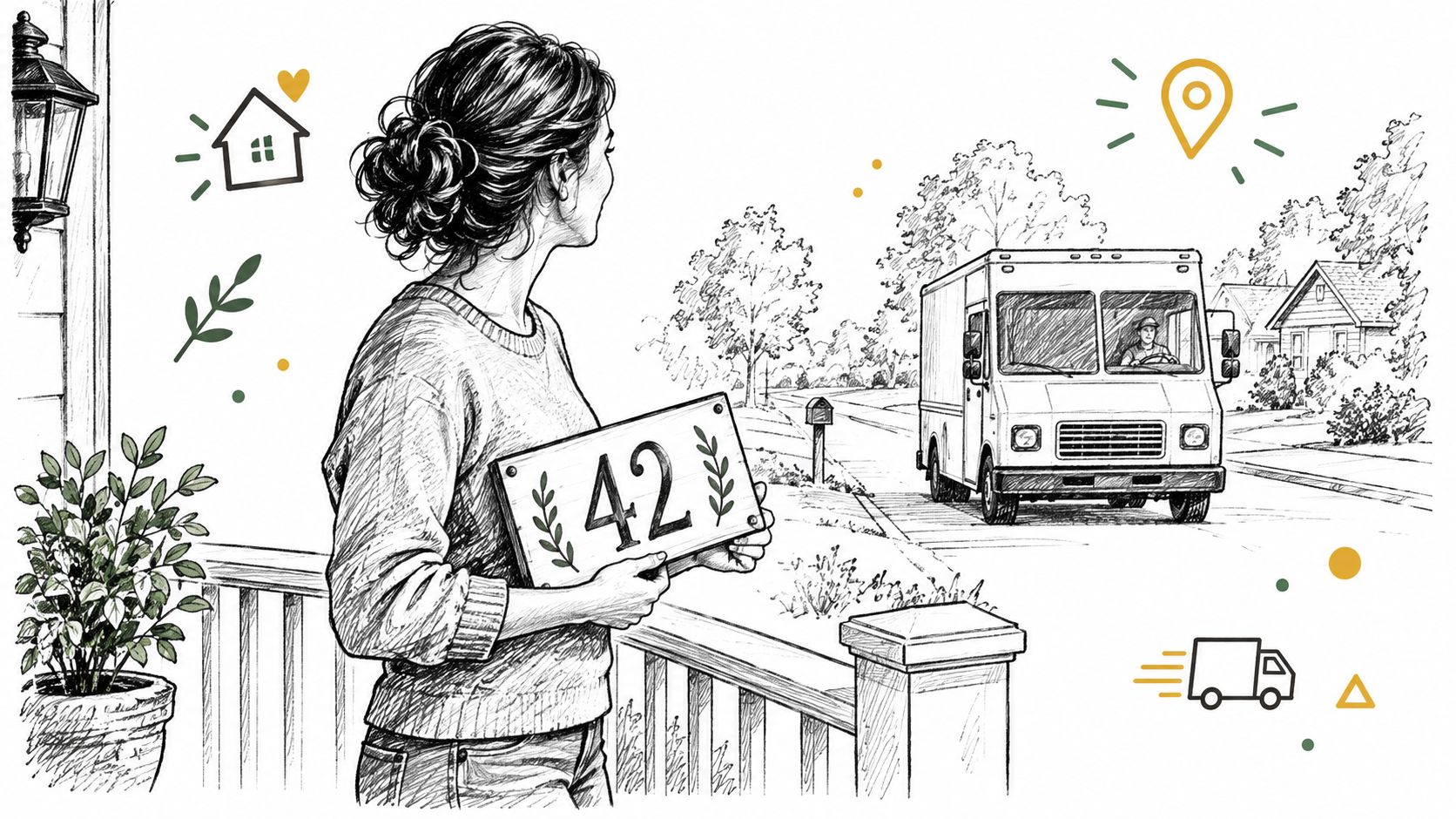
A decorative plaque with thin script may suit a cottage porch, but large, contrasting numbers serve a different purpose. If you're comparing styles, find attractive house number signs while keeping visibility at the center of the decision.
This guide builds the choice in a practical order: what the sign needs to accomplish, which materials hold up outdoors, how number height affects viewing distance, where to mount the plaque, and what to confirm before production. You'll finish with a checklist you can use before ordering from Farmhouse World or any other sign maker.
Table of Contents
- What a Custom Address Sign for House Actually Does
- Materials Finishes and Durability Compared
- Sizing Personalization and Visibility That Works From the Street
- Placement and Mounting Best Practices for Day and Night Visibility
- Ordering Proofs Shipping and What to Check Before Production
- Final Checklist and Care Tips for a Lasting Address Display
What a Custom Address Sign for House Actually Does
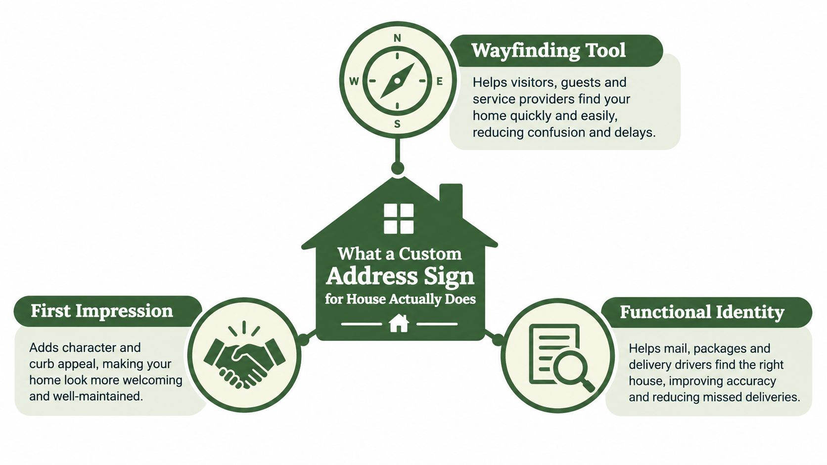
A delivery driver turns into your street near dusk and scans the homes for one clear clue. Your custom address sign for house should make that search quick, then fit the character of your property. Treat the sign like a book cover: its colors and border attract attention, while the address remains the title readers must recognize.
The first job is wayfinding. A person approaching from the road must spot the sign, identify the numbers, and connect them with the correct home. Size alone cannot do that. Clear letterforms, space around each character, and strong separation from the background work together like road markings that guide a driver.
The vocabulary that makes shopping easier
Contrast measures how clearly the numbers stand apart from the sign surface. White numbers on a dark green plaque generally read more clearly than gray numbers on weathered silver metal.
Stroke width means the thickness of each character line. Thin strokes can disappear with distance, an angled view, or weak lighting. Some residential guidance specifies minimum four-inch numbers and a minimum one-half-inch stroke width for street readability, as summarized by SmartSign's address plaque guidance.
Retroreflectivity describes a surface that sends incoming light back toward its source. Reflective material can respond to vehicle headlights. A standard painted finish depends more on daylight, porch lighting, or nearby streetlights.
Practical rule: If someone must slow down, walk closer, or use a phone flashlight to read the numbers, the sign is serving decoration before identification.
Give the street number the strongest visual position. A family name, street name, or small monogram can follow if it does not compete with the address. For a long driveway, angle the sign toward approaching vehicles instead of pointing it directly at the front door. Before choosing a style, confirm that the numbers still read clearly from the road.
Materials Finishes and Durability Compared
Outdoor signs face a combination of moisture, sunlight, temperature changes, wind, dust, and physical contact from routine cleaning. The right material depends on how exposed the sign is and how much maintenance you're willing to provide.
Aluminum is often a practical choice for a custom metal sign because it resists rust and remains relatively light for wall or post mounting. A thicker, non-rusting aluminum substrate paired with reflective film creates a useful balance between structural durability and nighttime recognition. Wood offers warmth and texture, but it needs a well-maintained exterior finish to prevent moisture from affecting the surface. Acrylic can provide crisp color and a contemporary appearance, though its performance depends heavily on the quality of the print, coating, and mounting system.
Compare the main options
| Material Finish | Best For | Durability and Visibility | Maintenance |
|---|---|---|---|
| Powder-coated aluminum | Farmhouse, rustic, and traditional exteriors | Resists rust and provides a stable base for contrasting numbers; reflective film can improve detection after dark | Wipe away dirt and inspect fasteners |
| Reflective aluminum | Long driveways, dark roads, and homes with limited lighting | Returns headlight light toward approaching drivers; visibility depends on contrast and viewing angle | Keep the surface clean and free from snow or plant growth |
| Sealed wood | Porches and homes where texture is part of the design | Warm appearance, but moisture and sun can affect the finish over time | Recoat as needed and check edges for wear |
| Acrylic or composite | Modern façades and sheltered entries | Light and visually clean; outdoor life depends on UV protection and substrate quality | Clean gently and avoid harsh abrasives |
| Painted metal without reflective film | Covered porches and well-lit entryways | Strong daytime appearance, but nighttime visibility relies on external light | Inspect paint, edges, and mounting points |
Reflective products are commonly grouped into three grades. Engineer-grade film supports basic dark-condition visibility, high-intensity film returns about three times the light of engineer grade, and diamond-grade film provides about ten times the reflectivity. These comparisons come from SmartSign's 911 sign guidance, which also notes that diamond-grade products are often rated for outdoor life of at least 12 years.
Match the finish to the setting
A shaded porch may work well with a painted aluminum plaque and a nearby light. A rural property set back from the road benefits more from reflective or illuminated numbers because drivers may have little ambient light to work with. Against red brick, a dark sign with pale numbers may provide stronger separation than a warm copper finish that repeats the brick's color.
For metal care, use a cleaning routine that suits the coating and mounting environment. Farmhouse World's guide on how to protect metal from rust offers a useful maintenance reference for outdoor metal décor.
Sizing Personalization and Visibility That Works From the Street
A sign can look generous beside your front door and still disappear from the driveway. Choose its dimensions from the distance where a driver, visitor, or delivery person must read it, then check whether contrast and placement support that size.
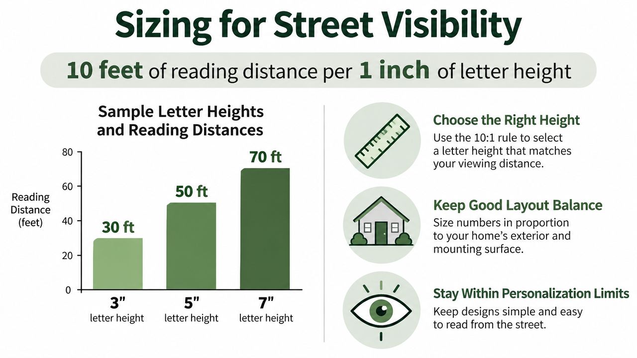
A common rule allows roughly 10 feet of reading distance for each 1 inch of letter height. Under that guideline, four-inch numbers are meant to stay readable from about 40 feet. Glare, crowded lettering, weak contrast, an obstructed view, or a low mounting position can shorten that useful range. Use the address-letter-height visibility chart to compare letter height with the distance people must cover.
Make the numbers lead
A home close to the curb may need only a moderate plaque when its numbers are bold and the background is quiet. A rural or set-back property needs a stronger signal. Increase letter size, choose clearer contrast, or select a reflective finish before adding decorative wording.
A plaque between 12 and 36 inches can produce very different layouts, and Farmhouse World offers personalized metal signs within that general range. Select the smallest sign that gives the address room to breathe while fitting the wall, post, or entry feature. The sign should function like a road label first, with personalization supporting rather than competing with identification.
Use these checks before approving the proof:
- Distance test: Print or sketch the numbers at their proposed height, then view them from the road or driveway entrance.
- Squint test: Squint from that reading position. If the address becomes one blurred shape, increase contrast or simplify the font.
- Spacing test: Check gaps between numbers, around the address line, and between the address and any family name.
- Night test: View the sign after dark with vehicle headlights or the lighting you plan to use.
A family name can add warmth, while a street name can help visitors confirm the property. Keep both visually secondary to the street number. For coordinated exterior styling, Ottawa-Gatineau curb appeal ideas can help connect the sign with fencing, planting, and entry details.
For a lit display, review the design and installation considerations in address signs that light up before choosing a solar or wired option.
Placement and Mounting Best Practices for Day and Night Visibility
A well-designed plaque can fail if a shrub hides it, the house faces away from the road, or snow covers the lower edge. Placement turns a sign from an object on the property into a visible instruction for approaching people.
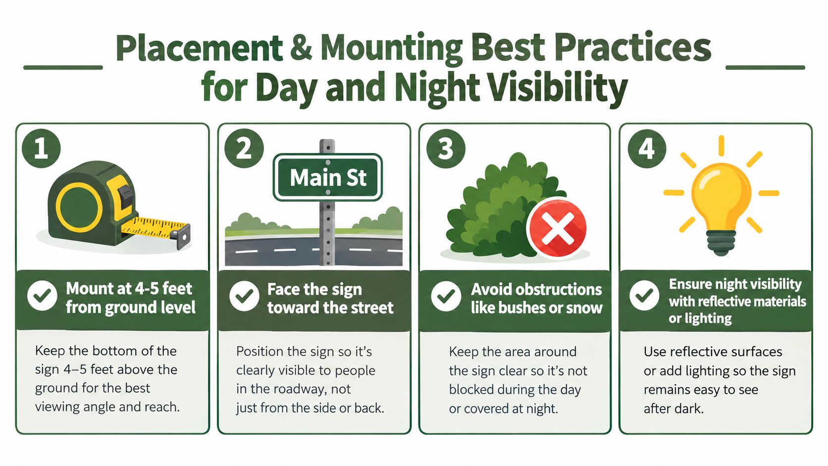
Start by standing where a driver or responder will approach. Ask a friend to walk or drive toward the home while you observe when the address becomes readable. Test both directions if vehicles can arrive from either side. The sign should face the addressed street rather than face the front door.
Choose a location people can scan
A wall beside the entry works when the entry is visible from the street. A post near the driveway may work better for a long approach, especially when the house itself sits behind trees or a bend. A mailbox-adjacent plaque can help delivery drivers, provided it doesn't get hidden by the mailbox, vegetation, snow, or roadside clutter.
Emergency-preparedness guidance commonly recommends numbers at least 3 to 4 inches tall, with some responder-focused guidance raising that to 4 inches minimum and 6 inches recommended when the home sits farther from the curb. The same municipal guide advises keeping numbers visible from the road, clear of landscaping, and reflective or illuminated at night. Review Keene's emergency responder address guidance for those placement considerations.
A practical installation check includes:
- Measure the mounting zone: Confirm the sign sits at a comfortable viewing height and doesn't disappear behind parked vehicles.
- Check the sightline: View it from the road, driveway entrance, and the most likely emergency approach.
- Inspect the night response: Use headlights to see whether reflective numbers return light clearly.
- Secure the hardware: Match screws, anchors, and brackets to wood, brick, vinyl, masonry, or a post.
A sign that faces the wrong direction can be present, attractive, and functionally invisible.
Snow deserves its own check in cold climates. Mounting near the road may improve recognition but can also expose the plaque to plowed snow. Review the location after a storm and clear the face without scratching the finish.
For sign-and-post configurations, compare the installation details in address sign and post.
A short visual demonstration can help you think through the physical setup before drilling.
Ordering Proofs Shipping and What to Check Before Production
Personalized signage rewards careful review. A spelling error, reversed number, cramped line, or unexpected color is harder to correct after production than before approval.
Begin with the physical requirements. Confirm the available wall or post width, the approximate viewing distance, the direction of approach, and whether the sign will receive direct sun, rain, snow, or vehicle spray. Then choose the material, finish, number style, and mounting method as a group rather than selecting each feature separately.
Review the proof like an installer
A digital proof is more than a preview of the artwork. It's a chance to catch practical problems before the sign becomes a physical object.
- Read every character: Check the house number, street name, family name, monogram, and punctuation letter by letter.
- Check hierarchy: Make sure the address is visually stronger than optional wording.
- Study the spacing: Look for crowded numbers, tight margins, and decorative elements touching the text.
- Compare the colors: Judge contrast against your siding, brick, stone, or fence rather than against a white screen.
- Confirm the hardware: Verify whether mounting parts are included and whether they suit your surface.
Some personalized sellers provide customer validation of designs before production on select items, a feature reflected in Farmhouse World buyer feedback. Ask what happens if the proof needs correction, and save the approved version for your records.
Shipping expectations should also be clear before checkout. Confirm the stated production timeline, dispatch information, shipping cost, tracking process, and support contact. Farmhouse World publishes a free-shipping threshold of orders over $49 and provides telephone support at 888-886-1005, so those details can help set expectations when comparing the ordering experience. The threshold and contact information come from the publisher's provided business information.
Read reviews for comments about finish, legibility, packaging, hardware, and proof accuracy. Those details matter more than a photograph taken in perfect daylight. Also check the remake, return, and damage-on-arrival policies, since personalized products may have different terms from standard décor.
Final Checklist and Care Tips for a Lasting Address Display
A reliable address display begins with a simple priority order: recognition first, decoration second. Once the numbers can be found and read, you can refine the shape, color, border, and farmhouse details.
Use this checklist before ordering:
- Viewing distance: Measure from the road, driveway entrance, or likely delivery stopping point.
- Number height: Use the roughly 10-feet-per-inch rule as a starting point, then account for contrast and obstructions.
- Letter clarity: Choose a clean font with open shapes, adequate spacing, and visible stroke width.
- Color contrast: Set the numbers clearly against the plaque and the plaque clearly against the building.
- Material: Favor non-rusting metal for exposed locations, or choose sealed wood and protected acrylic where their maintenance needs fit your routine.
- Night performance: Select reflective film or illumination when the sign sits far from the curb or the approach is dark.
- Placement: Face the addressed street and keep the sign clear of plants, parked vehicles, snow, and decorative clutter.
- Installation: Use weather-resistant hardware designed for the mounting surface.
Care doesn't need to be complicated. Wipe away dust and road grime with a soft cloth and a suitable mild cleaner. Avoid abrasive pads that can scratch lettering or reflective film. Inspect the edges, fasteners, post, and surrounding plants during seasonal maintenance.
A quick evening check is useful after installation and whenever landscaping changes. Stand at the road, approach with headlights, and confirm that the address remains distinct rather than merely visible. If the sign disappears after dark, improve the light source, clear the sightline, or upgrade the reflective finish instead of adding more decorative elements.
For a cohesive farmhouse entry, repeat one visual detail from the sign elsewhere, such as a black metal finish, warm wood tone, or simple botanical motif. Measure the mounting area, mock up the design at full scale, and approve the proof only after testing it from the street.
Farmhouse World offers personalized metal signs with customizable names, addresses, monograms, sizes, colors, and design variations for farmhouse-style homes and outdoor spaces. Visit Farmhouse World to explore address sign options, compare styles, and choose a display that makes your home easier to find.


