

You pull into a property for the first time, slow down at the entrance, and look for a sign. Sometimes you see one right away. It gives the place a name, a mood, and a sense of care before you've even parked. Other times, the sign is pretty but too small to read from the road, or it has faded enough that guests still miss the turn.
That's why personalized ranch signs matter so much. They aren't only decor. They introduce the property, help visitors find the right entrance, and carry a bit of family story at the same time.
A good ranch sign works like a handshake. It says who lives here, what kind of place this is, and whether the style leans working ranch, rustic homestead, western lodge, or modern farmhouse. If you're buying one for the first time, the tricky part is that beauty alone doesn't solve the problem. A sign can look wonderful in a product photo and still be hard to read at your gate or wrong for your climate.
Table of Contents
- Introduction to Personalized Ranch Signs and Why They Matter
- What Makes a Ranch Sign Truly Personalized
- Popular Styles and Motifs for Ranch Signs
- Choosing Materials and Finishes for Outdoor Durability
- Sizing and Placement for Gates Walls and Entrances
- Customization Options and Design Inspiration Examples
- Ordering Tips and Final Checklist Before You Buy
Introduction to Personalized Ranch Signs and Why They Matter
A ranch sign usually becomes important in a very ordinary moment. A friend is driving out at dusk. A delivery driver is trying not to miss your entrance. Family arrives for a holiday gathering and wants to feel like they're pulling into a place with a name, not just a driveway. That's when a sign stops being an extra and starts becoming part of how the property works.
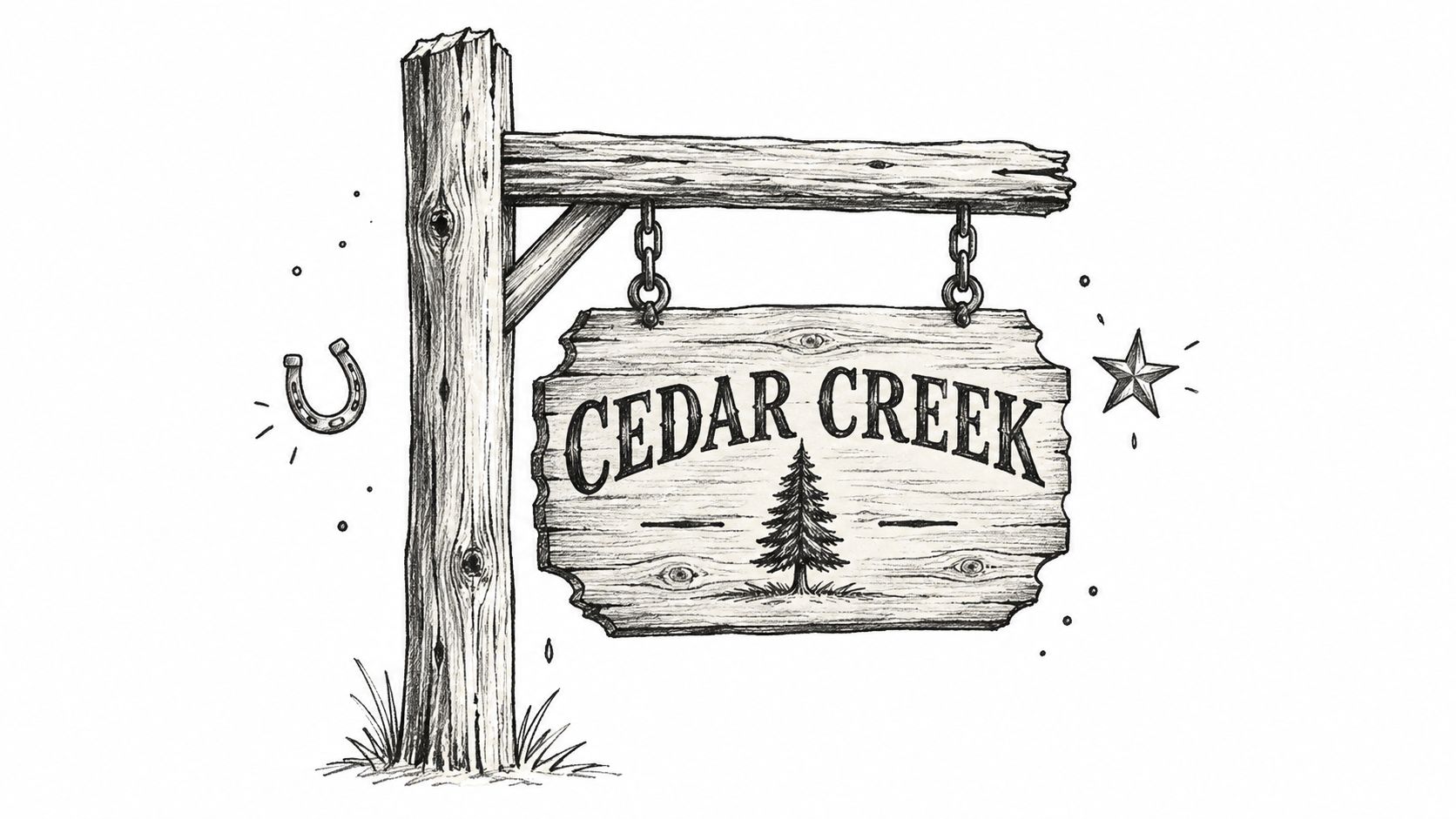
For some owners, the sign honors a family name. For others, it marks a pasture gate, a barn wall, a gravel drive, or a home tucked back from the road. Gift buyers often choose one because it feels more personal than standard wall decor. It can mark a wedding, an anniversary, a move to acreage, or the year a family started building a place of its own.
There's also a wider shift behind this interest in personalized decor. The broader personalized home decor market was estimated at US$165.4 billion in 2024 and is projected to reach US$330.6 billion by 2034, with another estimate placing the sector at US$355.4 billion by 2036, both using a 7.2% growth rate over their forecast periods, according to personalized home decor market projections. That matters because personalized ranch signs sit inside a much bigger decorating habit. Buyers want pieces that reflect identity, not just fill space.
More than a welcome sign
A ranch sign does three jobs at once:
- It marks identity. The family name, ranch name, or brand turns a property into a place with character.
- It helps with wayfinding. Guests, service providers, and deliveries can spot the entrance faster when the sign is readable.
- It adds visual balance. A sign can tie together fencing, landscaping, exterior finishes, and entry decor.
A beautiful sign that nobody can read from the road is acting like wall art, not entrance signage.
That doesn't mean every sign has to look strictly functional. It means the best ones balance personality with practical choices like size, contrast, finish, and placement. That balance is where many buyers get stuck, especially when they're choosing online.
The difference between nice and right
A sign over a porch can be more decorative because people view it up close. A sign on a gate has a different job. It has to stand out sooner, hold its shape outdoors, and stay legible in changing light.
That's where this topic gets interesting. The style you love should influence the size you order, the material you choose, and where you mount it. Otherwise, it's easy to pick a design that fits your taste but not your entrance.
What Makes a Ranch Sign Truly Personalized
Many first-time buyers think personalization just means adding a last name to a pre-made design. That's part of it, but it's not the whole story. A ranch sign feels personal when several choices work together, the way ingredients work together in a recipe.
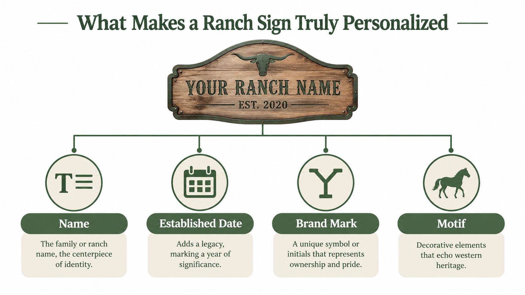
If you've ever seen a family crest, a cattle brand, or an old lodge plaque, you already understand the idea. The sign tells people something specific about who the property belongs to and what story it carries.
The four parts that create a custom feel
Most personalized ranch signs are built from four core elements:
-
The name
This is the anchor. It might be a family surname, a ranch name like Cedar Creek Ranch, or a place-based name tied to the land. The main name usually deserves the largest visual weight because it's what people remember first.
-
The established date
An “Est.” line adds a sense of heritage, even on a newer property. It might mark the year the ranch was founded, the year a family bought the land, or the year of a wedding or anniversary.
- A brand mark or monogram
The sign starts to feel owned instead of borrowed. A simple monogram can feel formal and classic. A brand-style symbol can feel rooted in ranch tradition. Initials inside a crest, circle, or shield often land somewhere in between.
-
A motif
This is the image language around the text. Longhorns, horses, pine trees, mountains, antlers, stars, scrollwork, or rope borders all change the personality of the sign.
Stock decor versus real customization
A stock western sign can still be charming, but it usually follows a fixed layout with limited editing. A custom design changes more than the text line.
Look for personalization in these areas:
- Layout choices that let the name, date, and image sit in a different order
- Font choices that change the tone from rugged to refined
- Artwork options such as horses, cattle, trees, or monograms
- Shape and border details that make the design look customized to the property
Practical rule: If you can swap only the name and nothing else, you're buying a customized template. If you can shape the text hierarchy, motif, and visual balance, you're much closer to a personalized sign.
How story shows up in the design
A ranch sign doesn't need to include every meaningful detail. It just needs to include the right ones. A working cattle operation might use a clean brand mark and a bold ranch name. A family homestead might prefer softer scrollwork, a date, and a horse silhouette. A gift sign for newlyweds might center on a shared last name and established year.
That's why random template picking often leaves buyers unsatisfied. The sign may look fine, but it doesn't feel like their place. Personalization happens when the design choices match the property's identity, not just when a seller inserts custom text.
Popular Styles and Motifs for Ranch Signs
A buyer often falls in love with a ranch sign in the first few seconds. Then comes the practical question. Will that same sign still read clearly from the road, or will the nice details disappear once it is mounted on a gate or wall?
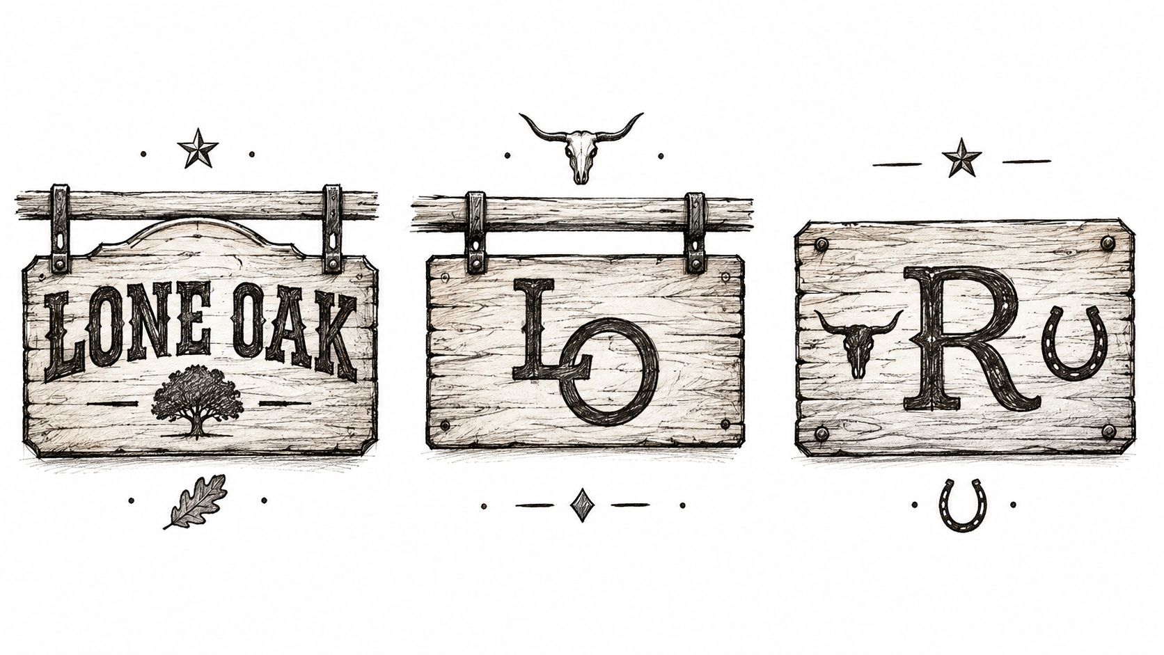
That is why style and motif should never be picked as decoration alone. A sign works like a handshake and a road marker at the same time. It needs personality, but it also needs clear lettering, enough contrast, and a finish that suits where people will see it.
Western typography versus monogram style
Western typography uses heavier, more rugged lettering with strong shapes. Those bold forms usually hold up better at a driveway entrance, on a fence, or across a wider gate because the letters stay readable from farther away. If your sign will be seen from a vehicle, this style often gives you more room for error.
Monogram-focused signs feel more formal and decorative. They shine in places where people approach on foot, such as a porch wall, courtyard entry, mudroom, or covered patio. At those closer distances, viewers can appreciate smaller details that would get lost at the roadside.
Placement should guide the style choice. A gate sign needs the visual strength of a billboard in miniature. A wall sign near the front door can act more like framed art.
Use this quick comparison:
| Style Direction | Best Fit | Watch Out For |
|---|---|---|
| Western block lettering | Driveways, gates, barn exteriors | Overly distressed fonts can reduce readability |
| Monogram-centered | Porches, patios, indoor walls | Initials can overpower the actual ranch name |
| Brand-inspired | Working ranches, simple entrances | Very thin lines may disappear at a distance |
| Rustic scrollwork | Decorative settings, gift signs | Too much ornament can crowd the text |
Motifs that shape the mood
Motifs set the tone before anyone reads a single word. They also affect how busy or clear the finished sign feels.
- Longhorns and cattle imagery suggest tradition and a strong ranch identity.
- Horse silhouettes feel equestrian and slightly softer in tone.
- Trees, mountains, and creeks connect the sign to the property itself.
- Rope borders and stars push the design toward cowboy or lodge style.
- Minimal geometric framing feels cleaner and more modern farmhouse.
The main mistake is crowding too many ideas into one piece. A horse, rope trim, stars, scrolls, and antlers may all sound meaningful, but together they can bury the ranch name. One clear motif usually reads better than several smaller ones competing for attention.
A quick video can help you see how different western sign looks come together in real materials and layouts.
Matching the sign to the property
The strongest ranch signs borrow cues from what is already on site. A cedar-sided home may pair well with warm metal tones or forest imagery. A white farmhouse with black fencing often looks sharper with higher contrast and simpler artwork. A heavy stone entry can visually support a larger, bolder sign than a narrow garden gate can.
When the sign matches the architecture and surroundings, it looks like it belongs there instead of being added later.
This is also where legibility becomes a design decision, not just a size decision. Delicate script may look beautiful on a close wall plaque, but it can fade into the background at a road entrance. Dark metal on dark wood may feel rich up close, yet lose readability in evening light. A glossy finish may brighten a sheltered sign, while glare can make a roadside sign harder to read at certain angles.
If you are torn between two directions, start with the viewing distance. Then ask what the sign needs to do there. Mark the entrance clearly, welcome guests at the house, or add character to a barn wall. Once that job is clear, the right style usually becomes much easier to choose.
Choosing Materials and Finishes for Outdoor Durability
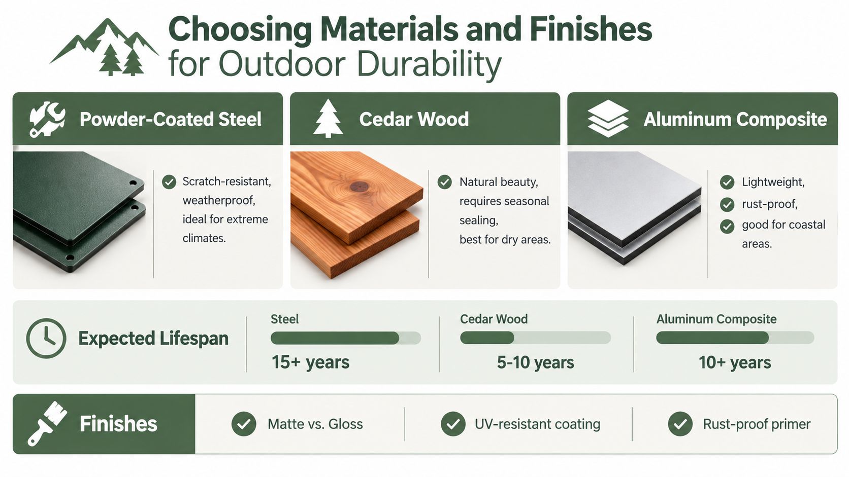
Material choice decides whether your sign stays handsome for years or starts looking tired after a rough season. Buyers often focus on color and design first, but outdoor performance depends more on substrate, finish, and where the sign will live.
One reason this matters now is that customization itself is growing at a category level. The global signage custom printing market was valued at US$1,277.5 million in 2024 and is projected to reach US$1,880.1 million by 2030, implying a 6.7% CAGR from 2025 to 2030, according to custom signage market data. For ranch sign buyers, that tells you custom signage is part of a large and expanding market, not a tiny niche. It also helps explain why you now see more finish and material options than older sign catalogs offered.
How outdoor finishes protect the sign
For metal signs, powder coating is one of the most important durability features. Industry guidance explains that powder coating creates a continuous barrier against moisture, salt, UV exposure, scratches, and chipping, and outdoor signs commonly use about 3 to 4 mils for normal exterior conditions and 4 to 6 mils for high-wear or marine conditions. Durable installations can remain serviceable for 10 to 20 years or more when the coating stays intact and the substrate is properly prepared, according to powder coating guidance for exterior signage.
That's a useful benchmark because many buyers assume “metal” by itself means weatherproof. It doesn't. Bare or poorly finished metal can still fade, chip, or corrode faster than expected.
Picking material by climate and location
Different materials suit different conditions:
- Powder-coated steel works well when you want a strong, crisp silhouette and a substantial look.
- Weather-resistant aluminum is often a smart choice where moisture and corrosion are bigger concerns.
- Wood signs bring warmth and authenticity, but they usually need more upkeep outdoors.
Recent reporting on outdoor metal signage shows rising interest in weatherproof aluminum, powder-coated steel, and UV-protected finishes because buyers are paying closer attention to fade resistance, corrosion, and maintenance in different climates, as noted in this overview of outdoor metal sign material trends.
If you're styling a barn office, tack room, or covered porch along with your entrance, looking at complementary decor can help you keep the metal finish consistent. For example, this guide to metal horse art for homes offers useful visual ideas for matching horse-themed metal pieces with rustic interiors.
What to ask before you order
Climate should drive your questions:
- Humid or coastal area: Ask how the material and finish handle moisture and salt exposure.
- High-sun region: Ask whether the finish includes UV protection and how dark colors hold up.
- Snow and freeze cycles: Ask about coating durability, edge protection, and mounting hardware.
If you're choosing a metal sign, this guide on how to protect metal from rust is a helpful reference for understanding ongoing care after installation.
A sign doesn't have to be fussy to last. It just needs the right combination of material, finish, and placement for the weather it faces.
Sizing and Placement for Gates Walls and Entrances
A sign can look perfect on a screen and still fail at the gate. The usual problem is not the artwork. It is the match between size, placement, contrast, and the distance from which someone first sees it.
A ranch sign works like a handshake from your property. At a front wall or porch, people have time to notice finer details. At a gate or driveway entrance, they need to read the name quickly, often while approaching from the road. That is why style choices cannot be separated from placement. A delicate script that feels charming on a barn wall may disappear at the entrance. A dark finish with low contrast may look rich up close and turn unreadable at a distance.
Start with viewing distance
A simple rule helps first-time buyers choose letter size with more confidence. Readability guidance often uses about 1 inch of capital letter height for every 10 feet of viewing distance, as explained in this outdoor sign thickness and readability guidance.
That does not mean every sign needs oversized text. It means the main line, usually the ranch or family name, should match the approach distance. If visitors first read the sign from the road, the main letters need more presence. If they read it while standing near a porch or entry wall, smaller lettering can still work well.
Contrast carries equal weight. Light text on a dark background, or dark text on a light background, usually reads faster than low-contrast combinations. Font choice matters too. Bold, simple letterforms hold up better at a distance than thin script or heavily decorated type.
If the ranch name cannot be read in a quick glance from the approach path, the sign is too small, too low-contrast, or too detailed for its location.
Gates and walls ask for different design decisions
Gate signs need quick clarity. Wall signs allow more detail.
A gate sign is often viewed at an angle and from farther away, so the design should be simpler. Use a larger main name, fewer secondary lines, and stronger contrast. A wall-mounted sign near a porch, courtyard, or barn entrance can support smaller details because people are closer and moving more slowly.
Use this guide as a starting point:
| Placement Location | Recommended Size Range | Best Design Approach |
|---|---|---|
| Gate or driveway entrance | 24 to 36 inches | Large main text, simple layout, high contrast |
| Fence panel near entrance | 18 to 30 inches | Keep center text open and avoid crowded motifs |
| Porch or front wall | 12 to 24 inches | Smaller scale works, with room for finer detail |
| Barn wall or shop exterior | 18 to 36 inches | Scale up to fit the wall so the sign does not look undersized |
For a fuller picture of how a sign fits into the approach to your home or ranch, these entrance decorating ideas for gates, paths, and front approaches can help you plan around lighting, planters, and fencing.
Placement changes what people actually see
Height, background, and surrounding clutter all affect legibility. A sign mounted against busy stonework, dark-stained wood, or heavy landscaping can visually disappear even if the sign itself is beautiful. A cleaner backdrop helps the lettering stand out.
Mounting height matters too. Place the sign where it meets the natural line of sight as someone approaches. Too low, and grass, vehicles, or gate rails may block part of it. Too high, and the sign becomes harder to read quickly.
This is why placement and style need to be chosen together. A black matte sign with cutout script may be a strong choice on a pale stucco wall under a porch roof. The same design at a roadside gate could call for a larger size, thicker strokes, and stronger contrast to stay readable.
Thickness and support should match the sign's exposure
Size is only half the job. A larger sign also needs enough stiffness to stay flat in wind and weather. Sign panel sizing charts from Hall Signs on aluminum sign thickness options show a common pattern. Smaller outdoor signs can use thinner aluminum, while larger pieces often need thicker stock to reduce flexing and bending.
The comparison is simple. A larger sign works like a wider gate panel. More surface area catches more wind, so it needs more support.
Before you order, test the layout in real conditions. Print the ranch name at full size on paper, tape it to cardboard, and place it where the sign will go. Then check it from the driveway, the road, and the walk-up path. That quick test often reveals whether the sign needs bigger lettering, stronger contrast, or a simpler layout.
Customization Options and Design Inspiration Examples
Once size, placement, and material are clear, the fun part gets easier. Customization stops feeling overwhelming because each choice has a job. Text creates hierarchy. Color creates contrast. Motifs add personality. Borders and spacing keep the sign from feeling crowded.
Building a design that reads well
Start with the most important line. Usually that's the ranch or family name. It should be the first thing the eye lands on. After that, add supporting details in smaller scale.
A balanced layout often follows this pattern:
- Main name first: “Willow Creek Ranch” or “The Harper Family”
- Secondary detail second: an established year, address, or short tagline
- Graphic support last: horse silhouette, longhorn, tree line, or monogram
When all three fight for attention, the design feels noisy. When the main name leads and the rest supports it, the sign feels composed.
Example combinations that work
Here are a few common design directions buyers like:
- Family ranch look: Large surname, established year below, simple branch or scroll border.
- Working ranch style: Bold ranch name, brand-style initials, minimal ornament, high-contrast finish.
- Modern homestead feel: Clean font, motif, restrained frame, fewer decorative elements.
- Gift-ready anniversary sign: Shared last name, year, heart or horseshoe accent, warmer finish tone.
Color can push the same design in different directions. Black often feels crisp and practical. Copper and gold can feel warmer and more decorative. White stands out well on darker surfaces. Red, blue, and green can work beautifully when they connect to nearby trim, fencing, or barn paint.
If you want to compare styles already popular in farmhouse settings, this collection of farmhouse metal signs shows how naming, motifs, and finish choices change the personality of metal wall decor.
Small decisions that make a big difference
Buyers often underestimate these details:
- Address inclusion: Helpful for wayfinding, but it should never crowd the main ranch name.
- Border thickness: A thin frame can disappear outdoors, while an overly heavy one can shrink the text area.
- Script use: Best kept to accent words or smaller decorative lines unless the sign is viewed up close.
- Color matching: Pick a sign color that works against the mounting surface, not just in the product photo.
Farmhouse World offers personalized metal signs in sizes commonly ranging from 12 inches to 36 inches and multiple color options such as Black, Copper, Gold, Silver, White, Red, Blue, and Green, which is useful when you're trying to match a gate, barn, porch wall, or gift occasion to a specific look.
The strongest custom sign designs usually feel edited, not overloaded.
That's worth remembering when you're tempted to add one more graphic, one more line, or one more decorative border.
Ordering Tips and Final Checklist Before You Buy
By the time you're ready to order, most regrets come from rushing the last review. Buyers usually don't dislike the concept. They dislike one missed detail, a color that blended into the background, lettering that ended up too small, or hardware they forgot to plan for.
Check the proof like it will be installed tomorrow
When the proof arrives, don't look at it only as a design. Look at it as a physical object in a real location.
Ask yourself:
- Can I read the main name quickly? Zooming in on a proof doesn't count.
- Does the contrast work against the actual mounting surface? A black sign on a dark stained gate may disappear.
- Is the established date helping or crowding? Supporting text should stay secondary.
- Does the motif fit the property? The style should feel connected to the place, not generic.
Final buying checklist
Use this before clicking purchase:
- Confirm the placement. Gate, porch, barn wall, fence, or interior wall all call for different sizing choices.
- Verify dimensions. Don't assume the preview tells the whole story. Measure the actual space.
- Review finish details. Outdoor placement needs a finish suited to sun, moisture, or winter exposure.
- Ask about mounting. Check whether hardware is included and whether your surface needs special anchors or posts.
- Approve spelling and dates carefully. Names, initials, and established years are easy to overlook because your brain reads what it expects.
- Plan delivery timing. Custom signs take production time, especially when proofs or finish options are involved.
A personalized ranch sign should feel lasting the day it goes up. If the design suits the property, the lettering reads clearly from where it needs to, and the finish fits your weather, you'll enjoy it far longer than a trendy decor purchase.
Treat it like a legacy piece, even if it's for a modest gate or small porch. That mindset leads to better decisions.
If you're looking for rustic decor that connects personal style with practical use, Farmhouse World offers personalized metal signs, farmhouse wall accents, and gift-ready custom pieces that fit ranch, barn, porch, and homestead spaces. You can explore design ideas, compare styles, and shop pieces that work with this guide by visiting Farmhouse World.


