

You're standing at the end of a gravel drive with a sign proof in one hand and a tape measure in the other. The ranch name looks handsome on your screen, but you're wondering whether a visitor can read it before the gate, whether the address will show after dark, and whether the whole thing will still look decent after a season of sun, rain, weeds, and mud.
That's the right set of questions. A sign for gate has two jobs, and they're not always served by the same placement or design. It should identify your property with some character, but it may also need to help delivery drivers, guests, and emergency responders find the correct driveway from the public road.
Table of Contents
- What a Gate Sign Is Really Doing for Your Property
- Matching Materials and Finishes to Your Climate
- Sizing Lettering That Visitors Can Actually Read
- Designing for Daylight and After Dark
- Mounting Hardware, Posts, and Placement
- When Decoration and Emergency Visibility Are Two Different Jobs
- Personalization, Proofing, and a Seasonal Care Routine
What a Gate Sign Is Really Doing for Your Property
A ranch gate is the first handshake between your property and everyone outside it. A family name on a steel plaque tells a visitor they've reached the right place. A farm name gives a long gravel drive some identity. A simple address marker removes guesswork when the house sits behind trees, barns, or a bend in the road.
That role isn't new. At Eisenhower National Historic Site, the formal farm entrance included white gates, brick pillars, a guard hut, and a landscaped sign during the 1950s. The entrance created a recognizable public face for the property, and a National Historic Landmark marker was later placed near the gate to identify the farm's connection with President Dwight D. Eisenhower. Historic farm records also associate formal entry gates with “gentleman farms,” where plaques or signs announced a farm's presence.
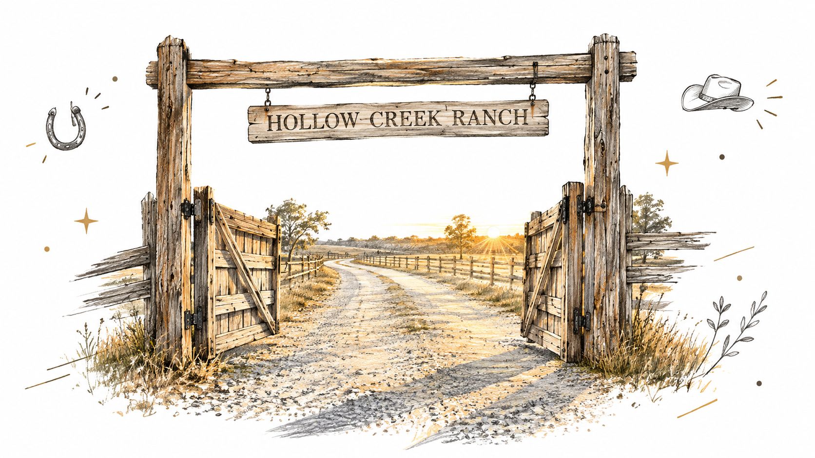
The modern version carries that same identification function, but it has to work harder. It must look right in bright daylight, remain legible from an approaching vehicle, survive the local climate, and avoid becoming useless when the gate is open or the road is dark.
Know which sign you're buying
These labels sound interchangeable, but they solve different problems.
- Name sign: Displays a family name, ranch name, farm name, monogram, or established date. It's primarily an identity and design piece.
- Address sign: Displays the street number or rural address so visitors can locate the driveway.
- Emergency marker: Uses high visibility, reflective treatment, or other features intended to help responders identify the property from the road.
- Decorative plaque: May include a welcome phrase or artwork, but often sacrifices reading distance for appearance.
A single sign can combine a ranch name and address, especially on a short, straight approach where the gate stays visible. On a hidden homestead or shared driveway, assume you'll need a decorative sign at the gate and a separate road-facing address marker.
A custom metal sign can fit this job well because it gives you control over the wording, finish, and layout. Farmhouse World's farmhouse metal sign collection includes personalized options for family names, addresses, coops, farms, and ranches. Treat the product size as a starting point, not proof that the lettering will be readable from your road.
Practical rule: Design the sign around the person approaching the property, not the camera taking the listing photo.
Matching Materials and Finishes to Your Climate
There isn't one universally superior gate-sign material. A shaded backyard coop and a ranch entrance beside an open road face different abuse. Sun, salt air, standing moisture, snow, weeds, and poorly chosen fasteners can ruin a sign long before the panel itself fails.
Compare the material to the location
| Material | Best For | Watch Out For | Typical Lifespan |
|---|---|---|---|
| Powder-coated steel | Ranch entrances, farm gates, and bold rustic designs | Scratches, exposed cut edges, and incompatible or corroding hardware | Depends on coating, exposure, and maintenance |
| Galvanized or raw metal | Industrial, weathered, or intentionally aged appearances | Surface oxidation, staining, and the need for appropriate protection | Depends heavily on finish and climate |
| Aluminum | Coastal areas, lighter gate mounting, and corrosion-conscious installations | Dents, flexing on unsupported panels, and a less substantial feel | Depends on alloy, finish, and mounting |
| Wood | Traditional farms, cabins, and shaded garden gates | Moisture movement, checking, fading, insects, and fastener staining | Depends on species, sealing, and exposure |
| MDF-backed printed panels | Covered porches, sheltered fences, and temporary decorative use | Swelling, edge damage, and moisture intrusion outdoors | Best treated as a protected-location option |
| Composite panels | Low-maintenance decorative installations and lighter-duty locations | Finish aging, mounting limitations, and product-specific outdoor ratings | Depends on the product and exposure |
For an open ranch entrance, I'd start with steel or aluminum, then choose the finish based on exposure. Powder coating changes the maintenance equation because the coating forms a consistent protective surface across the panel. It still isn't permission to ignore scratches, drilled edges, or rusty bolts. A gouge that reaches bare steel can become the starting point for corrosion.
Raw or galvanized metal can look excellent when the weathered appearance is part of the plan. It's less forgiving when you want a crisp, permanent finish. Before ordering, ask how the surface is protected, whether the finish is intended for outdoor exposure, and how the manufacturer treats cut edges.
Coastal, sunny, snowy, and overgrown properties
Near saltwater, choose corrosion-resistant metal and hardware, keep the surface clean, and avoid trapping moisture between the sign and its mounting bracket. Aluminum can make sense where weight and corrosion are major concerns, while coated steel gives a heavier, more substantial look when the mounting structure can carry it.
In strong sun, color retention matters as much as structural strength. University of Florida wayfinding specifications call for outdoor signs to target at least five years of normal service, use a UV-resistance rating of 7 or higher under a Xenon-Arc test, and retain color without significant fading or discoloration. Those benchmarks come from wayfinding specifications, so use them as questions to ask about an outdoor sign finish rather than as a promise for every decorative product.
Snow and weeds create a placement problem, not just a material problem. A durable panel installed low behind vegetation may be unreadable and repeatedly wet. A sign mounted where plowed snow hits it can suffer more abuse than one placed slightly higher and farther from roadwork.
For metal care, use a sensible cleaning and inspection routine rather than assuming a coating makes maintenance unnecessary. This guide to protecting metal from rust is useful when you're choosing a finish and planning upkeep.
Sizing Lettering That Visitors Can Actually Read
The panel size doesn't tell you whether the wording will work. A large sign with thin script and tightly packed letters can fail from the road, while a smaller sign with strong contrast and sturdy lettering may read cleanly.
Start with the approach distance. FHWA research commonly uses a legibility index of approximately 40 feet of viewing distance per inch of letter height. That makes a 3-inch letter a reasonable starting point for recognition at about 120 feet, while a 6-inch letter targets roughly 240 feet. See the FHWA sign legibility guidance for the underlying method and visibility factors.
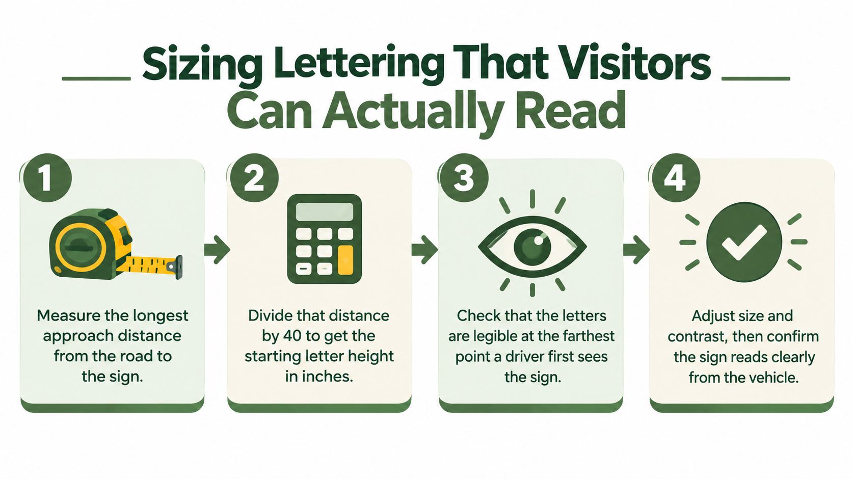
Use this five-minute sizing method
- Measure the approach. Stand where a driver first needs to identify the entrance and measure to the proposed sign location. Use the longest practical distance, not the spot where you personally stop.
- Divide by 40. Convert the distance into inches of starting capital-letter height. If the approach is about 160 feet, the starting point is about 4 inches. This is a design baseline, not a guarantee.
- Add margin for difficult conditions. Increase the lettering if the sign sits high, faces traffic at an angle, competes with trees or fencing, or needs to serve older viewers.
- Shorten the wording. “Hollow Creek Ranch” may work well. A long family name, street address, welcome phrase, and livestock illustration may create a crowded panel that reads poorly.
- Proof it from the road. Print or mock up the sign at full scale. Check it from the farthest approach in daylight, then repeat after dark with headlights or planned lighting.
Letter height is only part of the job. A Virginia Transportation Research Council study gives a practical rule of at least 25 millimeters, or 1 inch, of letter height for every 9 meters, or 30 feet, of legibility distance. The same research found that legibility varied by lettering treatment and sign type, which is why a font choice can't rescue an undersized layout.
Skip thin calligraphy, narrow condensed faces, decorative all-caps lettering, and cramped spacing. Use sturdy letterforms, generous gaps, and a clear hierarchy. Make the address larger than a small “established” line if people need the number to find you.
A sign should be readable before a driver reaches the decision point, not after the vehicle has already rolled past the gate.
Designing for Daylight and After Dark
A gate sign that looks beautiful at noon can disappear at dawn. Rural entrances often sit outside streetlight coverage, and the people searching for the property may be driving slowly with headlights pointed down the lane instead of directly at the sign.
Start with contrast. White lettering on black, black lettering on a light background, or another clearly separated foreground and background combination usually performs better than two similar earth tones. Virginia research found that achromatic signs, such as white on black, had an average legibility distance of 53.30 meters, compared with 50.84 meters for chromatic signs under bright illumination. The same study reported a 14% increase in legibility distance when illumination rose from 70 to 273 lux, and signs viewed straight-on had a legibility distance 19% longer than signs viewed at a 45-degree angle. These findings support a simple design decision: face the sign toward the approach and protect the contrast.
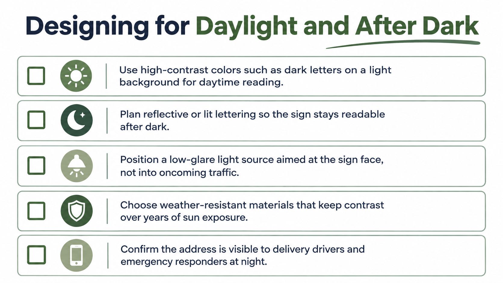
Build the nighttime setup in the right order
- Choose the contrast first. Don't start with an ornate font. Decide whether the legend and background separate clearly in both sunlight and shadow.
- Control the surface reflection. Glossy finishes can throw glare back toward a driver. A matte or controlled-reflectance surface is easier to manage.
- Select the lighting strategy. External lighting should wash the sign evenly, not create one white hotspot over the first letter and leave the rest in darkness.
- Consider retroreflective material. Retroreflective surfaces can return headlamp light toward the vehicle, but color, uniformity, position, and available sight distance still affect recognition.
- Test the actual approach. Walk toward the sign, then drive toward it with normal headlights. Check both directions if traffic can approach from either side.
FHWA testing found that achieving at least 85% correct identification for tested signs at 90 meters required luminance above approximately 40.2 candelas per square meter, with results varying by sign design and conditions. That figure belongs to tested sign systems, not every residential plaque, but it reinforces the point that nighttime performance must be validated rather than assumed.
For a more complete lighting plan, including how fixtures and hardscape interact around an entrance, review this resource on the cost and ROI of hardscape lighting from Task Masters Inc. Keep the fixture aimed at the sign face, shield the light from approaching drivers, and inspect the view from inside a vehicle.
Night test: If you can read the sign only after stopping beneath the fixture, the installation is decorative. It isn't doing its identification job.
Mounting Hardware, Posts, and Placement
The prettiest position on the gate is often the wrong position for the sign. Gates move, rattle, swing into posts, collect dust, and sometimes sit open for days. A plaque attached to the moving panel can work, but only when you account for clearance, weight, visibility, and the way the sign looks when the gate is open.
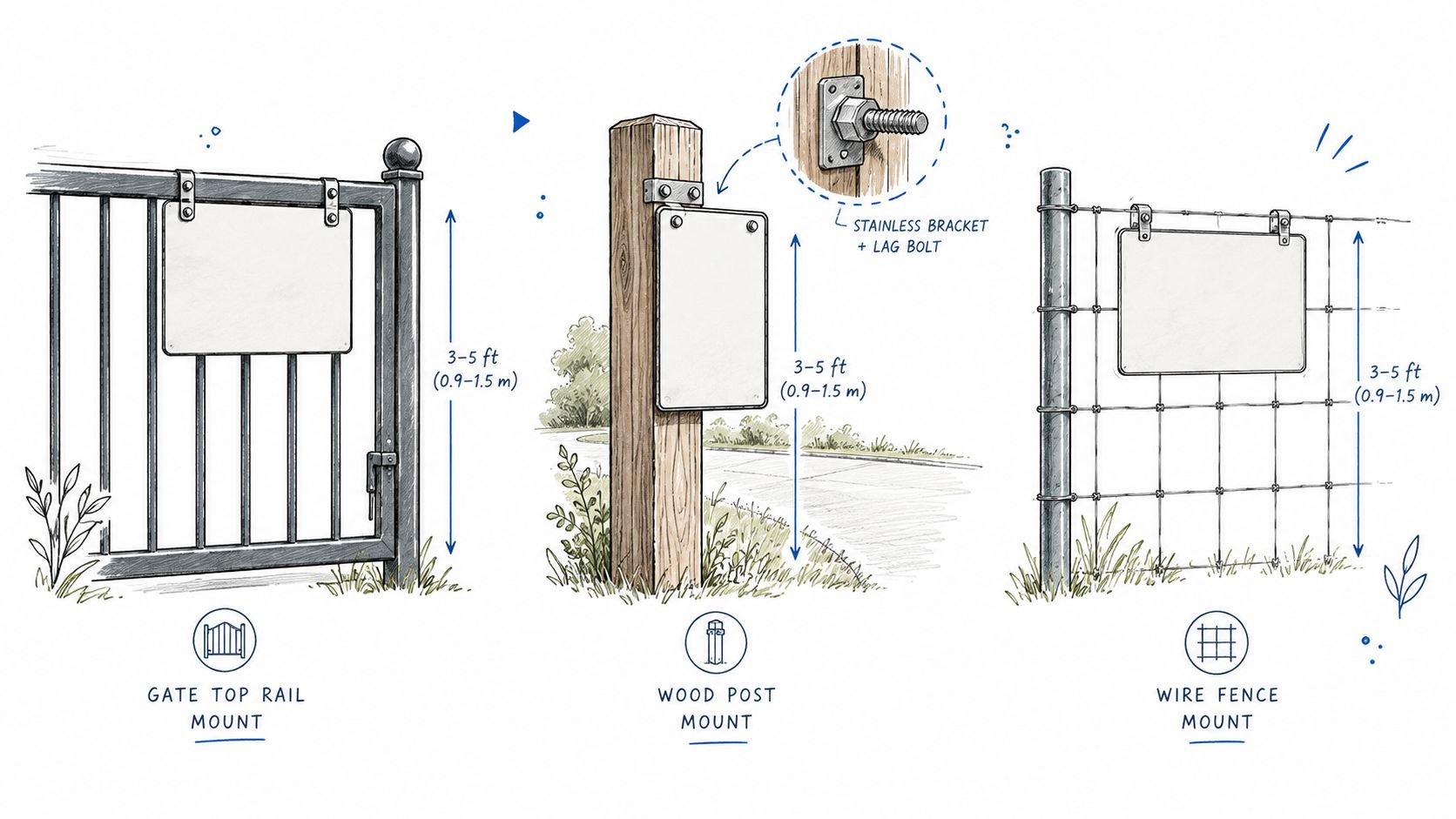
Pick the mounting location before drilling
Use this decision tree:
- The gate stays closed, faces the road, and doesn't block the sign when open. A gate-mounted sign can serve as the identity piece.
- The gate swings open or sits far inside the property line. Use a dedicated post beside the drive for the address, then place the decorative plaque on the gate if you still want it there.
- The entrance has a sturdy fence line with clear sight distance. Fence mounting can work, provided the panel won't be hidden by vegetation or damaged by livestock.
- The road approaches from both directions. Use a double-sided sign or paired markers so drivers aren't forced to see the back of the panel.
Rural sign guidance commonly places address markers around 3 to 5 feet above ground, which helps keep them visible while avoiding some weeds, plowed snow, and low roadside clutter. Confirm local requirements before treating that range as a code requirement.
Match the hardware to the structure
For a wood post, use exterior-rated lag screws or through-bolts with washers, and keep the sign from sitting directly against wet timber if the design traps water. On pipe posts, U-bolts provide a practical clamp, especially when the post diameter matches the hardware. A metal gate may need welded tabs, through-bolts, or a purpose-built bracket. Don't drill through a structural rail or hinge zone just because it gives the centered look you want.
Near the coast, select corrosion-resistant fasteners and avoid combining metals carelessly. A stainless fastener installed through a coated steel sign still needs a sound hole treatment and a design that sheds water. In snow country, set the sign high enough to remain visible after plowing, but not so high that drivers must tilt their heads sharply to read it.
Gate movement also matters. Open and close the gate slowly after installation. Check that the panel won't strike the latch post, scrape a wall, catch a vehicle, or become a handle for livestock. For hinge, latch, and structural considerations, this guide to gate hardware and latches from AlliedFenceAndGate.com™ is a useful reference.
A dedicated post beside the drive is usually the safest location for the emergency address. Use the gate itself for the ranch name when the property benefits from that visual statement. Farmhouse World's address sign and post options show how a separate roadside marker can carry the practical information without crowding the decorative plaque.
When Decoration and Emergency Visibility Are Two Different Jobs
Your ranch name and your emergency address are not automatically the same sign. The name helps guests confirm they've arrived. The address helps responders identify the correct entrance before they commit to the driveway.
That distinction matters most on long rural drives. If the house can't be seen from the public road, Northampton County advises placing numbers on a sign, post, or pole visible from the road. It also warns that numbers mounted on a gate may disappear when the gate is open. A beautiful sign can fail at the exact moment the driveway needs to be found.
Use one sign only when the entrance is simple
A single combined sign is reasonable when:
- The gate remains visible from the road in both its open and closed positions.
- The road approaches from one clear direction.
- The address and property name fit without tiny lettering.
- Trees, fencing, parked equipment, and mailboxes don't obscure the panel.
- Local emergency-address rules allow that placement.
Even then, make the address easy to find in the layout. Don't bury it beneath a large monogram or tuck it into a decorative border.
Use two signs when visibility can change
Choose a paired setup when the gate swings open, the driveway is shared, the property sits behind a bend, or traffic approaches from both directions. Put the decorative ranch or family-name sign where it looks right, then install a separate road-facing address marker where it remains visible regardless of gate position.
Burleson County recommends a double-sided sign near the driveway entrance so responders can read it from either direction, positioned roughly 3 to 5 feet above ground and kept clear of vegetation. That's a practical model for rural properties, though local requirements should control your final setup.
A reflective emergency marker may look less romantic than a custom plaque. That's fine. It has a different assignment. Keep the decorative piece attractive and the emergency marker obvious, durable, and readable from the public road.
The gate can welcome people. The roadside marker needs to help them find you before they enter.
Personalization, Proofing, and a Seasonal Care Routine
Personalization should follow the viewing distance, not the other way around. A family name, ranch name, established date, monogram, and address can all belong on one sign, but they shouldn't all compete for the same attention.
For a roadside sign, lead with the property name or address, then use the secondary line sparingly. An established date or monogram often works better as a smaller supporting detail. A long welcome phrase and detailed livestock artwork may look good close up but become visual noise from a moving vehicle.
Approve the proof like an installer
Before production, check the full-size layout for:
- Letter height: Is the main wording large enough for the measured approach?
- Contrast: Can you separate the letters from the background in shade and sun?
- Spacing: Do letters and lines have enough breathing room?
- Address priority: Can a stranger find the number without studying the design?
- Mounting holes: Will the holes clear rails, hinges, latches, and post edges?
- Gate clearance: Does the panel avoid the swing path and vehicle path?
Ask for a physical proof or make one yourself from the actual approach distance. This catches crowded wording and misplaced mounting holes before the sign reaches the property.
Keep a simple seasonal routine
- Spring: Tighten fasteners, inspect brackets, and look for coating damage or rust at drilled holes.
- Summer: Rinse salt, dust, and bird residue from exposed surfaces, especially near the coast.
- Fall: Cut back vines, weeds, and branches that hide the sign.
- Winter: Clear snow from the face and surrounding sightline without scraping the finish.
Cleaning should be gentle. Avoid aggressive pressure directly against painted edges, lettering, or loose fasteners. For broader exterior-cleaning decisions, this pressure washing frequency guide from Water Works Power Washing offers useful context.
Choose one sign when the gate stays visible and the address reads clearly from the road. Choose two when the gate can open, the driveway is long or shared, or responders need a dependable roadside marker.
Farmhouse World offers personalized metal signs for ranches, farms, coops, family names, and addresses, with design options that can be matched to your entryway and mounting plan. Review the available styles at Farmhouse World, then measure your approach distance and decide whether your property needs one sign or a decorative sign paired with a separate emergency marker.


