

A durable ranch sign should combine weather-ready materials with lettering sized to the driveway's viewing distance. Federal Highway Administration guidance sets a benchmark of approximately 1 inch of character height per 30 feet of viewing distance, making 4-inch letters suitable for roughly 120 feet, 6-inch letters for 180 feet, and 8-inch letters for 240 feet.
A polished sign can still fail at the gate. Delivery drivers may slow too late, guests may choose the wrong lane, and a family name can vanish against dark stain or tangled vegetation. Choose contrast, spacing, and placement for quick recognition, then use the design to express the property's character. The strongest ranch sign ideas balance beauty with practical wayfinding, helping visitors, service vehicles, and emergency responders locate the entrance safely.
Table of Contents
- Welcome to the Ranch - Why Your Entrance Sign Matters
- The Roots of Ranch Branding and Modern Symbolism
- Sizing Lettering for Driveways and Private Roads
- Material and Finish Choices for Outdoor Durability
- Traditional Rustic versus Modern Metal Ranch Signs
- Personalizing with Family Name and Heritage Details
- Matching Ranch Signs to Farmhouse and Country Decor
- Planning Your Custom Ranch Sign for Lasting Impact
Welcome to the Ranch - Why Your Entrance Sign Matters
A visitor approaches at dusk, looking for a driveway that seems obvious from the house but nearly vanishes from the road. The old post is still there, yet the lettering is small, the paint has faded, and the surrounding trees swallow the sign. A clear ranch marker changes that arrival immediately. It gives the property a recognizable face before anyone reaches the porch.
An entrance sign does more than announce a surname. It identifies a place for guests, delivery workers, neighbors, and people who may need to locate the property quickly. The decorative sign and the operational address marker may share a post, but they don't always have the same job. A family name can express character, while an address needs simple, high-contrast text that can be read from a moving vehicle.
Start with the whole arrival
Think about the sign together with the gate, driveway surface, fence line, and first view of the home. A plain entrance can gain presence from a well-proportioned marker, while a busy gate usually needs a quieter sign. If you're redesigning the approach, reviewing stamped concrete driveway options can help coordinate the ground surface with the sign's material and color.
Good ranch sign ideas also respect how people arrive. Place the main name where it catches the eye, keep the address easy to locate, and leave enough space around the panel for contrast. The result should feel like part of the property, not a sign added after everything else was finished.
The Roots of Ranch Branding and Modern Symbolism
Ranch signage has a practical history. Cattle branding reached the New World in 1541 through Spanish explorer Hernando Cortés, and the practice became widespread in the United States after the Civil War. During the open-range era, a distinctive mark helped establish ownership when animals from several ranches mixed across unfenced land. Historical background on cattle brands
The most influential period for American cattle-brand development was the 1870s and 1880s, when marks became associated with families, properties, and regional identity. From 1867 through 1885, more than 5.5 million cattle moved north from Texas ranches, making recognizable ownership systems increasingly important along long-distance trail routes. King Ranch offers a well-known example. Its founder, Richard King, began using the “Running W” brand in 1867 after repeated cattle theft.
Why simple marks still work
That history explains why bold initials, monograms, numerals, and geometric marks remain strong choices for modern ranch sign ideas. A brand had to be recognized quickly, and an entrance sign has a similar challenge. Visitors may see it through a windshield, in changing light, or against a background of grass, fencing, and trees.
Choose one dominant symbol rather than combining every Western motif available. A single cattle brand style mark, horseshoe, windmill, star, or livestock silhouette can carry more authority than a crowded collection of icons. Keep the surname or ranch name visually dominant, then use the emblem as supporting information.
The strongest designs connect legibility and meaning. A mark that looks authentic but can't be distinguished from the road has lost the practical quality that made ranch branding so enduring. Treat the sign as a modern expression of ownership, heritage, and place, not merely as rustic decoration.
Sizing Lettering for Driveways and Private Roads
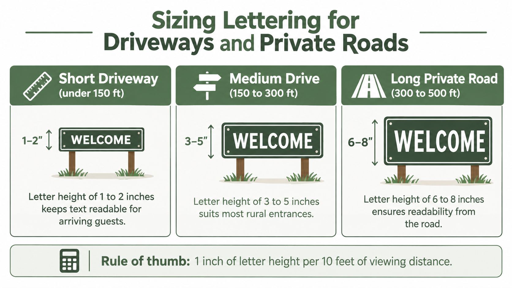
A driver approaching a ranch entrance has only a short window to identify the property, especially where the driveway meets a busy road or bends behind trees. Size the lettering for that approach, not for how attractive the sign looks on a workbench. The Federal Highway Administration gives a practical benchmark of approximately 1 inch of character height per 30 feet of viewing distance under high-contrast conditions. As examples, 4-inch letters suit roughly 120 feet, 6-inch letters about 180 feet, and 8-inch letters about 240 feet. FHWA sign legibility research
Use a clear hierarchy
Give the largest lettering to the ranch or family name. Place the address, establishment date, or short secondary phrase below it in smaller type. An emblem can sit beside the name or above it, as long as it does not compete with the characters visitors need to read.
A 24 to 36-inch sign can work well with a disciplined layout. Reserve the main area for one identifier, avoid forcing a long surname into narrow script, and review the design from the road. Script fonts may look elegant at arm's length, yet thin strokes and tight spacing often disappear at approach distance.
The same visibility problem affects the setting around the sign. A driveway surfaced with decorative concrete driveways can create a clean approach, but the sign still needs separation from pale paving, fencing, grass, and trees.
Night arrivals require separate consideration. The FHWA research indicates that nighttime legibility can be 8 to 20 percent lower than daytime legibility, so evening visibility may call for larger letters, stronger contrast, or lighting. Dark lettering on a light panel, or light lettering on a very dark panel, generally stands out more clearly against mixed outdoor backgrounds.
Roadside test: Have one person stand near the driveway while another approaches from the direction visitors use. If the name cannot be read before the turn, shorten the wording or increase the letter height.
At a faster road, separate the decorative ranch sign from the address marker. The decorative panel can express personality. The address should remain plain enough for drivers and emergency responders to identify without studying the artwork.
Material and Finish Choices for Outdoor Durability
An outdoor sign lives through moisture, ultraviolet exposure, temperature changes, wind, dust, and occasional contact with animals. Material selection is therefore an environmental decision, not just a style preference. The National Park Service identifies aluminum composite panels as materials that don't swell, corrode, rot, or deteriorate in the same way as less stable substrates, which makes weather-resistant metal or composite construction preferable to untreated wood for long exposure. National Park Service sign guidance
Match the construction to the site
Aluminum composite suits open pasture, exposed gates, and locations where maintenance access is limited. Mild steel can deliver a strong, weighty appearance, but it needs a protected finish and careful attention to edges, fasteners, and scratches. Wood provides warmth and texture, yet every face, edge, joint, and mounting point needs protection from moisture.
Use sealed or powder-coated surfaces where appropriate, corrosion-resistant hardware, and finished or rounded edges. A distressed surface may look convincing in a catalog, but deep texture collects dirt and can reduce the contrast between the lettering and background. If the sign sits near livestock, mount it above rubbing height and avoid sharp projections.
Don't overlook the mounting system
A strong panel can still fail when the hardware doesn't suit the installation. Through-bolts are more dependable for gates and posts than adhesive alone, and the fasteners should match the wall, fence, or post material. Consider wind exposure, standing water, coastal air, and freeze-thaw conditions before ordering.
For additional practical guidance on extending the life of metal components, see this resource on protecting metal from rust. The goal isn't just to buy the heaviest sign. A repairable finish, replaceable address plaque, and accessible fasteners can reduce waste when property details change.
Traditional Rustic versus Modern Metal Ranch Signs
Traditional rustic signs bring warmth immediately. A stained or painted wood panel with hand-lettered text and a wrought iron bracket suits an older farmhouse, barn, or homestead with existing timber details. The appeal comes from irregular grain, softened edges, and a sense that the sign belongs to the property.
Modern metal signs take a different approach. Laser-cut lettering, crisp silhouettes, and powder-coated finishes create a cleaner profile for updated farmhouse exteriors, dark siding, steel gates, and contemporary landscaping. Metal also makes it easier to maintain consistent line weight and sharp lettering across a personalized design.
| Style Direction | Typical Materials | Best For | Maintenance Level |
|---|---|---|---|
| Traditional rustic | Wood, hand-painted lettering, wrought iron | Historic farmhouses and warm country settings | Regular inspection and finish maintenance |
| Modern metal | Mild steel, aluminum composite, powder-coated surfaces | Contemporary farmhouses, gates, and clean-lined entrances | Lower routine maintenance, with finish checks |
| Mixed rustic-modern | Wood backing with metal lettering or emblem | Properties combining barn character with updated details | Maintenance depends on both substrates |
Choose for the setting, not the trend
Rustic wood doesn't automatically look more authentic, and metal doesn't have to look industrial. A simple steel panel in a muted finish can feel quiet and rural, while a carefully painted wood sign can look polished rather than rough. The surrounding roofline, fence material, exterior color, and hardware should guide the decision.
Review examples of metal ranch entrance signs before choosing a direction. Pay attention to the negative space around the name and the way the panel handles long surnames. In practice, a restrained design usually ages better than a sign overloaded with distressed effects, decorative flourishes, and multiple competing motifs.
Personalizing with Family Name and Heritage Details
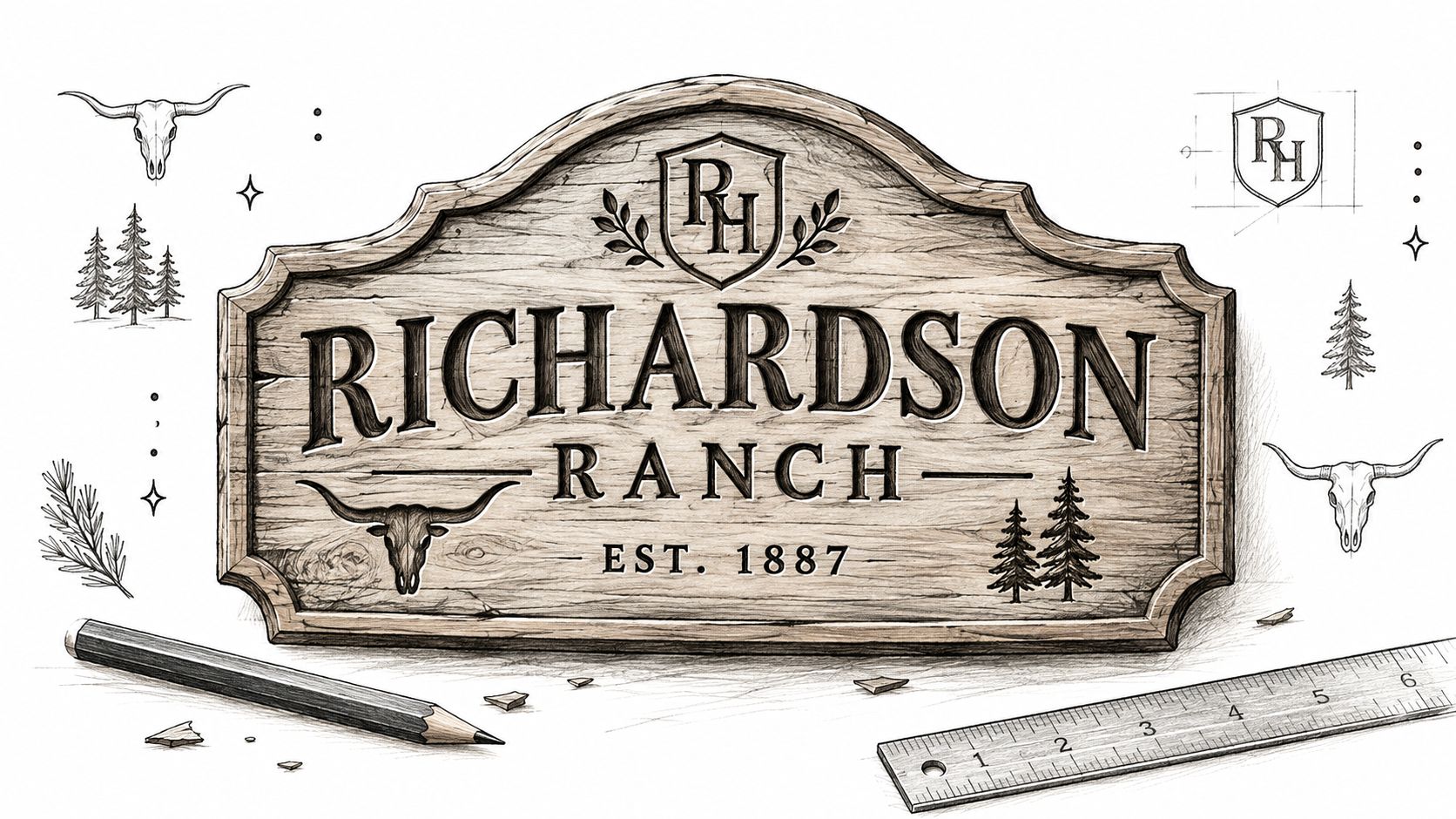
A good personalized sign tells people whose place they're approaching without turning the panel into a scrapbook. Start with one clear primary line, usually the family surname or ranch name. Then add one supporting detail, such as an established date, monogram, or property reference.
The scale of American agriculture helps explain why this style of identity remains meaningful. The United States had approximately 1.88 million farms in 2024, and family farms represented 97 percent of all farms. Those farms covered about 876 million acres, with an average farm size of 466 acres. USDA farm and census history
Make heritage readable
A windmill, barn, horse, cow, tractor, tree line, or cattle-brand-inspired mark can add context, but the icon shouldn't overpower the name. For a long surname, place the emblem above or beside the text rather than forcing everything into one horizontal line. Established dates work best as secondary details because they're meaningful to the family but less important for wayfinding.
The personalized ranch signs can extend beyond the gate. A coordinated name, monogram, or emblem can appear on an entryway sign, indoor wall piece, or complementary farmhouse accent, creating a visual thread between the property exterior and the home.
A short video can also help when you're comparing layouts, motifs, and sign proportions before committing to a custom design.
Keep the final composition calm. One surname, one meaningful symbol, and one supporting detail usually communicate more heritage than a crowded arrangement of animals, slogans, dates, and decorative borders.
Matching Ranch Signs to Farmhouse and Country Decor
The entrance sign should feel related to the house, even when it doesn't match every interior accessory. Pull one color from the exterior, repeat a metal finish from the gate or lighting, and choose an emblem that reflects the property's character. A black metal sign can connect with window trim and gate hardware, while a warm wood panel may suit a porch with timber posts and natural siding.
Build a consistent visual language
Farmhouse styling benefits from restraint. Pair a surname sign with neutral canvas art, simple textiles, a practical entry bench, or understated planters rather than repeating the same livestock graphic everywhere. Coastal farmhouse spaces can use lighter backgrounds and restrained blue or gray accents, while traditional country settings may support deeper greens, warm browns, or muted red.
Low-cost decorative signs often fail because they prioritize a distressed appearance over construction. The lettering may be too small, the background too close in value to the text, or the mounting points too weak for an exposed gate. A well-built sign at the correct scale contributes more to the property than several inexpensive pieces that need frequent replacement.
The same principle applies to the surrounding approach. If you're planning a pasture fence, consider how the posts, rails, gate, and sign will read as one entrance composition. The sign shouldn't look pasted onto the fence. Its width, height, and finish should belong to the structure supporting it.
Planning Your Custom Ranch Sign for Lasting Impact
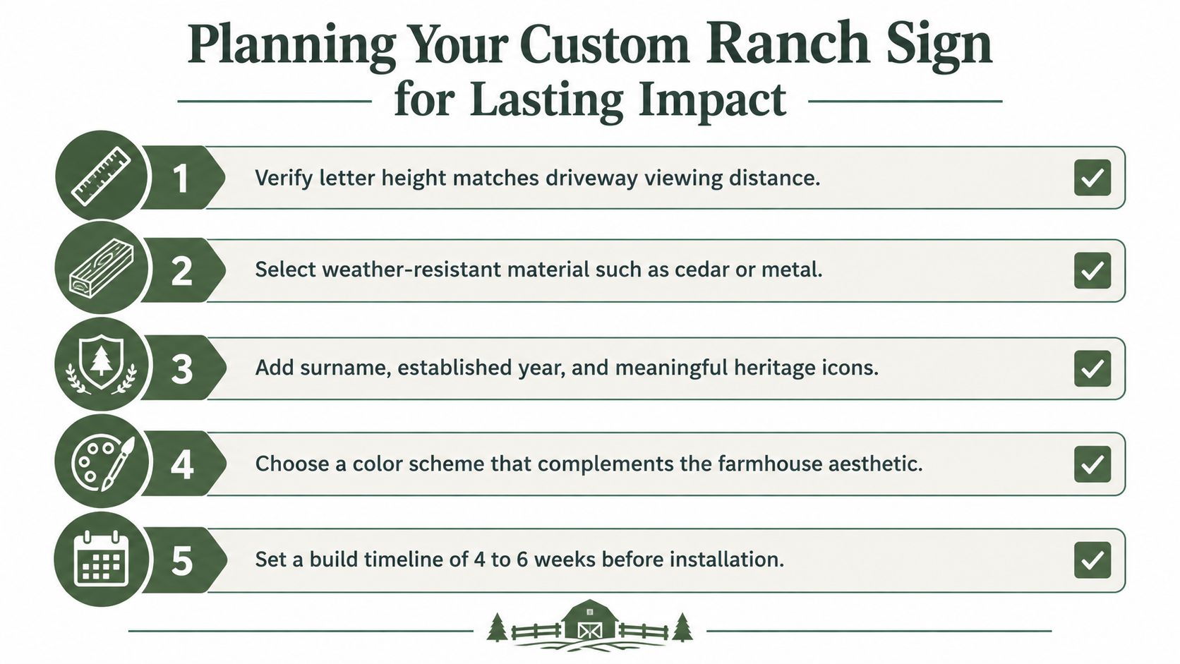
Before ordering, stand at the road and record the distance from which visitors need to identify the entrance. Use that measurement to set the main letter height, then reduce secondary details until the name remains dominant. Confirm the contrast in daylight and after dark if evening arrivals are common.
Make the decisions in order
- Measure the approach. Decide where a driver, delivery worker, or emergency responder must be able to read the sign.
- Choose the substrate. Match wood, aluminum composite, or protected steel to sun, rain, salt, dust, and temperature cycling.
- Set the hierarchy. Put the ranch or family name first, then add a short address, date, or emblem.
- Specify the hardware. Use fasteners suited to the gate, wall, fence, or posts, and keep the panel above animal rubbing height.
- Plan maintenance. Inspect the finish, clean dirt from textured areas, and make sure the address can be updated without replacing the entire decorative sign.
A personalized metal sign from Farmhouse World is one option for combining a family name, date, address, or ranch motif with farmhouse styling. Compare its proportions and finish with your driveway conditions rather than selecting a design only from its appearance on a screen.
The right ranch sign ideas end in a practical specification: readable lettering, stable contrast, weather-appropriate materials, secure mounting, and personalization that means something to the people who live there.
Browse Farmhouse World for personalized metal signs, farmhouse wall decor, and complementary accents that can carry your ranch identity from the entrance into the home. Choose the name, emblem, colors, and dimensions only after you've checked the viewing distance and the conditions at your gate.


