

You've packed away the everyday prints, pulled out the garland, and placed a nostalgic Christmas piece against the wall. It looks promising, but something feels off. The artwork may be festive, yet the room now feels cluttered rather than collected.
Vintage Christmas wall art can solve that problem when you choose it as part of the room, not as a separate holiday layer. Muted reds, warm creams, hand-drawn scenes, and aged-looking textures work naturally with farmhouse wood, shiplap, plaster, and linen. The challenge is knowing whether a piece is truly vintage, carefully reproduced, or merely styled to look old, then choosing a size and material that will still work next season.
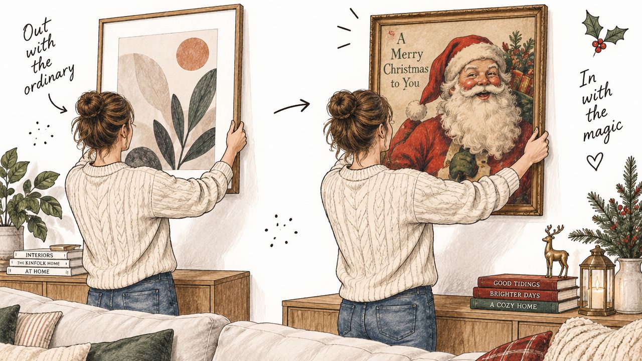
Table of Contents
- Setting the Scene for Vintage Holiday Walls
- What Defines Vintage Christmas Wall Art
- Materials and Finishes Worth Knowing
- Sizing and Placement That Actually Works
- Aging Restoration and Authenticity Cues
- Integrating Vintage Wall Art with Farmhouse Decor
- A Quick Checklist Before You Buy or Hang
Setting the Scene for Vintage Holiday Walls
On an ordinary afternoon, a homeowner can change the mood of a living room in under an hour. A minimalist botanical print comes down, a framed Santa illustration takes its place, and a small wreath moves above the console. The furniture hasn't changed, yet the room suddenly feels warmer, older, and more personal.
That transformation works when the holiday art shares visual qualities with the space already in place. A faded winter scene can sit comfortably beside a linen sofa and a reclaimed wood table. A generic sign with bright lettering and several competing motifs may demand attention from every direction, making the room feel decorated rather than designed.
Farmhouse interiors give vintage Christmas wall art a useful foundation. Whitewashed walls, shiplap, exposed beams, woven baskets, and aged wood already provide the tactile background that nostalgic art needs. The artwork doesn't have to match every object. It only needs a related color temperature, a compatible level of visual detail, and enough breathing room to read clearly.
Design principle: Seasonal art should look like a natural chapter in the room's story, not a temporary sign pasted over it.
The purchase decision becomes easier when you separate inspiration from evidence. A moodboard can show you that you like old-fashioned Santa figures, snowy villages, or Victorian botanicals. It can't tell you whether the paper is fragile, whether the frame is too shallow for the wall, or whether the colors will disappear against a white farmhouse backdrop.
The three decisions that prevent clutter
Start by identifying the image's visual age. Does it have the irregular linework and restrained palette associated with older print traditions, or is it a new illustration with a digital filter? Next, measure the wall and the furniture beneath it. Finally, inspect the substrate and storage requirements before you buy.
This guide follows that order. You'll learn how the style developed, how to compare paper, canvas, wood, and metal, how to place art above furniture, and how to preserve it through repeated seasonal use.
What Defines Vintage Christmas Wall Art
The phrase vintage Christmas wall art describes a broad visual family rather than one exact period. Its roots reach back to holiday cards, printed illustrations, posters, and advertising imagery from the late nineteenth century through the mid-twentieth century. Victorian culture played a major role in shifting Christmas imagery toward domestic scenes, decorated trees, Santa Claus, winter gatherings, and other familiar household subjects. The history of Christmas decoration and light art places a useful milestone in 1848, when the Illustrated London News published an engraving of Queen Victoria and Prince Albert with a Christmas tree.
Mass printing helped these images travel into ordinary homes and public spaces. By 1896, Christmas cards and seasonal printed imagery were established enough to form part of holiday display culture, while electric lighting in the 1890s changed the way people decorated interiors and festive spaces. Those developments explain why vintage holiday art often feels both intimate and commercial. It may resemble a family keepsake, a greeting card, a shop poster, or a magazine illustration.

Motifs you can recognize quickly
Look for recurring details rather than relying on the word “vintage” in a product title:
- Botanical elements: Holly, evergreen branches, pinecones, berries, and poinsettia-like forms often appear in hand-drawn or hand-colored arrangements.
- Traditional lettering: Serif type, stenciled forms, and restrained decorative lettering usually feel more period-aware than glossy script fonts.
- A softened palette: Faded red, cream, forest green, brown, and warm gold tend to sit more comfortably in a farmhouse room than highly saturated color.
- Storytelling scenes: Snowy lanes, family gatherings, trains, village streets, and children near a tree create the sense of a remembered moment.
- Religious imagery: Nativity scenes and angels can look vintage when printed in gentle tones with a paper-like texture rather than sharp, high-contrast color.
Collectors and shoppers generally encounter three different categories. Authentic antique originals carry natural patina and individual history, but their condition, size, and color may vary. Curated reproductions recreate an older image and may add an aged paper effect, giving you consistency without the fragility of an original. Modern vintage-inspired pieces borrow cues such as muted colors, old typography, and distressed edges, but they're contemporary designs with no historical wear.
A related collecting history includes posters, postcards, and die-cut paper decorations. Some holiday die-cuts date to the 1920s, and collector references identify German examples produced from 1919 to 1935 in the broader history of antique Christmas decorations and printed ephemera (a timeline of old Christmas paintings and decorations). The key question at purchase time is simple: Are you buying age, an image, or an atmosphere?
Materials and Finishes Worth Knowing
The same Santa illustration can feel like an heirloom, a modern canvas, or a novelty sign depending on what carries it. Material affects more than durability. It changes the artwork's weight, surface reflection, color depth, and relationship with farmhouse textures.
Paper prints
Paper usually gives the most convincing connection to vintage print culture. A framed print on acid-free, low-lignin paper or cotton-rag stock can preserve fine detail and keep the surface close to the look of an old card or poster. It's also easier to store flat, but it needs protection from bending, moisture, direct sunlight, heat, and careless handling.
For a piece intended for repeated seasonal display, conservation guidance from the Canadian Conservation Institute's paper care instructions recommends stable materials and protection from environmental stress. A mat can keep the glazing away from the image, while a substantial frame adds structure without making the print visually heavy.
Canvas prints
Canvas brings texture and can disguise minor surface irregularities. It works well beside rough timber, woven textiles, and rustic furniture, but an image printed with extreme sharpness can make the canvas feel more contemporary than nostalgic. Choose a matte surface and a restrained image, or use a simple wood frame to soften the finished appearance.
Solid wood panels
Wood panels, particularly those made from reclaimed barn wood, give farmhouse rooms immediate material character. They tolerate more casual handling than an unframed paper print and can conceal small imperfections. The trade-off is visual weight. Dark wood can reduce the brightness of a pale room, and its grain may compete with detailed artwork.
Metal signs
Metal is lightweight and practical for seasonal storage. It suits industrial farmhouse rooms, porches, kitchens, and spaces that already use galvanized finishes. Without careful color and surface treatment, though, metal signs can lean toward a retro diner look rather than an antique paper-print mood.
| Material | Best For | Watch Out For |
|---|---|---|
| Paper print | Authentic print detail and heirloom-style framing | Moisture, sunlight, bending, and fragile edges |
| Canvas | Rustic texture and casual farmhouse layering | A crisp image may look too contemporary |
| Solid wood panel | Reclaimed character and sturdy display | Dark tones and grain can dominate |
| Metal sign | Lightweight storage and durable seasonal use | Glossy or bright finishes can feel commercial |
For reproductions, archival pigment inks on premium matte paper are a sensible choice when repeated handling and light exposure matter. Archival systems improve fade resistance, while museum-quality giclée printing can preserve fine detail and color fidelity more effectively than standard dye-based printing, as illustrated by this vintage Christmas poster reproduction with archival printing details.
If you're comparing farmhouse substrates more broadly, this guide to wood and metal wall decor offers useful context. The simplest rule remains the most reliable: match the substrate's finish to the room's existing texture, not just to the picture.
Sizing and Placement That Actually Works
A beautiful print can look awkward when it's too small for the wall or too large for the furniture below it. Start with the wall, then consider the room's function. A holiday piece above a sofa needs a different visual presence from one beside a pantry door or at the end of a hallway.
Measure before choosing the artwork
Measure the usable wall width, excluding trim, windows, and nearby door casings. For a single focal piece, the artwork or grouped display should generally occupy about two-thirds of the wall or furniture width, a proportion that keeps the arrangement substantial without filling every available inch. Sketch the frame outline with painter's tape before ordering, especially on shiplap where horizontal lines can make an undersized piece look even smaller.
Furniture changes the hanging height. Above a sofa, console, or mantel, the artwork should feel connected to the object beneath it rather than floating near the ceiling. Keep the lower edge close enough to establish that relationship, while leaving room for garland, stockings, or a narrow ledge if those elements are part of the plan.
A narrow hallway can take a vertical print or a sequence of small pieces. A staircase wall often benefits from an arrangement that follows the slope, while a large living room wall may need one strong hero image instead of several unrelated small signs.
Choose a layout that supports the farmhouse mood
- Single hero piece: Use a large Santa, winter village, or family scene where the wall needs one clear anchor.
- Symmetrical pair: Place matching or related botanical prints above a console or on either side of a central mirror.
- Small cluster: Group postcard-scale images, book-cover reproductions, or seasonal botanicals above a shelf.
- Asymmetrical gallery: Combine varied frames only when the palette and subject matter provide enough unity.
Vintage art often benefits from clustering because many original formats are smaller than modern statement prints. Above a console, a group of modest frames can feel collected and personal. Above a broad sofa, however, several tiny pieces may look lost unless they form a clearly bounded arrangement.
Leave breathing room around windows, light switches, and doorways. Keep frame spacing consistent within a symmetrical group, and let subject orientation guide placement. A vertical Santa portrait suits a narrow wall, while a horizontal snowy scene can echo the width of a mantel or sideboard.
For exact measurements, hardware placement, and a level installation, use this guide to hanging art accurately. If canvas is your preferred substrate, this overview of farmhouse canvas wall art can help you compare how soft textile texture changes the overall arrangement.
Aging Restoration and Authenticity Cues
Aged appearance and actual age aren't the same thing. Genuine vintage paper may show uneven fading, small foxing marks, softened corners, or ink that has settled differently across the surface. A new print may imitate those effects with a digital overlay, stained background, sanded edge, or deliberately rough frame.
Neither choice is automatically wrong. The important part is knowing what you're buying. An original offers variation and evidence of time, while a reproduction gives you a cleaner, more predictable object. A modern distressed sign may provide the farmhouse mood at a lower maintenance burden, but it shouldn't be described as an antique.
Read the surface before the sales language
Look closely at the edges. Natural wear usually follows handling patterns, with corners and exposed borders affected more than protected areas. Artificial distressing can look evenly distributed, overly dark, or repeated in a pattern that doesn't make sense for normal use.
Ink also provides clues. Older printed imagery may contain slight irregularities in registration, softened lines, or uneven color density. A modern image can be intentionally aged, but its resolution, uniform texture, and perfectly repeated marks may reveal the newer production method.
| Indicator | Genuine Vintage | Reproduction Distress |
|---|---|---|
| Paper tone | Uneven yellowing that follows age and exposure | Uniform cream or digitally applied discoloration |
| Edge wear | Irregular wear concentrated at vulnerable corners | Repeated sanding or identical marks around all sides |
| Ink | Faded or uneven print density | Clean modern detail beneath an aged filter |
| Metal surface | Oxidation that develops unevenly | Decorative rust or paint applied for effect |
| Overall character | Small inconsistencies that make the piece individual | Predictable distressing designed to look old |
Restore lightly and frame carefully
Leave stable wear intact when it adds character and doesn't threaten the object. Don't scrub foxing, sand an old edge, or apply household cleaners to paper. Fragile prints may need professional stabilization before framing, particularly if the sheet is brittle, torn, damp-stained, or severely curled.
Conservation also depends on the display environment. The Canadian Conservation Institute advises keeping paper works away from direct sunlight, heat sources, and high humidity because light and environmental stress accelerate degradation, while cooler, more stable conditions slow the decay process. A seasonal piece deserves the same care as a permanent one if you plan to use it year after year.
Collectors tend to value honest aging because it records the object's history. That doesn't mean every mark increases value, but it does mean artificial wear shouldn't be used to disguise a new product. For ideas on combining an older-looking piece with contemporary furnishings, this guide to blending antiques with modern interior design provides a helpful styling perspective.
Integrating Vintage Wall Art with Farmhouse Decor
Farmhouse styling works best when each seasonal addition reinforces the room's existing materials. Start with the wall surface. White shiplap provides a pale, orderly background, while plaster adds softness and irregularity. Reclaimed beams and stained timber introduce deeper tones, so the same print may need a different frame or mat depending on where it hangs.
Against whitewashed shiplap, warm cream paper and muted red imagery create gentle contrast without overwhelming the horizontal lines. A narrow black frame can sharpen the arrangement, while a honey-toned wood frame makes it feel more traditional. On plaster, a botanical print with faded greens and brown shadows can echo the wall's quiet texture.
Match the art to the room's strongest texture
Smooth shiplap usually suits framed paper prints. The clean frame provides structure, and the paper surface introduces detail without adding another heavy texture.
Rustic timber can support canvas or a lightly finished wood panel. Canvas softens the harder grain, while reclaimed wood makes a smaller print feel more substantial. Keep the image relatively simple if the timber already has knots, cracks, or strong color variation.
Galvanized metal and industrial accents pair naturally with a matte metal sign or a black-framed print. Avoid combining several shiny surfaces in the same small arrangement. One reflective element is usually enough to keep the display from becoming visually noisy.
A dark antique botanical can anchor a brick wall or stained beam, but it may need nearby cream textiles or pale greenery to prevent the corner from feeling heavy. Conversely, a bright Santa illustration can become the room's loudest object, so balance it with quieter elements rather than adding more colorful signs.
For a more detailed example of using an animal motif without losing proportion, see this guide on how to style stag wall decor. The same principle applies to holiday imagery: give a strong silhouette enough surrounding space to remain intentional.
Layer seasonal elements with restraint
Use greenery to frame the art, not cover it. A slim evergreen garland can run along a shelf beneath a print, while a small wreath can sit beside a vertical piece instead of overlapping its subject. Twinkle lights work best when their wires disappear and their glow supports the artwork's palette.
Stockings need their own visual zone. If they hang directly below the art, choose a quieter print above them. If the artwork is the focal point, move stockings to a mantel or adjacent rail. For more ideas on keeping rustic pieces cohesive across rooms, explore vintage-inspired home decor.
Farmhouse World is one option for coordinating this look, offering farmhouse canvas prints, wood and novelty signs, picture frames, seasonal accents, and personalized metal wall art. A custom-name metal sign can bring a personal farmhouse note to an entryway or adjacent wall, while a framed paper print remains the better choice for a softer vintage gallery.
A Quick Checklist Before You Buy or Hang
Use a short yes-or-no check before you place an order or carry a piece to the register. This prevents the most common mistakes, especially buying an image that looks charming online but disappears on the wall, clashes with the room, or suffers during storage.
Confirm the visual fit
- Does the palette belong in the room? Look for a relationship between the artwork and existing creams, wood tones, greens, reds, or metal finishes.
- Does the age claim make sense? Decide whether the piece is an antique original, a reproduction of an older image, or a modern vintage-inspired design.
- Does the surface support the mood? A glossy finish can undermine a muted paper-print aesthetic, while matte surfaces usually feel calmer and more collected.
- Is the image detailed enough for its distance? A small print needs a clear subject, while a large piece can carry a more complex winter scene.
Measure the installation area
Measure the wall width and the furniture beneath it. Mark the proposed artwork's outer dimensions with painter's tape, then stand across the room and check whether the composition feels balanced.
- Will the width relate to the furniture? A hero piece should feel connected to the sofa, mantel, or console rather than isolated above it.
- Is there space around the frame? Keep doorways, windows, switches, and nearby decor from crowding the artwork.
- Does the orientation fit the wall? Choose vertical art for narrow sections and horizontal scenes for broad furniture or ledges.
- Will the frame clear nearby objects? Check frame depth against shelves, sconces, hooks, and layered decor.
Plan for safe hanging and storage
Verify that the hardware matches the piece's weight and the wall type. A lightweight paper print in a frame needs different support from a solid wood panel or metal sign, and the hanging point should be secure before you add garland or other seasonal layers.
When the season ends, remove paper art from direct light and store it flat in an acid-free, low-lignin folder or protective enclosure. Keep framed pieces in a dry, stable area away from heat and high humidity. Store wood and metal so their surfaces won't rub against one another, and avoid compressing canvas under heavy boxes.
Before you commit: If you can answer what the piece is, how large it is, where it will hang, and how it will be stored, you're making a design decision rather than an impulse purchase.
For additional seasonal context, holiday decor demand is commonly concentrated around the final quarter of the year, with search and sales activity peaking around November and December, as described in this Christmas marketing strategy overview. Buying earlier gives you more time to compare materials, test the layout, and choose a storage-friendly format instead of settling for whatever remains.
Farmhouse World offers farmhouse wall art, canvas prints, wood and metal signs, frames, seasonal accents, and personalized decor that can complement a vintage Christmas display. Visit Farmhouse World to compare pieces for your wall, entryway, mantel, or gift list, then choose the format and finish that will work beyond a single holiday season.


