

You've chosen the name, sketched the look, and found the perfect spot beside the porch. Then the practical questions arrive: will the finish survive salt air, will the lettering suit a modern coastal exterior, and will the sign still look intentional after months of sun and wind? A personalized beach house sign should work as part of the architecture, not as an afterthought attached to it.
The strongest results combine restrained design with careful material selection, correct mounting, and disciplined proofing. The sign should identify the property clearly, reflect its character, and tolerate the environment it faces.
Table of Contents
- The Tradition and Purpose of Coastal Signage
- Selecting Weather-Resistant Materials and Finishes
- Designing Layouts and Typography for Modern Coastal Style
- Choosing the Right Size and Color Palette
- Mounting Hardware and Installation Best Practices
- Proofing Your Design and Long-Term Maintenance
The Tradition and Purpose of Coastal Signage
A coastal house name once did more than welcome visitors. Before modern navigation systems and consistent street grids, a named cottage could help guests and delivery services find the right property. The tradition is believed to have roots in England, where ancestral homes were named after the families who owned them, before spreading to plantations and estates in the United States. On American coasts, naming became especially practical for beach cottages that were difficult to locate.
That usefulness mattered during the 1940s and 1950s, when many beach cottages were lightly constructed and roads didn't always follow a clear grid. A sign carrying the house name gave people a recognizable destination when a formal address wasn't enough. The exact beginning of the tradition along places such as the South Carolina coast remains unclear, but the custom itself is established and historically diffuse. Coastal home decor history and context provides useful background on how these signs developed from practical markers into decorative features.
A modern sign still performs that identifying role, especially at a vacation property, shared driveway, or home with several nearby entrances. The difference is that today's sign also communicates how the house should feel. A family name, a simple coastal address, or a monogram can make a rental feel personal and help a private retreat feel connected to its setting.
Design principle: Treat the sign as a small architectural element. Its proportions, material, and mounting should belong to the house rather than compete with it.
The naming tradition also connects naturally with related lake-house and farmhouse signage. A useful example is this guide to a lake house sign, where the property name becomes part of the arrival experience. The same principle applies at the coast, but salt, sunlight, wind, and moisture demand more demanding specifications.
Selecting Weather-Resistant Materials and Finishes
Material choice determines whether a sign ages with dignity or begins showing problems at its edges and fasteners. For most coastal projects, powder-coated aluminum is the practical default because it doesn't rust, remains relatively light, and can be paired with a UV-stable finish. With suitable coating and stainless hardware, it's commonly specified for 15 to 20 or more years of outdoor service, according to technical guidance on custom outdoor metal signs.
Stainless steel offers greater rigidity and a more substantial appearance, but the alloy grade matters. 304 stainless steel can develop crevice-related corrosion in salt-air conditions, particularly where moisture remains trapped around brackets or fasteners. Coastal signage references report that this problem may appear in roughly 3 to 5 years, while 316 stainless steel is better suited to chloride-heavy environments and can extend service life substantially. The same guidance recommends keeping water and air moving behind the sign instead of pressing it flat against the wall.
Comparing the main choices
| Material | Coastal lifespan | Best use case |
|---|---|---|
| Powder-coated aluminum | Commonly specified for 15 to 20+ years with a UV-stable finish and suitable hardware | Most residential beach-house signs, especially where low weight and rust resistance matter |
| 304 stainless steel | May develop crevice-related corrosion in roughly 3 to 5 years in salt-air conditions | Sheltered locations away from direct salt exposure |
| 316 stainless steel | Longer service in salt-air environments than 304 stainless steel | Exposed coastal sites, high-value installations, and demanding mounting conditions |
A finish is only as reliable as its weakest breach. Specify a UV-stable topcoat, inspect cut edges, and avoid designs with narrow recesses that collect salt film. Powder coating can fail when scratched or poorly sealed, so the signmaker should explain how edges, drilled holes, and mounting points are protected.
Wood can deliver warmth, but it requires a different maintenance plan. If you're considering applied graphics on a timber substrate, this guide to decals for wood from Raccoon Transfers is a useful reference for understanding how the surface affects the finished result. For metal signs, the key lesson is similar: the substrate, coating, and installation method must be specified together. More general guidance on protecting metal from rust can also help when reviewing a proposed finish.
Designing Layouts and Typography for Modern Coastal Style
A beach house sign doesn't need an anchor, rope border, or cluster of shells to look coastal. Current design coverage points toward a quieter direction, with muted sand, driftwood, seafoam, natural textures, and personal details replacing heavy nautical theming. That shift matters because literal motifs can make a new sign feel like souvenir decor, especially beside a contemporary house with clean lines.
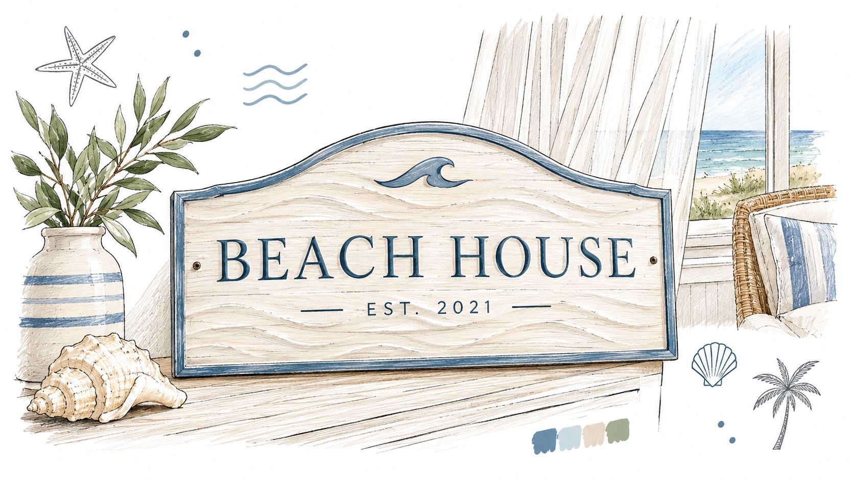
Start with the information the sign genuinely needs. A property name may be enough at a visible entry, while a gate sign may need a house number or street name. A family name and monogram can work when the sign is primarily decorative, but combining too many lines often produces a crowded result.
Use hierarchy instead of decoration
Give the most important wording the strongest visual position. A practical arrangement might place the house name in a larger serif or restrained sans-serif typeface, followed by a smaller address line and a subtle monogram. Leave generous negative space around the lettering. Empty space isn't wasted space, it keeps the sign legible and makes the finish feel deliberate.
Avoid thin lettering if the sign will be viewed from a driveway or road. Fine strokes can disappear against textured siding, while overly heavy script can become difficult to read. Before approving artwork, test the design at the intended viewing distance and in the actual exterior color.
For broader visual guidance, these graphic design tips from MyImageUpscaler offer useful reminders about composition, contrast, and image preparation. Those fundamentals apply even when the final design is simple.
A weathered finish can complement cedar shingles, stone, or painted clapboard, but artificial distressing should be controlled. One restrained texture is usually more convincing than several competing effects. The same applies to color. A soft sand background with charcoal lettering can feel coastal without announcing a theme, while seafoam or driftwood tones can echo the surroundings without copying them. For a related perspective on metal signage and restrained rustic styling, see these farmhouse metal sign ideas.
Choosing the Right Size and Color Palette
Scale the sign to the surface, not to the amount of text you want to include. A large name on a narrow pier can feel crowded, while a small plaque on a broad gable disappears. Farmhouse World commonly offers personalized metal signs in sizes ranging from 12 to 36 inches, which creates useful flexibility for doors, porches, gates, and larger exterior walls.
Measure before choosing the artwork
Use masking tape to mark the proposed width and height on the wall. Stand where visitors will approach from, then check the sign from the driveway, sidewalk, and street if it needs to function as an identifier. Measure the clear mounting area, including trim, light fixtures, railings, door swings, and any surface irregularities.
A useful selection sequence is:
- Mark the footprint: Outline the proposed dimensions with tape and view it at different distances.
- Check the architecture: Keep the sign aligned with porch posts, door centers, window lines, or gate panels.
- Reserve hardware space: Allow room for standoffs, screw heads, and tool access around the perimeter.
- Test the lettering: Make sure the smallest line remains readable against the chosen background.
- Review the surroundings: Look at the sign beside siding, landscaping, shadows, and exterior lighting.
Color should support contrast and material, not compete with either. Black or copper can stand out against pale siding and natural wood, while white or silver may sit more softly within a minimalist facade. A deep blue or green can work when it echoes shutters, doors, or planting, but it should have enough tonal separation from the wall to remain visible.
Sun exposure changes the result throughout the day. Review a finish in morning and afternoon light, and don't judge it only against a digital screen. A muted color that looks refined in shade may lose definition on a bright wall, while a high-contrast combination may appear harsher than expected once installed.
Mounting Hardware and Installation Best Practices
A sign can have excellent metal and still fail early if its mounting points trap moisture. The most reliable installation creates a small, open gap behind the panel, allowing drainage and air circulation. Standoffs are preferable to a flat-back installation because they reduce contact between the sign and wet siding, masonry, or wood.
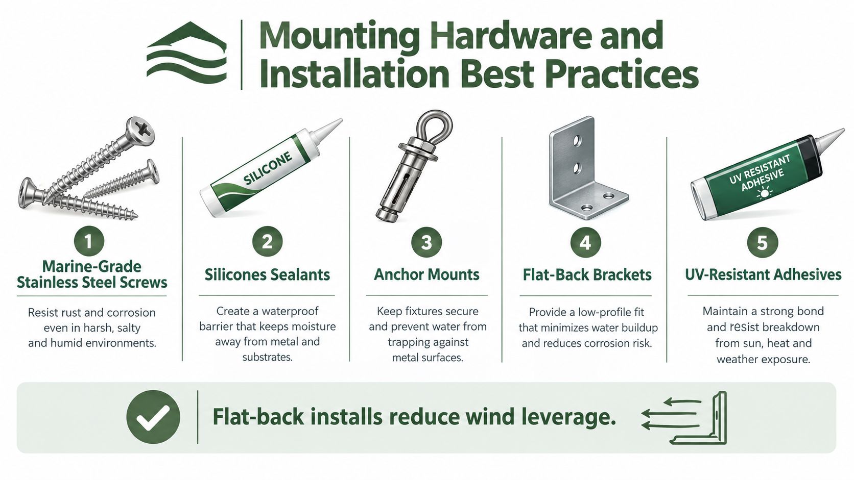
Use 316 stainless steel hardware at directly exposed coastal sites when the signmaker can supply it. Even stainless steel can suffer localized attack when a crevice holds moisture, so avoid enclosed brackets, blocked drainage paths, and hardware that presses tightly against the panel. Sealant can help around appropriate penetrations, but it shouldn't be used to create a waterproof pocket that has nowhere to drain.
A sound installation sequence
- Confirm the substrate: Identify whether you're drilling into siding, sheathing, masonry, or a structural post. Select anchors for that material rather than relying on a universal plug.
- Lay out the holes: Use the approved drawing and check every hole against trim, wiring, pipes, and framing.
- Install the standoffs: Keep the gap consistent so the sign doesn't twist or rub against the wall.
- Use compatible fasteners: Match the screw, washer, anchor, and standoff materials to the coastal exposure.
- Protect penetrations: Apply an exterior-rated sealant where appropriate, while preserving drainage below the sign.
- Tighten without distortion: Over-tightening can deform thin metal, damage coatings, or close the drainage gap.
- Inspect the edges: Confirm that no sharp cut edge, exposed core, or trapped debris remains around the mounting points.
Flat-back mounting can reduce wind load in some applications, but it also creates the moisture problem that damages coastal hardware. The installation needs to balance wind resistance with drainage, and the correct solution depends on the wall and sign construction. For a visual checklist of hardware roles, review the infographic above before handing the work to a contractor.
A sign installer should also inspect the finished piece under real lighting and from the approach route. A panel that looks centered on a workbench may appear low beside a door, or may cast a shadow that reduces legibility once mounted.
Proofing Your Design and Long-Term Maintenance
Most expensive sign errors happen before installation. A disciplined proofing process checks the content, artwork, dimensions, and production file before anyone cuts metal or applies a finish. Signage guidance recommends confirming file type, CMYK color space, outlined fonts, image resolution, bleed, and safety margins, then comparing every name, address, and number with the original order.
For close-viewing signs, the stated benchmark is 150 to 300 DPI at final size, while large-format work may be acceptable at around 100 DPI depending on viewing distance, as outlined in signage proofing guidance. Require written approval or a hard proof for a high-risk order. Check rich black on small lettering, RGB-to-CMYK shifts, drill-hole clearance, and the position of grommets before approval.
After installation, maintenance should stay simple and regular:
- Rinse salt residue: Use fresh water to remove surface buildup rather than allowing a salty film to remain.
- Inspect clearances: Check that the sign still stands away from the wall and that fasteners haven't loosened.
- Examine coating edges: Look for scratches, bubbling, pitting, or exposed metal around holes and corners.
- Review after severe weather: Wind and driven rain can shift hardware or force debris into gaps.
A proof is the sign's first inspection, and maintenance is its continuing inspection. Treat both as part of one lifecycle, and small problems are far easier to correct than hidden corrosion or a lettering error discovered after installation.
Farmhouse World offers personalized metal signs with options for names, addresses, monograms, sizes, colors, and design variations, making it a practical place to compare a coastal sign with your exterior before ordering. Visit Farmhouse World to review personalized signage and coordinate a refined beach-house look with other farmhouse or coastal decor.


