

You've found the perfect spot beside the driveway, chosen a handsome rustic design, and pictured your family name above the lake road. Then the sign arrives, and the ornate lettering disappears in afternoon glare. A season later, moisture sits behind the panel, the finish starts fading, and the hardware loosens every time the wind picks up.
A personalized lake house sign should do more than look charming in a product photo. It needs to identify the property, remain readable from the intended distance, suit the local climate, and stay securely mounted. The right sign balances sentiment with practical decisions about scale, contrast, material, drainage, and hardware.
Table of Contents
- Why Personalized Lake House Signs Need Functional Planning
- Selecting Size and Material for Your Lake Location
- Choosing Fonts and Wording for Maximum Legibility
- Navigating Color Options and Finishes
- Mounting Hardware and Installation Best Practices
- Ordering Your Custom Sign with Confidence
Why Personalized Lake House Signs Need Functional Planning
A sign that looks perfect online can fail at the property entrance. Product photos show the panel close up, under controlled lighting, without passing vehicles, lake glare, rain, or wind. Your driveway exposes every weakness in the design.
Consider a distressed metal plaque with flowing script, a dark background, and a family name stretched across the panel. Above a porch bench, it may look excellent. From the road, textured lettering can disappear until drivers have passed the entrance. An untreated edge paired with indoor screws creates another predictable problem. Rain and condensation reach the openings, then rust spreads around the hardware.
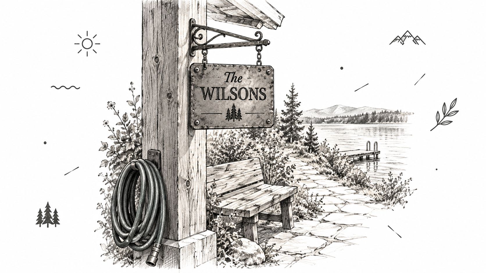
Start with the viewer, not the trend
The U.S. Access Board identifies viewing distance, character height, font proportions, contrast, surface finish, lighting, shadows, and background uniformity as key factors in legibility. Apply those principles to a sign read from a driveway, road, dock approach, or long garden path, even when a private residential sign does not have to meet every accessibility provision. The Access Board's sign guidance provides a practical benchmark for judging how clearly people can decode the lettering.
Stand at the point where visitors will read the sign before selecting its finish. Check the panel in daylight, at dusk, and with the sun low behind or beside it. If the primary name does not stand out immediately, a more decorative font will not rescue the layout.
Practical rule: Treat the sign as property identification first and decoration second. A beautiful sign that nobody can read has failed its main job.
Personalization creates a real design responsibility
A personalized sign is a permanent commitment. The maker reproduces the wording and layout you approve, so choose information that will remain useful and make the primary identifier dominant. A family name, lake name, address, established date, or short welcome message can turn a generic rustic plaque into a meaningful keepsake. Personalized gifts are part of a broad market estimated at USD 33.42 billion in 2025, although that estimate covers personalized gifts generally rather than lake signs specifically. Read the personalized-gifts market estimate.
Make the property's real viewing conditions the design test. Put rustic character into the finish and silhouette, while protecting legibility, weather performance, and secure installation. That approach produces a sign that looks appropriate at the lake and still performs when glare, moisture, and distance put it under pressure.
Selecting Size and Material for Your Lake Location
Sign size isn't a style decision alone. It follows from where the sign sits, how far away the viewer stands, and what the outdoor environment does to the surface.
A driveway marker viewed from a short approach needs a different layout from a plaque beside a porch. A sign along a lakeside path may need larger lettering than a wall plaque because the viewer is moving, partially distracted, or approaching through changing light.
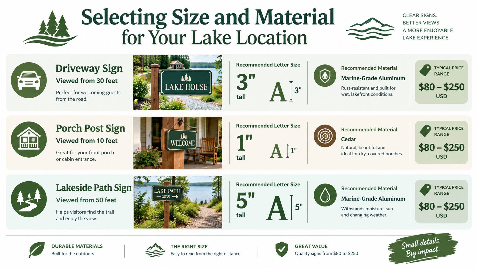
Match letter height to viewing distance
Use the farthest unobstructed viewing point as your starting measurement. Don't measure from the spot where you expect to stand for a photo. Measure from the driveway entrance, road edge, dock approach, or path location where people will read the sign.
A practical design brief can look like this:
| Location | Viewing condition | Design priority |
|---|---|---|
| Driveway entrance | Moving vehicle or distant approach | Large primary name, high contrast, simple type |
| Porch post | Close pedestrian view | More decorative detail is possible |
| Lakeside path | Longer approach with changing light | Oversized lettering and an uncluttered field |
Keep the family or property name as the largest line. Put the address, established date, or secondary phrase beneath it only if the panel has enough space. Compressing several lines into a small sign creates the exact problem buyers are trying to avoid.
Choose material for exposure, not just appearance
An inland freshwater property still deals with UV exposure, rain, humidity, condensation, wind, and freeze-thaw cycles. A coastal lake property adds salt spray and a more aggressive corrosion environment. High-altitude sites may experience intense sunlight and rapid temperature changes, while humid locations can trap moisture behind a poorly spaced panel.
The sign material matters, but it isn't the only durability factor. Orientation, drainage, finish quality, edge treatment, and fasteners often determine whether the material performs well. A horizontal sign can hold water and debris. A south-facing panel may fade faster. A sign mounted tight against damp siding can trap condensation.
For metal plaques, ask about the coating, exposed cut edges, drilled holes, and compatible fasteners. If you want a deeper explanation of plaque construction and engraving choices, this industrial plaque engraving guide is a useful technical reference. For general rust prevention around outdoor metal, review this guide to protecting metal from rust.
Make the specification climate-specific
Use a sealed, appropriately coated metal sign near persistent moisture. Select corrosion-resistant fasteners, keep the panel off the wall with suitable spacers, and provide a route for water to drain. Cedar can suit a sheltered, dry porch, but it still needs a finish and maintenance plan. A “weather-resistant” label doesn't mean maintenance-free.
Your order specification should identify the exposure, not merely say “outdoor use.” Tell the maker whether the sign will face a road, sit near freshwater, hang under a roof, or stand fully exposed on a post. That information should influence the panel, coating, hardware, and mounting method.
Choosing Fonts and Wording for Maximum Legibility
A sign that looks elegant on a product page can disappear beside the road. Choose a broad, clean typeface with consistent strokes. Thin scripts and delicate details lose clarity through distance, glare, shadows, and passing movement.
Put one identifier in charge
Choose one primary message:
- Family name: A strong choice for a long-term family cottage.
- Property name: Suits a rental, shared retreat, or home that may change ownership.
- Lake name: Works when the location matters more than the surname.
- Address: Helps visitors find the property, but display only the personal information you need.
- Short phrase: Suitable for a close porch sign, less effective as a driveway marker.
A surname can sit neatly with an established year. Adding the surname, lake name, address, slogan, coordinates, and decorative quote creates competing entry points. Give the viewer one clear phrase to read first.
For family-name layout ideas, browse this last-name sign guide for the home, then simplify the design to match the distance from the road or driveway.
Build contrast before adding character
Use dark lettering on a light field or light lettering on a dark field. Keep woodgrain, distressed texture, and multicolor effects away from the area behind the words. Non-glare surfaces and clear separation between letters and background make the sign easier to read, especially for viewers with limited vision.
Avoid thin strokes, tightly packed capitals, elaborate swashes, and lettering that changes color within a word. Faux-rust effects may look appealing in a close product photograph, but broken edges become difficult to decode from a vehicle.
Treat the preview as the production brief
Read the personalization preview slowly before approving it. Check every letter, space, apostrophe, date, abbreviation, and capitalization choice. Confirm punctuation with the maker, and do not assume a hyphen will appear exactly as it does in the mockup. If the layout feels crowded, shorten the wording rather than shrinking the type. Use a period or slash only when it remains clear and fits the phrase.
Save the approved wording with your order. A sign maker can reproduce submitted text, but cannot fix a family spelling error after production begins. Permanent exterior signs benefit from plain wording that remains readable and still makes sense if the property changes hands.
Navigating Color Options and Finishes
Color should support the lettering, not compete with it. A copper-toned sign may suit a warm timber exterior, while black can provide a strong farmhouse contrast. Neither choice works if the background disappears into dark siding or reflects sunlight directly into the viewer's eyes.
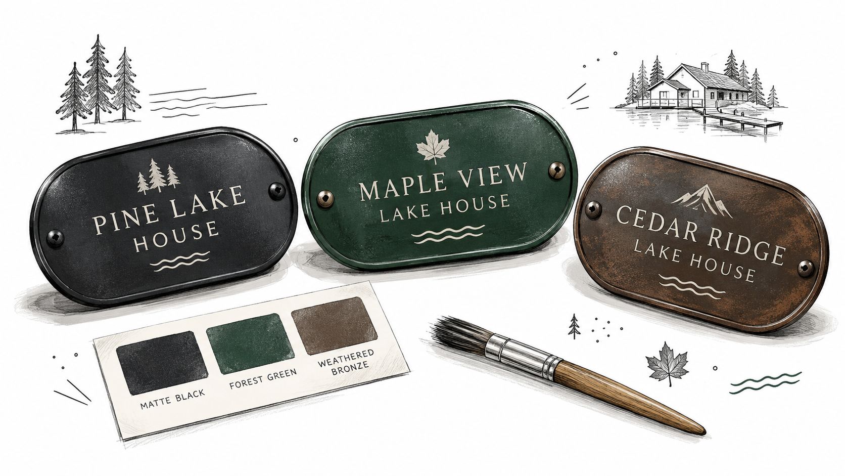
Compare finishes by what the viewer sees
| Finish choice | Strength | Risk |
|---|---|---|
| Matte | Reduces reflections and supports steady contrast | May look less glossy in close-up photos |
| Satin | Adds a controlled sheen without excessive glare | Still needs testing in direct sun |
| High gloss | Can produce a polished decorative effect | Reflections may obscure letters outdoors |
| Distressed texture | Adds rustic character | Can break up letter edges and reduce clarity |
A matte or satin surface is usually the safer outdoor choice, particularly beside open water or a bright driveway. High-gloss finishes can reflect low-angle sunlight and make a readable design look washed out from one direction.
Make the sign stand apart from the building
A dark sign against dark cedar siding will recede. A light sign against pale siding may lack enough separation. Hold a printed color sample or a piece of painted board against the mounting location before you order. Check it from the road, not only from the porch.
Metallic tones require extra care because reflections change throughout the day. If you choose copper, gold, or silver, keep the lettering simple and avoid placing a glossy letter over a similarly reflective field. The more reflective the surface, the more important the viewing test becomes.
Keep the finish tied to the architecture
Use the house, post, roof, trim, and surrounding scenery as the palette. A lake house sign should feel connected to the property, but it shouldn't vanish into it. A controlled contrast usually looks more intentional than an exact color match.
For an exposed location, ask whether the finish is powder coated, how the edges are treated, and whether the maker recommends touch-up care. Those details matter more than a small difference between two fashionable color names.
Mounting Hardware and Installation Best Practices
A sign can have a durable panel and a sound finish, then fail because the installer uses the wrong screws or anchors. Installation begins with the substrate, not the sign.
A porch post, timber frame, masonry wall, vinyl siding, and plasterboard each require a different fixing strategy. Mounting only into siding is a common mistake because the siding may not carry the wind load or the weight of the panel. Locate structural framing where possible, or use anchors designed for the actual wall material.
Choose the method for the site
Magnetic hanging hardware works for compatible metal surfaces and makes removal or seasonal repositioning convenient. It isn't the right choice for every exposed sign, especially where wind can lift or rotate the panel.
Drilled mechanical fasteners provide a more secure permanent installation when the holes are correctly placed and sealed. Use corrosion-resistant fasteners compatible with the sign material. Dissimilar metals can accelerate galvanic corrosion, particularly where moisture remains trapped.
Post mounting needs more than a decorative post sleeve. The post, frame, brackets, and ground connection must suit the panel size and local conditions. For larger panels, a perimeter frame and multiple mounting points can reduce flexing, but the pattern must match the post or wall structure.
For a temporary indoor display or a lightweight panel, the magnetic hanging hardware for metal art may be suitable. If you're fixing a sign to plasterboard, consult this guide to plasterboard anchors before selecting a fastener.
Seal the weak points
Before installation, inspect every drilled hole and cut edge. Seal or touch up exposed metal, keep drainage space behind the panel, and avoid placing holes too close to an edge. Install spacers when they prevent water from sitting between the sign and wall.
A municipal outdoor-sign specification requires signs and mounting devices to withstand at least 30 psf normal wind pressure, or more where local code requires, and calls for stainless-steel, tamper-resistant fasteners. It also says exposed hardware should be touch-up painted as needed. This is an engineering benchmark, not a universal residential requirement, so verify local wind, setback, and placement rules before installation. Review the municipal outdoor-sign specification.
Inspect the installation annually
Check for loose screws, coating scratches, rust around fasteners, trapped moisture, and movement in the panel. Near freshwater, pay particular attention to condensation and drainage. Near a marine environment, inspect more often and prioritize hardware intended for corrosive exposure.
The right workflow connects the personalization preview to the installation plan. Confirm the panel dimensions, identify the substrate, choose compatible hardware, and only then finalize the design. A sign ordered without a mounting plan often leads to improvised drilling, visible damage, or an expensive replacement.
Ordering Your Custom Sign with Confidence
Order only after you can answer five practical questions:
- What will the sign say? Check names, dates, punctuation, spacing, and capitalization.
- Where will it hang? Record the wall, post, porch, driveway, or path location.
- How far away will it be read? Use the farthest realistic viewing point.
- What will the weather do there? Note sun, rain, humidity, freeze-thaw exposure, wind, and spray.
- How will it be fixed? Confirm anchors, screws, spacers, framing, and drainage before production.
Custom metal signs are made to order, so production and delivery require more planning than an off-the-shelf decoration. Verify the finished dimensions against the available mounting space, including room for brackets and hardware. Read the return policy carefully because personalized products may not be returnable after production begins.
Keep the finish clean with a soft cloth and mild soap when needed. Avoid abrasive pads that can scratch the coating. Inspect the sign after severe weather and touch up exposed edges or hardware before corrosion spreads.
Farmhouse World offers personalized metal signs with choices for names, dates, designs, sizes, and colors, along with farmhouse and coastal-style home accents. Visit Farmhouse World with your wording, viewing distance, climate exposure, and mounting plan ready, then choose a sign that looks good and performs properly at the lake.


