

You're standing in the entryway with a tape measure, looking at the blank wall above the console. A family-name sign sounds right, but you don't want the finished room to look like a collection of wedding decorations. You want something personal that belongs with the furniture, not something you have to decorate around forever.
That's the right concern. Personalized wall art with names is an interior design decision first and a personalization purchase second. Before you type a surname into a preview box, decide where the piece belongs, what deserves attention, and what you're willing to remove.
Table of Contents
- Why Personalized Name Signs Change a Room More Than You Think
- Measure the Wall and the View First
- Choosing a Font and Finish That Actually Last
- Proofing Your Custom Text the Right Way
- Styling Tips So the Sign Does Not Overpower the Room
- Hanging and Outdoor Installation Without a Trip to the Hardware Store Twice
- Packaging, Shipping Realities, and Gift Presentation
Why Personalized Name Signs Change a Room More Than You Think
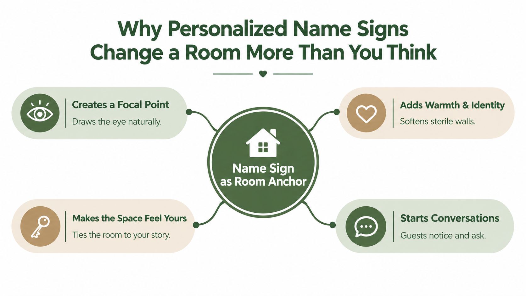
A name sign doesn't arrive emotionally neutral. A picture can sit behind a chair, but your surname announces something about the people who live there. Give that announcement a clear purpose.
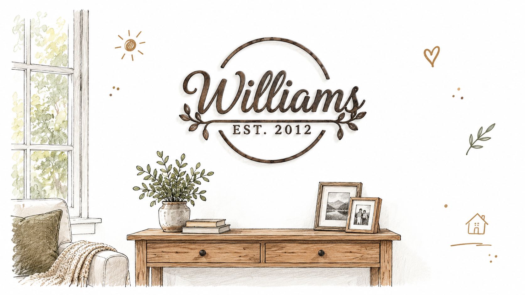
Consider an entryway with a wood console, a lamp, a basket, and family photographs. A decorative plaque containing a surname, date, slogan, and elaborate border asks you to notice another collection of details. A simple monogram above the same console gives the arrangement a center without repeating the entire family story.
My recommendation is to choose the sign's job before choosing its wording. Is it welcoming guests, identifying the property, or making a bedroom feel like someone's own space? Those are different jobs, and they shouldn't produce the same design.
Choose an anchor, not another accessory
The broader category is substantial. Grand View Research estimates global wall-art revenue at USD 61.0 billion in 2025. That establishes the scale of wall décor, not a reason to fill every available wall.
Use the following distinction when shopping:
- An anchor gives the surrounding arrangement a clear center and leaves supporting objects somewhere quieter to sit.
- An accessory adds another shape, phrase, or finish without improving the arrangement.
- A distraction pulls attention away from something you already love, such as an antique cabinet or architectural feature.
This is the role a named piece should play.
Keep the meaning and edit the decoration
I'd choose a restrained initial over an elaborate plaque when the room already contains patterned textiles, distressed furniture, and collected objects. The initial still makes the room personal. It doesn't demand that every nearby object participate in the announcement.
The name is the personal part. It doesn't need decorative proof that it matters.
Choose the emotional detail you care about most. Let the room supply the rest of the character.
Measure the Wall and the View First
A surname can look perfect on a product page and still read like wallpaper from the sofa. Measure for the room you live in. Thumbnails lie.
Start where your body goes. Stand in the doorway, sit at the table, then take the normal path toward the kitchen; the sign has to hold up from those angles, with the lamp lit and the console crowded, because a named piece either settles the wall or starts arguing with everything near it. Bring a tape measure, painter's tape, paper, and your phone. Record usable width after door swings, trim, switches, sconces, tall lamps, and shelves are removed from the equation, then tape the full silhouette and photograph it with the furniture below in place.
If two positions compete, choose the one people see first when they enter.
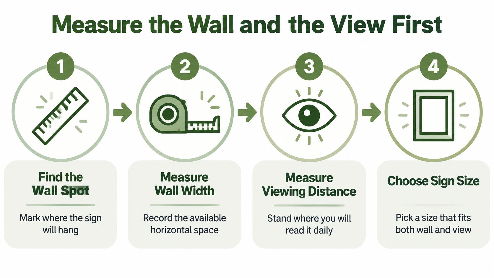
The taped outline tells you whether the sign fits. The view tells you whether the name survives. Leave quiet margin inside the border; overall dimensions can hide a very small surname once scrollwork, animals, machinery, or a frame take their share. If the listing gives only total size, ask for approximate capital-letter height and mock up the layout at actual size before you pay.
Use legibility as a reality check: Federal Highway Administration sign-legibility research supports an approximate benchmark of 30 feet of readable distance per inch of capital-letter height, which makes 0.5-inch capitals readable around 15 feet and 1-inch capitals around 30 feet; residential art is easier, so treat that as a floor for readability rather than a decorating formula. From your measured spot, the name should register immediately. If you have to concentrate, enlarge the lettering area or simplify the design.
Buy the layout that gives the name room to read. A neat outline that shrinks the surname will fight the room every day.
Choosing a Font and Finish That Actually Last
A font and finish have to work together. Delicate lettering in a low-contrast color might look lovely in a tightly cropped preview and disappear against your actual wall.
My starting point for farmhouse interiors is a clean serif or uncomplicated sans-serif, paired with a finish that clearly separates the letters from the background. Script is a deliberate exception, not the default.
Match the typeface to the actual name
A serif brings a traditional character without requiring ornamental loops. I'd choose it for a family surname above an antique chest or in a room with substantial wood furniture.
A sans-serif makes sense when you want the name to feel quieter and more architectural. It's my preference for modern farmhouse interiors, address displays, and compositions where the surrounding objects already provide plenty of rustic texture.
Script needs more scrutiny. Inspect the joins between lowercase letters, the open spaces inside letters, and the beginning and ending flourishes. For a long surname or a child's full name, I'd take clear lettering over romantic curls.
Font and Finish Combinations That Read Best
These are styling recommendations, not finish-performance ratings.
| Style | Best Finish | Readability | Best Setting |
|---|---|---|---|
| Clean serif | Matte black on a pale wall | Strong when strokes remain distinct | Traditional entryway or living room |
| Simple sans-serif | White against a dark background | Easy to assess at a glance | Modern farmhouse or address display |
| Restrained script | A contrasting, non-reflective finish | Depends on letter joins and spacing | Bedroom or close-view display |
| Decorative monogram | Black or white chosen for contrast | Strongest with an uncluttered outline | Small transitional space |
| Ornate lettering | Copper or gold only after a wall test | Must be checked under actual lighting | A room with restrained surrounding detail |
Choose color for the wall, coating for the location
I treat matte black and white as the safest styling starting points, not universally superior finishes. Black suits a pale background; white deserves consideration on a dark door or wall. Check either against the actual paint color rather than assuming a neutral will automatically work.
Copper and gold need a reason to be there. I'd use them when an existing fixture, frame, or furniture detail establishes that warm-metal direction. Don't introduce a new metallic finish because it looks impressive in the product photograph.
For a themed option, Farmhouse World's Personalized Classic Tractor Metal Sign combines a family name and established date with a tractor design. Its listing specifies laser-cut mild steel, powder coating, and indoor or outdoor use. That makes it a relevant option for an agricultural setting, but the tractor should connect to the home rather than merely fill the wall.
Don't rank outdoor durability by color alone. Ask about the coating, exposure limits, cleaning instructions, and treatment of damaged areas. A color swatch can help you choose the look; it can't establish how a finish will perform on your particular porch.
Proofing Your Custom Text the Right Way
A client of mine once approved a preview reading "The Henderson's," spotted the stray apostrophe only after the steel arrived, and paid for a second sign. Proofing is the cheapest step in the entire project, and somehow the one buyers rush.
Personalization is ordinary purchasing behavior now: YouGov reported that 26% of Americans had personalized a product. That familiarity breeds sloppy approvals. People skim the preview, recognize their own name, and assume it's right.
Check the words before you check the look
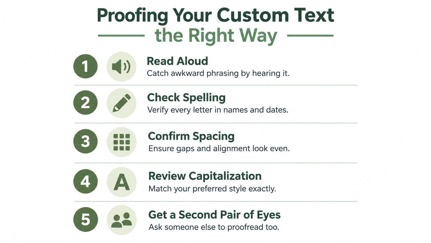
Build a written master copy first, covering exact capitalization, punctuation, apostrophes, diacritics, and date format. Every preview gets compared against that document.
Then run five checks in order. Pull the text from a reliable record rather than an old message thread or someone's memory of the address. Preview your actual name, because a sample surname won't show how your longer one fits the layout. Study line breaks, spacing, orientation, and approximate finished dimensions. Approve explicitly and save a dated screenshot. When the sign arrives, compare it against the order record character by character, since memory edits itself.
Read the name aloud, then look away and check it again. Hand the proof to someone who hasn't been told what it's supposed to say.
Now the apostrophe question, which comes up constantly. The Smiths names the family. Smith's claims ownership. Signs attract stray apostrophes the way porch lights attract moths, so question every single one.
Confirm what an established date represents. A wedding year, a farm's founding year, and the year a house was purchased tell different stories, and the wrong one gets cut into steel just the same. On an address plaque, verify the house number separately from the decorative wording.
Farmhouse World's tractor listing excludes emojis and emoticons and warns that certain punctuation, including hyphens, may not appear, recommending periods or slashes instead. Push back before dropping a hyphen from a legally hyphenated name. Correct spelling beats template convenience every time.
Retailers managing these customization options online can find related guidance in RankEngine tips for customization SEO. Your job as a buyer is simpler: the preview you approve is the text they manufacture. Make it right.
Styling Tips So the Sign Does Not Overpower the Room
My strongest styling recommendation is subtraction. Before adding greenery, another framed phrase, or a seasonal garland, hang the name sign and look at it with the furniture alone.
This arrangement shows the starting point I'd use: a named piece with a clear relationship to the console below.
Let room function determine the personalization
An entryway suits a surname, initial, or address because identification belongs near arrival. Keep everyday necessities usable; a beautiful arrangement that blocks the key tray is poor styling.
In a living room, choose between the name sign and another emotionally prominent display on that wall. I wouldn't crowd it between wedding portraits and a large family quotation.
For a bedroom, use first names or initials if they feel appropriate to the people sleeping there. Avoid turning a restful wall into a record of every milestone. In a child's room, consider whether the wording will still feel comfortable as their interests change.
A kitchen usually benefits from a quieter named piece, especially where shelving, cookware, and patterned textiles are already visible. On a porch, let the sign relate to the doorway or seating arrangement rather than surrounding it with unrelated seasonal messages.
Make the supporting pieces quieter
Try an odd-number grouping if the arrangement feels stiff, but don't treat that as permission to add objects. A lamp and a modest bowl may provide all the support a sign needs.
- Repeat a material. Echo the console's wood or an existing metal detail.
- Vary the silhouettes. Avoid surrounding a round monogram with more similarly sized circles.
- Remove competing words. Let the personalized piece carry the wall's written message.
For broader composition options, browse these farmhouse wall décor ideas. If you're deciding between a surname and a phrase, the word art decor ideas from That Blanket Co. provide another direction to consider.
Use the video as a prompt to evaluate arrangements, not as a shopping list to reproduce.
Leave something out. An arrangement doesn't become personal by displaying every meaningful possession at once.
Hanging and Outdoor Installation Without a Trip to the Hardware Store Twice
A sign hung two inches too low reads as an afterthought, whatever it cost. Placement is a design decision: the piece should sit in clear relationship to the console beneath it or the doorway beside it. A sign floating in the middle of empty drywall always looks misplaced. Settle the position before you touch a drill.
Collect four facts before the package arrives: the sign's weight, its attachment method, your wall material, and the hardware that combination demands. The tractor listing mentioned earlier states that mounting hardware isn't included, so assume nothing about hooks or anchors shows up in the box.
Take the product specs and a photo of the wall to the hardware store, then match the fixing to the surface.
| Wall surface | What to use |
|---|---|
| Drywall | Framing where possible; otherwise anchors rated for drywall and the sign's weight |
| Plaster | A fixing made for the underlying construction, never a drywall anchor |
| Brick | Masonry fasteners with instructions matched to that mounting spot |
| Wood paneling | Whatever holds whatever sits behind the paneling; the visible surface alone won't carry it |
Renting? Get permission for the attachment you plan. Adhesive hangers work only when the manufacturer rates them for your weight, surface, and conditions.
Outdoor mounting is a separate decision. An outdoor-rated finish still fails early if the mount traps water against the wall, so ask the maker whether it needs spacers for drainage or airflow rather than guessing at a universal gap. Walk the spot first: where rain runs off the roof, whether irrigation hits the wall, whether you can reach the sign for a seasonal check. Follow the seller's care guidance on strong sun and coastal air, and treat "weatherproof" as "weather-resistant with upkeep." This guide to protecting metal from rust covers the maintenance side, but confirm approved cleaning and touch-up methods for your specific finish before you spray or coat anything.
For the hang itself, work slowly once. Trace a paper template, tape it up, mark the fixing points, and check level before drilling. Hang the piece, check level again, and inspect the attachment from the side for gaps. Then do the only check that matters: stand where people see the room and confirm clearance above furniture and around doors. If the sign anchors the wall from that spot, you measured right.
Packaging, Shipping Realities, and Gift Presentation
A custom sign fails as a gift the moment it arrives late, bent, or with a misspelled name. Production time and delivery time are two separate clocks, so ask about both before you promise anyone a handoff date.
The tractor listing mentioned earlier puts personalized metal sign shipping at 7–10 business days, with slower turnarounds through November and December. Treat that as a window, not a delivery guarantee. Order earlier than you think you need to, and build in a day to inspect the piece before it gets wrapped.
Plan the handoff before checkout
- Before ordering. Confirm the recipient's exact wording, display wall, and preferred style. These personalized housewarming gift ideas help when the occasion is still fuzzy.
- After arrival. Inspect the finish and text before wrapping anything. Keep the protective packaging until the piece passes that check.
- Before gifting. Wrap with clean, soft material, keep tape off the finish, and tuck the care instructions and mounting information inside the box.
A printed proof makes a nice keepsake. Installation clarity matters more. If the recipient has to guess which screws or anchors the sign needs, you have handed them a chore, not a gift. Include a note naming the wall you pictured it on, because a named piece only works when it lands where it can anchor the room.
The retailer lists free shipping on orders over $49 and a support line at 888-886-1005, as noted earlier. Call with timing or product questions before ordering, especially when the gift has a hard deadline.
Farmhouse World sells personalized metal signs and farmhouse accents for family spaces, entryways, and outdoor walls. Bring your wall measurements and exact wording, then choose a named piece that anchors the room instead of just filling it.


