

You've found the sign you want, placed it in your online cart, and then the practical questions start. Will the family name be readable from the driveway? Will the finish survive direct sun, rain, or salt air? Should the sign go on the porch column, the fence gate, or closer to the road with the address?
A beautiful plaque can still fail if it's too small, mounted against a damp surface, or designed without nighttime wayfinding in mind. The right approach to personalized family name signs for outdoor use starts with the property itself. Placement determines viewing distance, viewing distance determines lettering, and the climate determines the material and finish.
Table of Contents
- Why Outdoor Family Name Signs Deserve a Real Plan
- Sizing, Lettering, and Finish Choices That Read From the Street
- Matching Material and Coating to Your Climate
- Prepping the Mounting Surface the Right Way
- Mounting Methods for Porches, Gates, and Posts
- Weatherproofing and Yearly Maintenance Habits
- Ordering, Proofing, and Balancing Style With Wayfinding
Why Outdoor Family Name Signs Deserve a Real Plan
A homeowner usually starts with appearance. The sign looks right in a product photo, so the next decision seems simple: choose a wall, drill a few holes, and hang it. That order causes many avoidable problems. The sign should be planned from the outside in, beginning with the location where people need to see it.
Choose the mounting position before choosing the plaque size. A sign beside a front door serves a different purpose from one at a long driveway entrance. The porch sign welcomes guests at close range, while the driveway sign must communicate the household identity across open space, changing light, landscaping, and weather.
Start with the site, not the font
Walk from the road or driveway entrance to the proposed mounting point. Note the farthest place where a visitor, delivery driver, or guest should recognize the sign. Then check whether trees, porch posts, parked vehicles, or seasonal plants will block the view.
A sign that looks elegant up close may disappear at the edge of the property. Thin lettering and ornate initials are especially risky when the name is viewed across a yard. Use a simple typeface with enough stroke weight to remain distinct in daylight, shade, and vehicle headlights.
Practical rule: If you can't read the family name from the same place a visitor will first look for the house, the sign is decorative only. It isn't doing the full job.
Homeownership creates a substantial audience for long-lasting exterior identity markers. The U.S. Census Bureau reported a 65.3% homeownership rate in the third quarter of 2025, meaning roughly two out of every three occupied households were owner-occupied, calculated at the household level rather than the individual level. That makes a family name, shared address, or homestead identity a practical unit for personalized exterior décor. The Census Bureau's quarterly housing report provides the relevant definition and current benchmark.
The market doesn't depend only on people buying their first home. Established homeowners replace weathered plaques, update an entry after renovation, and buy personalized signs for weddings, anniversaries, moves, ranches, hobby farms, and new households. The U.S. rate has stayed near two-thirds without returning to its early-2000s level, so personalization and practical value matter more than assuming ownership itself will expand demand. Historical homeownership data and context support that broader view.
Before ordering, write down four decisions:
- Placement: Porch, entry wall, gate, post, barn, coop, or driveway.
- Viewing distance: The farthest point from which the name must be recognized.
- Exposure: Sheltered, fully exposed, coastal, humid, sunny, wooded, or freeze-thaw.
- Wayfinding: Whether the sign will also display the street number or sit beside a separate address marker.
If the mounting surface needs repainting first, coordinate the sign installation with proper prep and timing for lasting exterior paint. Freshly painted surfaces need the right preparation and curing time before hardware or sealants go over them.
Sizing, Lettering, and Finish Choices That Read From the Street
A sign's overall width doesn't tell you whether its lettering will work. The important measurement is cap height, the actual height of the uppercase letters that carry the family name or address.
Measure the distance from the sign to the farthest viewing point. The U.S. Access Board offers a useful benchmark for signs mounted between 40 and 70 inches high: minimum character height is 5/8 inch for viewing distances under 6 feet, increasing by 1/8 inch for each additional foot beyond 6 feet. For signs mounted above 70 inches and viewed from 15 feet or more, the benchmark is 2 inches plus 1/8 inch for each additional foot beyond 15 feet. The U.S. Access Board signage guidance gives the full framework.
Build the proof around readable letters
Use the benchmark as a starting point, then test the actual design. A long surname needs more horizontal room than a short one, but squeezing the letters into a narrow plaque is the wrong solution. Increase the sign width or simplify the lettering before reducing spacing and stroke weight.
Sans-serif lettering usually gives the cleanest distant read. A moderately weighted serif can work on traditional farmhouse signs, but thin strokes, tightly packed initials, and elaborate script should stay reserved for close-range accents. The family name and street number need the strongest visual treatment, not the decorative border.
Contrast matters as much as size. The Access Board guidance recommends approximately 70% light-reflectance contrast for readers with low vision. Choose a background and lettering combination that separates clearly rather than relying on a fashionable tone-on-tone finish.
Use a street-view test before approval
Create a proof at the intended letter height. View it from the driveway entrance in daylight, then repeat the check from shade and under porch or pathway lighting. Glossy surfaces can produce glare, so a polished finish that looks rich in a close-up photograph may perform poorly when headlights or low sun hit the panel.
| Viewing Distance | Cap Letter Height | Minimum Sign Width | Best Contrast Choice |
|---|---|---|---|
| Under 6 feet | At least 5/8 inch when mounted between 40 and 70 inches high | Set by name length and comfortable spacing | Strong light-dark separation |
| Beyond 6 feet | Add 1/8 inch for each additional foot of viewing distance | Allow room for larger letters without crowding | High contrast with minimal glare |
| 15 feet or more, sign above 70 inches | Start at 2 inches, then add 1/8 inch per additional foot | Size for the longest name and address together | High contrast, uncluttered background |
For an address-and-name plaque, don't let the surname overpower the number. The name establishes belonging, while the address helps people find the property. Keep the number in a clear, high-contrast area and avoid placing it inside an ornate flourish.
Matching Material and Coating to Your Climate
Appearance is only one part of material selection. Choose the substrate for the harshest condition the sign will face, not for the mildest season when you place the order.
Aluminum is lightweight and corrosion-resistant, making it a sensible general outdoor substrate. It suits porches, garden walls, and many humid settings, but it can dent more easily than steel. Painted or galvanized steel offers good outdoor performance while its protective coating remains intact. Once that coating chips, exposed edges and drilled holes become vulnerable.
The practical production specification is straightforward: use aluminum or well-protected galvanized steel, specify a UV-resistant powder-coated or equivalent exterior finish, protect drilled holes and cut edges, and use corrosion-resistant stainless fasteners. Add a drainage gap so water can't remain trapped between the sign and the mounting surface.
Compare the material against the exposure
A shaded woodland porch and a sunny coastal gate aren't equivalent outdoor environments. Salt, sprinkler overspray, strong ultraviolet exposure, freeze-thaw cycles, and incompatible fasteners can shorten service life. A sheltered sign may need less intervention than one mounted directly against an exposed wall, even when both use the same metal.
The cited technical benchmark estimates typical service life of approximately 10 to 15 years for aluminum in standard outdoor conditions, 7 to 12 years for painted or galvanized steel, and 15 to 20 years for galvanized steel with regular inspection and touch-up painting. These are planning ranges, not guarantees. The outdoor metal sign material guidance explains the role of coatings, edges, drainage, and maintenance.
| Material | Coastal / Humid | Sun-Belt / Hot UV | Four-Season / Freeze-Thaw | Typical Service Life | Maintenance Level |
|---|---|---|---|---|---|
| Aluminum with exterior finish | Good choice when edges and holes are protected | Suitable with UV-resistant coating | Suitable where impact risk is controlled | Approximately 10 to 15 years in standard conditions | Low to moderate |
| Painted or galvanized steel | Works only while protective coating remains intact | Inspect for chips and exposed edges | Stiff and durable, but coating damage needs prompt attention | Approximately 7 to 12 years | Moderate |
| Galvanized steel with regular touch-up painting | Useful where stiffness and inspection access are available | Requires coating checks under strong sun | Suitable with regular inspection and repairs | Approximately 15 to 20 years | Moderate to high |
Don't treat untreated steel as weatherproof. Don't rely on a clear coat unless it's specifically rated for exterior ultraviolet exposure. For a farmhouse gate, ranch entrance, or chicken coop, drainage and edge protection often matter more than whether the finish is black, copper, silver, or another decorative color.
Outdoor consumers increasingly weigh practical performance against appearance. The International Casual Furnishings Association reported that 67% of surveyed consumers prioritized practicality and durability over style, while 59% planned to buy outdoor furniture or accessories in 2025. The association's 2025 trend report gives useful context for making durability a visible part of the buying decision.
Prepping the Mounting Surface the Right Way
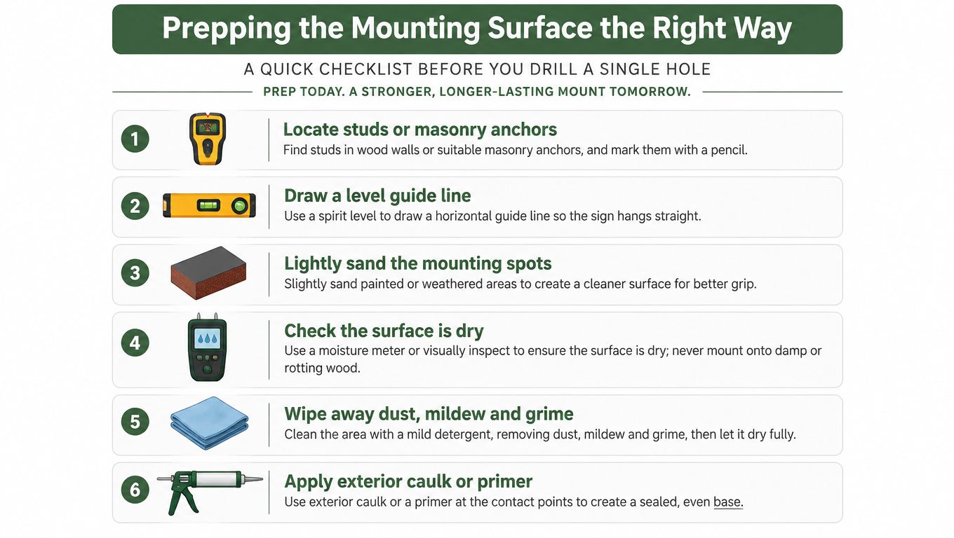
A sign is only as stable as the surface behind it. Before drilling, inspect the mounting area in daylight and treat surface problems as installation problems, not cosmetic inconveniences.
On wood, probe for soft spots and check whether paint is lifting around the proposed holes. On masonry, look for spalling, loose material, and hairline cracks. On a metal gate, remove surface rust at the contact zone and confirm that the surrounding metal isn't flexing under the sign's weight.
Clean, dry, and create an escape route for water
Degrease aluminum before applying any sealant. Sand flaking paint back to a firm edge. Remove dust and mildew with a mild detergent, and neutralize masonry efflorescence before allowing the surface to dry completely. Adhesives, primers, and caulks bond poorly to damp, chalky, or contaminated surfaces.
Leave a small drainage gap of roughly 1/8 to 1/4 inch behind the sign. This keeps wind-driven rain from pooling against the wall and gives the lower edge a chance to dry. Use spacers, washers, or a backing arrangement that creates separation without making the sign unstable.
On a fully exposed wall, angle the sign slightly downward so water sheds rather than rests on the top edge. A sheltered porch is usually the safer position when the chosen finish is decorative or the climate is especially wet.
Gather these supplies before installation:
- Layout tools: Tape measure, pencil, spirit level, and cardboard sign template.
- Surface tools: Mild detergent, soft cloth, sanding block, and a suitable brush.
- Hardware tools: Drill, pilot bit, masonry bit where required, screwdriver, and corrosion-resistant fasteners.
- Protection materials: Spacers, nylon washers, exterior-rated sealant, and compatible primer or touch-up paint.
Mounting Methods for Porches, Gates, and Posts
The correct fastener depends on the surface, not the sign's style. A rustic plaque mounted with the wrong hardware will still loosen, stain, or trap water.
For wood porch columns and railings, use stainless steel or ceramic-coated screws. Drill pilot holes first, especially near the edge of a narrow post, and place a small amount of butyl tape behind the sign to reduce moisture wicking. Don't over-tighten. Crushing the sign against the wood removes the drainage path and can distort the panel.
Brick, stone, and stucco require a masonry bit and the right anchor for the substrate. Plastic or lead expansion anchors can suit lighter installations, while chemical epoxy anchors may be appropriate where the masonry and sign load demand a more permanent connection. Mortar joints are often safer to drill than the brick face, but inspect the joint first. Loose or crumbling mortar won't hold an anchor reliably.
Match the hardware to the location
Metal driveway gates introduce a different problem. Dissimilar metals can encourage galvanic corrosion when moisture bridges the contact points. Nylon washers or rubber isolating grommets separate the sign from the gate and reduce direct metal-to-metal contact.
Fence posts need support at the back. Through-bolting works well when you can access both sides, while U-bolt brackets offer a practical alternative for posts that need a wraparound connection. Oversized signs should use a backing cleat or equivalent support so the panel doesn't sag between fasteners.
| Surface | Fastener Type | Isolation / Sealant | Common Mistake |
|---|---|---|---|
| Wood porch column or railing | Stainless or ceramic-coated screws with pilot holes | Butyl tape or exterior-rated sealant used without blocking drainage | Over-tightening into soft or splitting wood |
| Brick, stone, or stucco | Masonry anchors selected for the substrate | Exterior sealant around the penetration, without sealing in trapped water | Drilling into loose mortar or cracked masonry |
| Metal driveway gate | Corrosion-resistant bolts or screws suited to the gate | Nylon washers or rubber isolating grommets | Mixing metals directly at a wet contact point |
| Fence post | Through-bolts or U-bolt brackets | Spacers and a backing cleat where needed | Allowing a wide sign to sag under its own weight |
Use the same care for an address plaque as for a family-name panel. A coordinated address sign and post can move the number closer to the road when the house wall is too far back for reliable recognition.
Common installation failures are easy to prevent:
- Missing pilot holes: The fastener splits wood or wanders off the intended mark.
- Over-tightened hardware: The sign bows, the coating cracks, or water loses its exit path.
- Unsealed cut edges: Moisture reaches exposed metal and starts oxidation.
- Trapped sealant: A continuous bead behind the entire panel holds water instead of shedding it.
- Unsupported width: A large panel flexes at the center and pulls on its fasteners.
Weatherproofing and Yearly Maintenance Habits
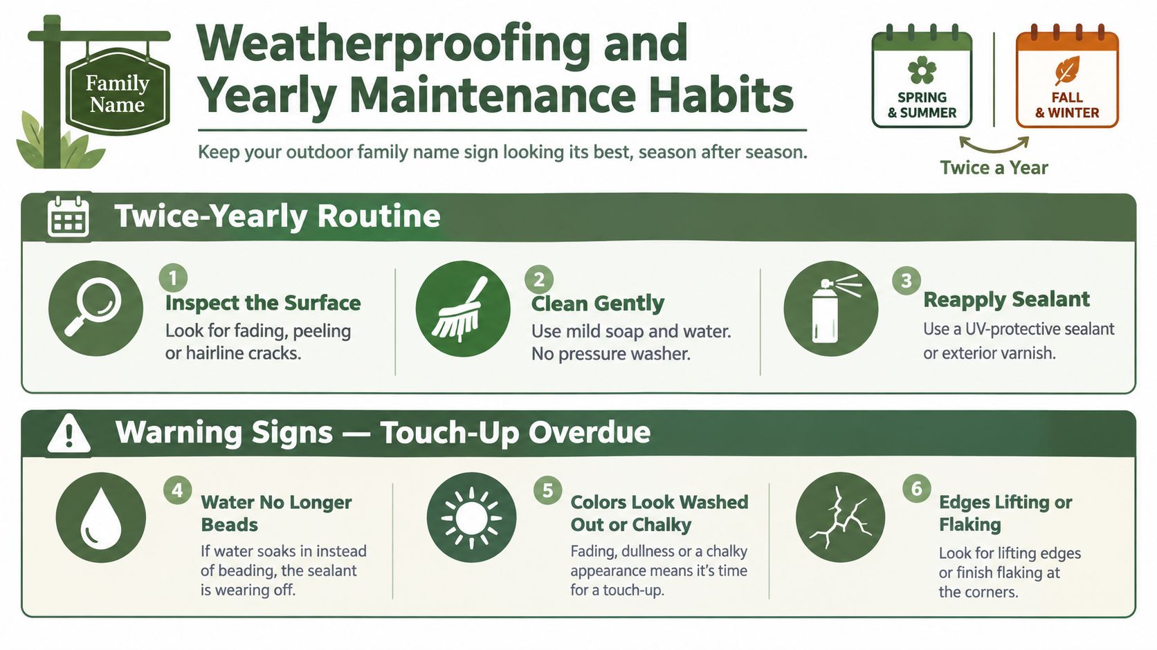
Outdoor signs don't need constant attention, but they do need inspection before small damage becomes structural damage. Make one pass in late spring after pollen and storms, and another in early fall before freeze-thaw conditions arrive.
Look for chalking, hairline coating cracks, fading around high-contrast lettering, rust blooms at fastener heads, and lifted edges. A dull patch that won't wash clean can indicate coating failure rather than ordinary dirt. Water staining behind the sign points to drainage or sealant trouble.
Clean gently and repair compatible coatings
Use mild soap, a soft brush, and clean water. A pressure washer can force water behind edges, lettering, and coatings, so keep it away from the sign. Let the surface dry before deciding whether a mark is dirt, fading, or a failed finish.
For a small chip, lightly sand the damaged area, apply a compatible exterior primer, and finish with matched exterior paint or an appropriate clear sealant. Don't paint over active rust or loose coating. Remove the unstable material first, then protect the exposed substrate.
A sign generally needs refinishing when the panel remains structurally sound but the coating has widespread dullness, peeling, or fading. Replace it when the substrate has serious corrosion, deep distortion, loose lettering, or mounting damage that can't be repaired without compromising stability.
Maintenance test: If the family name still reads clearly but the edges are beginning to lift, repair the coating now. Waiting for visible rust turns a small touch-up into a material problem.
Keep a simple annual record:
- Spring check: Clean pollen and residue, inspect fasteners, and look for storm damage.
- Summer check: Watch for fading, chalking, glare, and heat-related coating changes.
- Fall check: Clear leaves and vegetation, check drainage, and repair chips before wet weather.
- Winter awareness: Don't scrape ice against the sign or allow snow and meltwater to remain trapped behind it.
This short routine protects both the decorative family identity and the practical address element.
For additional metal-care guidance, use this resource on how to protect metal from rust alongside the inspection routine.
Ordering, Proofing, and Balancing Style With Wayfinding
Personalization should never make the address harder to find. Put the family name and house number on the same panel when the layout allows, or place them close enough that a visitor sees both as one address display. For a long driveway, a separate road-facing address marker may work better than forcing every detail into a porch plaque.
The design can include a last name, established date, monogram, or meaningful phrase. The street number deserves the clearest position and strongest contrast. If privacy is a concern, display the address without the full surname, especially when the sign is visible from a public road.
Treat the proof as an installation document
Send the exact spelling, punctuation, capitalization, and preferred font in writing. Confirm every character before production, particularly with double letters, initials, apostrophes, and house numbers that could be reversed or misread.
Request a digital proof at scale when possible. Check letter spacing, alignment, kerning, border clearance, fastener locations, and the relationship between the name and address. A pixel-accurate render can look convincing while still being misleading about physical size, so ask whether the proof represents the actual dimensions.
Reject a proof that has overlapping letters, hidden fasteners in a weak mounting area, low-contrast text, or a decorative border crowding the name. Test the approved design from the street angle, not only on a phone screen or from a few feet away.
The best sign does two jobs without confusing them: the family name creates welcome, and the address creates recognition.
For farmhouse-style personalization, last-name signs for the home can provide a useful starting point for comparing names, dates, monograms, and layout options. Farmhouse World offers customizable metal signs for family names, addresses, dates, and related farmhouse settings, so confirm the chosen design, finish, and intended placement before ordering.
Allow installation time to match suitable weather. Approve only the proof that matches the submitted details, then keep a copy of the final artwork with your maintenance notes. That small discipline prevents spelling errors, proportion problems, and a sign that looks charming in the product image but fails at the curb.
Choose the mounting location first, measure the actual viewing distance, and select the substrate for your harshest exposure. Farmhouse World offers personalized metal signs for porches, gardens, barns, coops, and other farmhouse settings, so visit Farmhouse World to compare family-name and address designs before you place your order.


