

You've painted the room, pushed the sofa into place, and the wall above it is still blank. One small picture looks lost, two vertical prints look cramped, and that wide empty span keeps pulling your eye. That's exactly the problem a horizontal piece solves, once you know how to size it, hang it, and style it without guessing.
Table of Contents
- Why a Horizontal Piece Changes the Whole Wall
- What Horizontal Farmhouse Wall Decor Actually Means
- Metal, Wood, and Canvas Compared
- Sizing and Spacing That Actually Works
- Three Styling Formulas for Different Rooms
- Personalization Without Overcrowding the Layout
- Room-by-Room Placement Adjustments
- Installation, Hanging Math, and Long-Term Care
Why a Horizontal Piece Changes the Whole Wall
You're standing in front of a sofa, a console, or a mantel, tape measure in hand, and the empty stretch above it feels wider than it is tall. A round clock leaves dead space on both sides. A tall print squeezes between the furniture and the ceiling. Horizontal farmhouse wall decor fits that leftover zone because its shape follows furniture instead of fighting it.
Your eye already travels left to right along a sofa back, a bed, a dining bench, or a long kitchen run. A wide sign, a horizontal panel, or a tight group of smaller pieces continues that line and gives the furniture a finished top edge. The room doesn't change size, but the wall stops looking unfinished.
What you'll be able to do
By the end, you should be able to handle four jobs with confidence.
- Recognize the style: Spot the materials, motifs, and proportions that make a piece read as farmhouse.
- Choose a material: Pick metal, wood, or canvas based on weight, room, and finish, not just color.
- Size and space it: Measure the anchor below, leave breathing room, and land the center at a comfortable height.
- Install it safely: Use the right attachment points and simple hanging math so it stays level.
You'll also get three styling formulas, classic, transitional, and industrial or Western, plus a room-by-room walkthrough. That way you're not copying a photo that doesn't match your house. You're matching a formula to your entryway, kitchen, bedroom, porch, or living room, then adjusting finish and wording to fit.
A horizontal piece works best when it feels connected to what sits below it, not like it landed there by accident.
What Horizontal Farmhouse Wall Decor Actually Means
Start with shape, because that's the easiest part. A horizontal piece is wider than it is tall, the same orientation as a landscape painting or a phone turned sideways for video. That proportion suits long walls and wide furniture anchors, and it keeps visual weight spread out instead of stacked up.
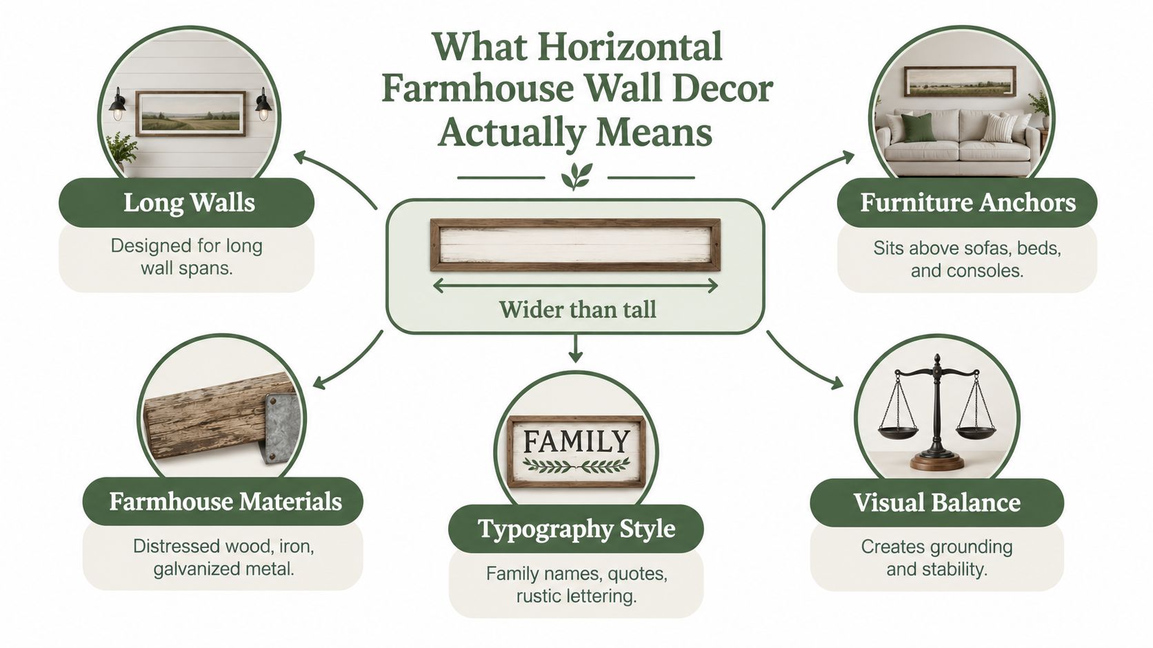
Next, add the farmhouse traits. Look for natural or aged materials, muted or earthy colors, and motifs tied to rural or family life. Distressed wood, iron, galvanized metal, a family name, a short welcoming phrase, a barn, a windmill, or a simple pastoral scene all signal the style without needing a label.
How to recognize it quickly
- Proportions: A wide rectangle, or several pieces grouped so the whole arrangement becomes wide.
- Materials: Wood grain, weathered paint, matte metal, and linen-like canvas rather than glossy finishes.
- Motifs: Typography, rural scenes, botanicals, animals, and family or place names.
- Placement: Above sofas, sideboards, beds, entry benches, and mantels where a vertical piece would feel pinched.
This isn't only a recent retail label. At Charleston Farmhouse in Firle, occupied by Vanessa Bell and Duncan Grant from 1916, broad painted walls and expansive compositions turned a rural home into personal, artistic space. That precedent helps explain why wide formats still feel natural in farmhouse rooms today.
The market context points the same way. One estimate valued global wall decor at USD 64.7 billion in 2024, with wall art at 37.1% and wood at 34.3% by material. You're choosing inside a large, established category, so focus on proportion and material fit rather than worrying the format itself is a passing oddity.
Metal, Wood, and Canvas Compared
Material decides more than looks. It changes weight, contrast, how the piece handles moisture or sun, and whether you can hang it with simple hardware. If you're torn between two designs you like equally, let material break the tie.
Metal gives you crisp edges and strong contrast. Powder-coated steel in Black, Copper, Gold, Silver, or White reads clearly from across a room, which is why it suits entryways, kitchens, porches, and outdoor coops where wording needs to stay legible. It's also the heaviest option at larger sizes, so installation matters most here.
Wood adds warmth you can see even before you read the words. Painted text on whitewashed boards feels classic, while stained planks with a simple frame feel calmer. Wood fits living rooms, bedrooms, and dining rooms where you want the wall to soften the furniture, not sharpen it.
Canvas is the lightest and quietest choice. A wide pastoral or botanical panel brings color without hard edges, and the fabric surface absorbs a bit of echo in hallways and bedrooms. If you're weighing that softer route, review farmhouse canvas wall art options and placement ideas before you commit to a size.
Horizontal farmhouse material comparison
| Material | Typical finish | Weight & installation | Best rooms | Care note |
|---|---|---|---|---|
| Metal | Powder-coated Black, Copper, White | Heaviest, needs secure anchors | Entry, kitchen, porch, coop | Dust with a soft dry cloth |
| Wood | Distressed paint or natural stain | Moderate, vary by thickness | Living room, bedroom, dining room | Keep out of damp and direct sun |
| Canvas | Matte printed fabric on frame | Lightest, easiest to level | Bedroom, hallway, living room | Dust gently, avoid moisture |
You don't have to pick only one texture for the whole wall. A single metal sign centered above a wood console, or a canvas panel flanked by small wood frames, layers texture without crowding. Keep the group to two material families, repeat one finish somewhere low in the room, and the mix will look intentional.
Practical rule: Choose metal for contrast and durability, wood for warmth, and canvas when weight or softness matters most.
Sizing and Spacing That Actually Works
Don't start by shopping. Start by measuring the thing your decor will sit above, because that anchor sets the size. Write down wall width, furniture width, ceiling or cabinet clearance, and where doors or windows cut into the space. You're building a small worksheet, and it prevents most returns.
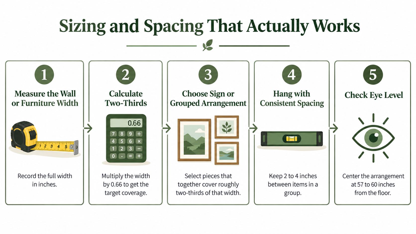
A simple measurement worksheet
- Measure the anchor: Record the full width of the sofa, bed, console, or open wall zone in inches.
- Target about two-thirds: Independent guidance recommends artwork occupy roughly two-thirds of the available wall or furniture width, so multiply by 0.66.
- Reserve breathing room: Where possible, reserve approximately 6 to 12 inches at each side and keep the total width inside the furniture below.
- Group tightly: For several pieces, maintain a consistent 2 to 3 inch gap and treat the whole group as one object.
Height depends on what's below. On an open wall, center the piece at roughly 57 to 60 inches from the floor, measured to the middle, not the top edge. Above furniture, don't force that rule. Keep the lower edge roughly 6 to 8 inches above the sofa, console, or headboard so the two read as one unit.
Then do the hanging math once, on paper. Use target center height, plus half the framed height, minus the wire or mounting drop. If you want another worked approach to large spans, the Miller Waldrop wall art design guide is a useful companion for checking proportion before you drill.
Bigger isn't always better. In a shallow entryway, a slightly smaller horizontal piece can preserve circulation and door clearance while still anchoring the bench below. If the two-thirds target pushes past a door swing or a light fixture, shrink the piece and let empty wall do some of the work.
Three Styling Formulas for Different Rooms
If you're worried a farmhouse sign will make your home look dated, you're asking the right question. Recent design coverage describes designers moving toward smooth walls, earthy tones such as sage and terracotta, mixed materials, and more individualized combinations. The fix isn't dropping farmhouse. It's choosing which version you're building.
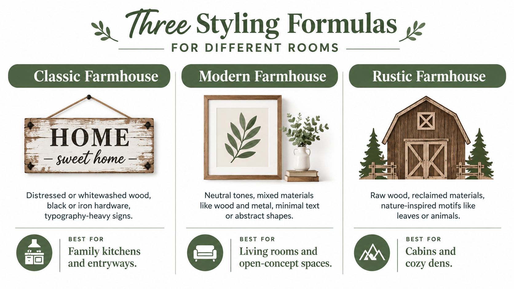
Classic farmhouse
This is the familiar recipe, distressed or whitewashed wood, black or iron hardware, and typography doing most of the talking. A wide family name sign above a kitchen table or an entry bench fits naturally here. Choose White or Black finishes and keep surrounding textiles simple, linen, cotton, and worn leather, so the lettering stays the focal point.
It lands best in family kitchens and entryways, where a welcoming phrase makes sense. It can tip into theme territory if every surface repeats the same distressed finish, so let one horizontal sign carry the message and keep the rest of the wall quiet.
Transitional farmhouse
Here you swap heavy shiplap for smoother walls and bring in sage, terracotta, or warm neutrals. The horizontal piece becomes an accent inside a cleaner room, not proof of a theme. A Silver, Gold, or soft White finish with minimal text or a simple scene works well above a tidy sofa or sideboard.
This formula suits living rooms and open-concept spaces because it bridges rustic texture with newer furniture. Pair weathered wood with clean upholstery, or hang a metal sign on a saturated wall color, and the contrast keeps it current.
Industrial or Western farmhouse
This version leans harder on powder-coated metal, raw wood, leather, and vintage finds. Copper and Black finishes hold up against darker woods and ranch, office, or dining room settings. Motifs can be bolder too, a longhorn silhouette, a ranch name, or a simple established date.
Keep the rest grounded. One strong horizontal metal piece above a desk, bar, or dining bench is enough, then repeat the metal tone in a lamp base or cabinet pull so it doesn't float alone.
Personalization Without Overcrowding the Layout
A name changes a sign from decoration to marker. Above a doorway, a single family name says who lives here. Across a mantel, a short phrase and a date can mark a wedding, a move, or the year a farm or ranch began. The trick is keeping that text readable at the size you chose.
Short wording scales best on common sign widths from 12 to 36 inches. One line, centered, usually reads cleanest on a long horizontal because your eye can take it in without dropping to a second line. A name plus a date, or a name plus a town, is often stronger than a full quote squeezed into small letters.
Wording checks before you order
- Count the characters: Longer text needs a wider sign, or the letters shrink and lose contrast.
- Test punctuation: Periods, slashes, and ampersands tend to stay legible in cut metal, while hyphens can drop out visually.
- Separate the jobs: Use a name or address where identification matters, and save quotes for living spaces where people linger.
- Approve the proof: Confirm spelling, spacing, and line breaks in the preview before production.
If you're comparing wording styles, browse farmhouse metal signs and personalization examples and notice how much empty margin surrounds the text. That margin isn't wasted. It's what lets the name read from the doorway instead of only up close.
Fight the urge to fill every inch. A horizontal layout already gives you width, so use it for breathing room around a few words, not for stacking a name, a motto, a date, and a graphic all at the same visual weight. Pick one hero element, let one smaller element support it, and stop.
Room-by-Room Placement Adjustments
The same sign needs different handling depending on whether people stand, sit, cook, or walk past it. Use the sizing method you've already learned, then adjust height, material, and clearance for how each room is used.
Here's a quick visual tour of how horizontal pieces sit in real rooms.
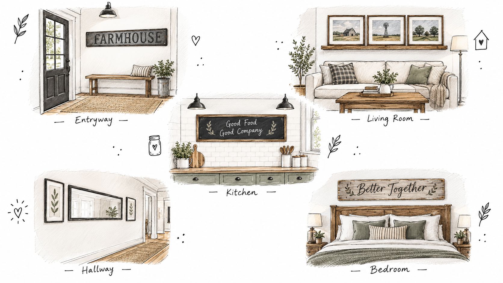
Entryway, living room, and kitchen
In an entryway or on a porch, people view the wall standing and moving. Keep the center near standing eye level, choose weather-resistant metal where moisture reaches it, and check the full door swing before you hang anything. A name or welcome sign above a bench works if coats and bags won't cover the lower edge.
In a living room, viewers are mostly seated, so a slightly lower center often feels right. Anchor the piece to the sofa with that small gap above the back cushions, then check it from the farthest seat. For more sofa-wall arrangements, see rustic wall art ideas for the living room and compare how width relates to the furniture below.
In a kitchen, usable wall comes in fragments, above a window, between cabinets, or over a breakfast bench. Shorter horizontals fit those slots. Keep wording brief, keep the piece clear of steam-heavy zones if it's wood or canvas, and don't let cabinet doors clip the frame.
Watching someone mark, level, and step back can make these adjustments easier to picture.
Bedroom and outdoor spaces
In a bedroom, soft canvas or warm wood centered above the headboard keeps the wall calm. Center on the bed, not the whole wall, if the bed isn't centered in the room. On a long unused wall, a wide scene gives you presence without visual noise before sleep.
For coops, ranches, and porches, powder-coated metal in the same finish family as your indoor signs extends the style outside. Confirm the mounting surface can hold the weight, leave clearance for gates and doors, and place names or addresses where a visitor reads them while approaching, not after passing.
Installation, Hanging Math, and Long-Term Care
Start with the wall, not the sign. Locate studs when you can, especially for large metal pieces. If studs don't fall where you need them, choose anchors rated above the sign's actual weight and check the manufacturer's rating rather than assuming adhesive will hold. Two spaced attachment points limit rotation and keep a wide piece from drifting crooked.
Run the math one final time so it becomes habit. Say you want an 18 inch tall sign centered at 58 inches, and the mounting point sits 3 inches below the top edge. Add 58 and 9, half the height, then subtract 3. Your fixture goes at 64 inches. If you're unsure which hardware suits your wall, it helps to find the right picture hanging method before you buy anchors.
Keeping it level and clean
- Metal and canvas: Dust with a soft, dry cloth and avoid soaking the surface.
- Wood: Keep it away from direct sun and damp zones that can warp or fade the finish.
- Hardware check: Recheck level and tightness once a year, since seasonal humidity can loosen lighter installations.
Hang it, step back to your normal viewing spot, and live with it for a day before adding anything else. One well-placed horizontal piece usually finishes the wall on its own.
Ready to put the worksheet to work with a name, date, or ranch sign sized for your wall? Browse personalized metal signs, canvas prints, and rustic wall accents at Farmhouse World, choose your width and finish, and approve your preview before production.


