

Your sofa is comfortable, the walls are rental beige, and the room still feels unfinished. You like floral curtains and old wooden furniture, but you don't want to turn your home into a country-house set or buy pieces that won't fit your next address.
English country home decor works best as a reversible layering method. Start with color and light, keep the furniture that earns its space, then add textiles and useful objects with character. You can create the feeling in an apartment without changing the architecture.
Table of Contents
- Palette, Contrast and Light Tests by Room
- Why English Country Decor Is Built in Layers
- Furniture, Textiles and Pattern Mixing by Room
- Renter-Friendly English Country Rooms
- Sourcing Pieces That Last, Old and New
- Layering Rustic Accents and Personalized Signs
- A First-Week Plan
Palette, Contrast and Light Tests by Room
Starter palettes for English country rooms
| Palette | Base colors | Accent colors | Best rooms |
|---|---|---|---|
| Faded Garden | Sage, warm white, dusty pink | Antique brass, dark timber | Living rooms and bedrooms |
| Warm Heritage | Warm white, ochre, natural oak | Iron black, deep red | Kitchens and halls |
| Chintz Cottage | Cream, soft blue, muted peach | Gold trim, botanical print | Bedrooms and guest rooms |
| Country Neutral | Stone, linen, warm grey | Copper, sage, navy | Small rooms and rentals |
Choose the palette that works with what you can't easily replace. Faded Garden softens a dark sofa; Warm Heritage sits comfortably beside oak cupboards and terracotta. Chintz Cottage suits a bedroom where fabric provides most of the decoration, while Country Neutral lets renters work around existing wall colors.
Don't give every color equal space. Let the base cover broad surfaces, then introduce accents through smaller, movable pieces. In a narrow hall, for example, ochre might appear in a print rather than across every wall.
Give soft colors enough definition
Begin with medium-low contrast between walls and upholstery. Then add definition through a dark timber table, patterned curtains, iron hardware, or a substantial picture frame. Repeat an accent in separate parts of the room so it looks intentional rather than stranded.
A living-room luminance-contrast study available through Bilkent University, using a digitally manipulated image and 35 participants, found that higher contrast produced more vibrant and lively impressions, while low-contrast gray schemes prompted more subdued and negative impressions.
That's a useful direction, not a formula for every home. Your curtains, daylight, flooring, and furniture will change the result.
Check the composition from the doorway and your usual seat. A deep-red cushion may look balanced from the entrance but compete with a painting when you're sitting opposite it. Remove the competing accent before adding anything else.
Practical rule: Soft doesn't mean indistinct. Keep enough contrast to see the furniture shapes and architectural edges.
Beige-on-beige fails when the rug, sofa, and wall merge into a single flat field. Stark black-and-white creates the opposite problem: it can dominate the faded florals and checks that should provide the interest. Dark brown, softened navy, or muted iron often gives a gentler outline.
Test the room at the times you use it
Treat paint and lighting as a combined decision:
- Name the main activity. A reading room needs useful light at the chair; a bedroom needs comfortable evening light without a bright bulb in your eyeline.
- Map the existing light. Note daylight direction, shaded corners, ceiling fittings, and every lamp before choosing colors.
- Make generous samples. Put wall and trim colors beside fabric samples on different walls. Inspect them in morning, afternoon, and evening conditions.
- Separate lighting jobs. Use diffuse ambient light for the room, directional task light where you work, and restrained accent light for an object or picture.
- Judge the furnished space. Curtains, upholstery, and timber affect reflected light, so an empty-room test isn't enough.
A virtual-reality living-room study published in the Journal of Design Sciences and Applied Arts involving 50 prospective residents found a preference for indirect lighting and warned that excessive light can cause eye strain and tension.
Choose warm bulbs for shaded lamps, but don't sacrifice clarity at a kitchen worktop. A tiny daytime paint swatch won't reveal how a green turns muddy under your evening lamps.
Finish by sitting in the reading chair and checking for exposed bulbs or reflections. Across connected rooms, carry a base color through the sightline, changing the accents rather than starting an unrelated scheme at every doorway.
Why English Country Decor Is Built in Layers
English country style isn't a requirement to own antiques or live behind roses. It's a way of combining useful objects that weren't bought together, with enough continuity to make the room feel settled.
As Country Life's account of the country house explains, 15th-century English country houses arranged halls, chambers, chapels, and kitchens around an inner court; textiles provided warmth and decoration, while prestigious tapestries encouraged taller walls and raised windows to accommodate large hangings. Fabric wasn't just a finishing touch. It played a role in room function and how people displayed status.
Borrow the method, not the costume
The eclectic mix draws on Jacobean, Classical, Dutch, Flemish, French, Georgian, and Victorian traditions. The familiar modern interpretation associated with Nancy Lancaster and John Fowler combined antiques, faded color, chintz, painted furniture, and comfort.
For a bedroom, that means judging the feel and usefulness of fabrics before choosing decorative trim. SouthShore Fine Linens' discussion of cozy materials for farmhouse bedding is a useful companion when comparing the tactile layers that make a bed inviting rather than merely styled.
Look for these signs that the approach is working:
- Old beside new. A worn wooden chest can sit beneath a contemporary reading lamp.
- Fabric at different heights. Curtains, upholstery, and a floor rug contribute different textures.
- Evidence of use. Books should be reachable, blankets easy to unfold, and tables available for a cup.
The test for an addition isn't whether it matches. It's whether it adds comfort and character without making daily life harder.
Furniture, Textiles and Pattern Mixing by Room
Furniture and textile choices by room
| Room | Key furniture | Textile choices | Pattern rule |
|---|---|---|---|
| Living room | Deep sofa with loose cushions, fabric-shaded table lamps, antique side table | Linen or chintz covers, wool rug | A large print with smaller-scale companions |
| Kitchen | Open shelving, painted pine table, mismatched chairs | Cotton tea towels, rooster or botanical runner | Combine motif patterns with a quieter stripe |
| Bedroom | Painted wood or iron bed, blanket chest | Layered quilts, cotton bedding, wool throw | Florals in one fabric, checks or stripes in another |
| Entryway | Narrow console or small bench, decorative ladder where space permits | Woven runner, durable mat | A statement item and a clear floor path |
Use the room illustration to compare how furniture and fabric can change without losing a shared character.
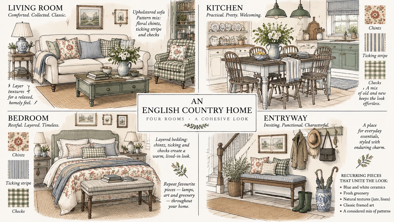
The recurring ingredients described in House & Garden's guide to English country house style include antique furniture, generous sofas with loose cushions, rugs, fabric-shaded lamps, and flowers expressed through arrangements, prints, or paintings. None requires a matching suite.
Fit comes before atmosphere. Choose a sofa deep enough for how you sit, but not so deep that guests perch on its edge or the door catches its arm. In a kitchen, mismatched chairs still need compatible seat heights and stable joints.
Make pattern scale do the work
Start with a dominant pattern on the surface you want people to notice. A broad floral on curtains looks different from the same floral scattered across small cushions. Large motifs need enough visible fabric to read clearly.
Add smaller patterns with different spacing. A narrow stripe can sit beside an open floral because their rhythms differ; another floral of similar size is harder to balance. Pull a shared color through the fabrics, then leave a substantial surface plain.
- Living room. Let a floral sofa lead, with a striped cushion and checked throw as supporting details. Keep the rug solid if the upholstery already feels busy.
- Kitchen. Keep decorative textiles away from heat and wet preparation areas. Open shelves work for frequently used crockery, not an expanding collection that needs constant dusting.
- Bedroom. Put the most expressive fabric where you'll enjoy seeing it. A quilt can provide the pattern while plain curtains keep the window calm.
- Entryway. Choose texture over complicated pattern when coats, shoes, and bags already create visual activity.
For timber floors, compare rug backing, underlay, and care requirements before choosing a weave; this guide to area rugs for wood floors helps frame those practical decisions.
Try a complete composition
Say your living room has a floral sofa, a striped armchair cushion, a checked throw, and a plain ochre wool rug. Repeat the ochre within the floral, but don't add matching floral lampshades. The rug gives your eye somewhere to rest.
Step back until you can see the whole seating group. If every pattern demands attention, remove the smallest accessory first rather than replacing the main upholstery. Small rooms usually benefit from fewer competing surfaces, not miniature versions of every pattern.
Watch the room arrangements with attention to furniture spacing and fabric balance, rather than treating every decorative object as something to copy.
Renter-Friendly English Country Rooms
Build a rental scheme with cushions, bedding, rugs, movable artwork, and plug-in lighting. Freestanding storage can help, but you don't need to paint, drill, replace fixtures, or buy large furniture to make the room feel personal.
The most useful lesson from Ideal Home's small-flat decorating guidance is to favor reversible improvements while protecting circulation and keeping cables tidy. More decoration isn't automatically more convincing.
Use portable room formulas
At the entrance, begin with a mat that clears the door and a runner that stays flat. Use an existing narrow table or bench if it fits. Lean a framed picture on the console rather than placing glass on the floor beside a busy walkway.
In the living room, dress your current sofa rather than hiding it beneath unstable layers. Tuck a throw neatly over an arm, choose cushions that support your back, and size the rug so the sofa's front legs can rest on it. Shaded plug-in lamps at different positions soften the room more effectively than a brighter ceiling bulb.
In the bedroom, put the palette into bedding and a folded wool throw. An existing chest can hold spare linen, but leave enough room to open its lid without moving the bed. A washable bedcover is often more useful than another decorative cushion.
A reversible scheme should be easy to live with and easy to remove. If an accessory makes cleaning or moving around harder, it hasn't earned its place.
Protect the usable space
- Keep cables at the perimeter. Use removable clips suited to the surface, test them discreetly, and never run cords beneath rugs.
- Preserve door movement. Check the route while carrying laundry or shopping, not just while standing in an empty room.
- Respect windows. Don't stack shelving and plants where they obstruct handles, daylight, or ventilation.
Country Neutral is a forgiving starting point when the landlord's finishes must stay. Compare fabric and color on freestanding sample boards rather than painting the walls; even removable tape can damage a fragile finish.
Sourcing Pieces That Last, Old and New
According to Elle Decor's furniture-trend coverage, 81% of designers surveyed by 1stDibs sourced furniture from the 1920s–1990s in 2024, while 43% said their 2025 projects would include a sustainability requirement. For a household buyer, the useful question is whether a piece has the materials, condition, and repair potential to remain useful.
Age alone doesn't answer that. A neglected antique can require more work than your budget allows, while a well-made reproduction can withstand everyday use without pretending to be historic.
Durability checklist for vintage and reproduction pieces
| Check | What to look for |
|---|---|
| Solid wood | Inspect edges and underside for solid timber; distinguish it from veneer over an unstable substrate |
| Drawers | Look for sound dovetailed joints rather than staples alone, then test smooth movement |
| Hardware | Check original fittings and matching screw holes; inspect replacements for secure fixing |
| Joints | Look for tight, square joints without movement when gently tested |
| Upholstery | Assess whether the frame and springs are sound enough to justify re-covering |
| Reproduction | Consider new dining chairs, traditionally styled rugs, and bedding for daily wear |
| Disposable vintage-look goods | Treat distressing, light weight, and thin seams as prompts for closer inspection |
Separate character from repair liability
Veneer isn't automatically poor quality. Well-made veneered furniture can be durable; lifting edges, swollen board, and loose construction are the concerns. Likewise, replacement handles don't ruin a useful chest, but badly drilled holes may complicate restoration.
Ask permission before moving furniture, and don't lift a heavy piece by its top. Check underneath for damp smells, fresh wood dust, damaged feet, and repairs that conceal movement. For upholstered furniture, obtain a re-covering estimate before committing.
New dining chairs can be the sensible choice when you need a dependable matching seat height. New rugs and bedding also let you choose known care requirements without giving up traditional pattern.
- Start with the anchor. Search secondhand shops or estate sales for the main table, chest, or sideboard, taking doorway measurements with you.
- Fill practical gaps with new pieces. Use vintage-inspired home decor selectively rather than buying accessories because they look aged.
- Record care needs. Keep material details, repair receipts, and finish information; Meliusly's guide to furniture care is a useful starting point for a maintenance routine.
Buy fewer pieces that you can maintain. Documented materials and repairability justify a purchase more convincingly than decorative distressing.
Layering Rustic Accents and Personalized Signs
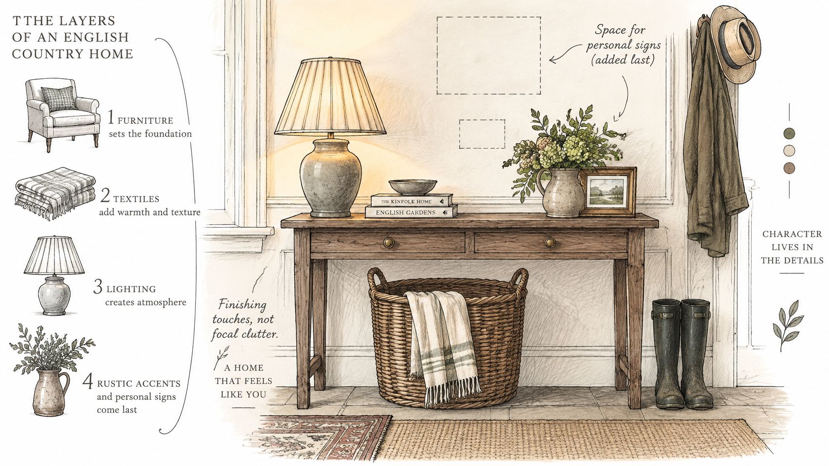
A sign feels connected to a room when its finish repeats a metal or color already in view. Black can echo iron hardware, copper can pick up a kitchen vessel, and muted gold can relate to a frame. Choose the wall first: a narrow interior space calls for a different scale than a broad porch wall.
Accent sizes and finishes
| Item | Finish or notes |
|---|---|
| Personalized metal sign | Black, Copper, Gold, Silver, White, Red, Blue, Green |
| Hand-carved distressed white wood cross | Distressed white wood |
| Floral embossed metal floating shelf, small | Removable wooden top |
| Floral embossed metal floating shelf, large | Removable wooden top |
| Rooster-motif accent rug | Kitchen |
| Decorative ladder | Displays folded blankets |
The assortment offers different materials and silhouettes. Build the room through individual choices rather than buying a matched collection.
Give the personal piece breathing room
Farmhouse World offers personalized metal signs alongside framed botanical art, inherited pictures, and other rustic accents. The Personalized Windmill Steel Sign has an agricultural motif. Place it where that motif suits the household, garden, or setting, rather than using it to fill an arbitrary gap.
Cut a paper template to the intended size before ordering. Hold it against the wall and check the view with nearby furniture in place. A small sign can disappear above a broad bench; an oversized one can crowd a narrow hall.
Browse these farmhouse sign ideas for examples of placement and lettering styles. Keep the wall's main feature clear, especially when a name sign already carries a message.
Add useful accents around it
A rooster-motif rug can suit a kitchen, provided it lies flat and doesn't obstruct a doorway. Candles and holders add warmth to a mantel. Keep flames clear of foliage, fabric, and shelves; choose flameless candles where there isn't enough clearance.
A distressed white cross stands out against a darker shelf or mantel. Leave room above floating shelves with removable tops so they can be lifted easily. In a rental, check permission and fixings before mounting anything. Keep a decorative ladder stable and outside the walking route. It is for folded blankets, not climbing.
Leave some surfaces unfilled. A quiet patch of wall gives an expressive object room to register.
Before ordering personalized work, check spelling, capitalization, punctuation, and the preview. Confirm whether mounting hardware is included rather than assuming it comes with the sign. Repeat an existing metal finish selectively, and let other accents vary in material or shape.
A First-Week Plan
A room can feel unsettled for a specific reason: the bedroom lacks a place for a book and a lamp, or the living room has no comfortable reading light. Start with the room where one practical change would improve your daily routine.
Use the early part of the week to decide what the room needs to do and what you're willing to move, store, or remove. Keep purchases small until that is clear.
Make a short working brief
- Set a base and an accent. Take one of each from your chosen palette and check them against the largest fixed item.
- Review the light. Use the sampling method from earlier in the week, then note which combinations still feel comfortable after dark.
- Name the missing function. It might be a usable side table, a supportive chair, or accessible blanket storage.
- Check the route in. Measure the available footprint, doorway clearance, and any awkward turn before visiting a secondhand shop.
- Complete one small area. Arrange a reading corner or bedside surface fully instead of scattering unfinished changes around the home.
Keep a photograph of the room and your samples on your phone. Use it to assess whether a secondhand find suits the existing scheme, rather than buying it on appearance alone.
Large furniture can wait if what you have already works. If the room relies on overhead light, a fabric-shaded plug-in table lamp is a practical first purchase. Place it beside the seat or bed where you'll use it, and check that the switch is accessible and the shade conceals the bulb. Add other pieces later, guided by comfort and character rather than a matching set.
Farmhouse World offers custom metal signs, rustic wall art, and complementary accents for entryways, living spaces, and outdoor areas. Browse Farmhouse World for a personalized finishing piece that suits your room's palette and available wall space.


