

You've found the perfect farmhouse bath sign online, brought it home, and then discovered that the wall beside the door is too narrow for the wide plank you ordered. Every time someone reaches for a towel, an elbow catches the sign. In a bathroom, a decorative piece has to survive more than visual judgment. It has to fit the wall, tolerate humidity, stay secure, and look intentional beside tile, fixtures, and textiles.
A successful choice comes down to four decisions: material, size, mounting method, and styling fit. Farmhouse design gives you plenty of attractive options, but the best sign is the one that suits the room's substrate and traffic before it matches your favorite phrase. If you're comparing a sign with other wall art, this guide to landscape wall art can also help you think about proportion, visual balance, and how one piece relates to the wall around it.
Table of Contents
- Choosing a Bath Sign That Actually Fits Your Bathroom
- What Makes a Sign Feel Farmhouse in 2026
- Metal, Wood, or Canvas Compared
- Why Powder-Coated Metal Wins in Humid Rooms
- Sizing, Typography, and Personalization That Read Clearly
- Mounting a Sign So It Stays on the Wall
- Styling a Bath Sign Without Dating the Room
- Coordinating With Towels, Fixtures, and Small Furniture
Choosing a Bath Sign That Actually Fits Your Bathroom
A sign can look balanced online yet crowd the wall beside your door, catch a towel, or dominate a small sink. Begin with the room's actual movement and moisture, then judge the product's appearance. A compact powder room may suit a small sign between the mirror and casing, while a larger primary bath can support a wider piece above the toilet or opposite the vanity.
Four decisions to make before buying
Material affects how the sign handles steam, splashes, cleaning products, and temperature changes. Powder-coated metal usually offers a safer choice for damp rooms than raw or poorly sealed surfaces. Wood can work when its finish is suitable and its position avoids direct spray.
Size affects comfort and readability. Measure the wall, then include the door swing, towel movement, switches, and nearby furniture. A clear wall is only part of the measurement. The usable area is like a walkway, it must remain open when people reach, turn, and move around the room.
Mounting method connects appearance with safety. A light print may need only a picture hook, whereas a heavier metal sign requires fasteners suited to the wall material and weight. Secure hardware keeps the piece from shifting when the room is busy.
Styling fit ties the sign to the rest of the bathroom. Farmhouse character can come from its finish, lettering, and restraint, so one simple design often works better than several rural symbols competing for attention.
Practical rule: Treat a bathroom sign as wall art with a job to do. It should look good while handling humidity and everyday traffic.
Choose the visual mood first, then check the substrate, usable dimensions, fasteners, and surrounding finishes. If you are comparing a sign with other wall art, this guide to wall art proportions can help you judge visual balance and how the piece relates to the wall around it. That sequence keeps style and durability in the same decision, rather than choosing an attractive sign that the room cannot comfortably support.
What Makes a Sign Feel Farmhouse in 2026
Farmhouse style grew from practical rural buildings rather than from a single decorative formula. Design histories trace its origins to 16th- and 17th-century Europe, particularly Germany and Scandinavia, where farmhouses provided practical shelter and housed farm workers. The style reached the United States in the 1700s, where it later developed into an American country aesthetic. Its modern resurgence accelerated in 2013 with HGTV's Fixer Upper, according to this history of farmhouse interior design.
That history explains why farmhouse signs often use humble-looking materials and straightforward lettering. The appeal comes from objects that appear useful, familiar, and lightly worn, not from luxury finishes or futuristic shapes.
Translate the look into bathroom details
A farmhouse bath sign often works best with a restrained combination of:
- Muted chalky whites, warm creams, and weathered greys
- Natural oak, pine, or reclaimed-looking wood
- Matte black iron or coated metal
- Serif lettering or relaxed hand-lettering
- Simple phrases with generous spacing
- Subtle texture, such as a brushed surface, raised edge, or quiet grain
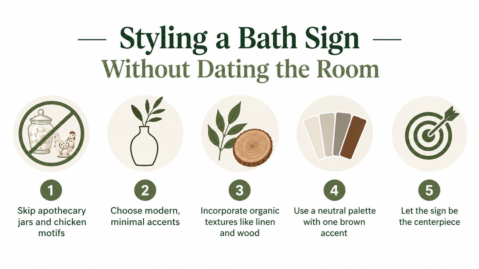
Farmhouse is a family of textures and finishes, not a checklist of roosters, tractors, mason jars, and oversized slogans. One neutral plank with an understated phrase can feel more authentic than a crowded design packed with rural symbols. If the sign competes with the mirror, tile, towels, and lighting, it has moved from accent to theme.
The 2026 conversation is also shifting away from the heavily distressed, all-white farmhouse bathroom. Design coverage describes a move toward personalization, warmer neutrals, texture, and richer materials, while overt farmhouse motifs are becoming less dominant. That doesn't make a farmhouse bath sign unusable. It means the current version should feel edited, tactile, and connected to the rest of the room.
Historical materials still provide the visual vocabulary, but they don't behave alike in steam. A warm wood sign may deliver the most character and require the most protection. Metal may look more industrial and need less maintenance when properly finished. Canvas may be easiest to change, but it can lack the depth that makes rustic decor feel substantial.
Metal, Wood, or Canvas Compared
The substrate changes more than the sign's appearance. It affects weight, cleaning, wall stress, edge durability, and how confidently you can place the piece near a sink or shower. Think of the material as the sign's clothing for the room. Some fabrics suit rain better than others.
Metal creates the strongest industrial-farmhouse impression. Tin, aluminum, and steel can support crisp lettering, cutout designs, and matte finishes, while a properly coated surface handles bathroom moisture more confidently than bare metal. Metal can dent, and a cool grey or black finish may need soft textiles and warm wood nearby so the room doesn't feel hard.
Wood brings the richest visual warmth. Pine, MDF, and reclaimed barnwood accept painted lettering and layered finishes, but they're vulnerable to swelling, warping, and mildew when moisture enters the material. A wood sign needs a sound seal on the face, back, edges, and mounting holes, plus enough ventilation to let damp air move around it.
Canvas or printed fabric is light and easy to change. It can suit a rental wall or a seasonal decorating plan, especially when the piece hangs in a frame. The tradeoff is lower resistance to fading, staining, and splashes, along with less dimensional presence than a solid sign. For additional inspiration on using metal as a farmhouse accent, explore this farmhouse metal signs resource.
Farmhouse Bath Sign Materials at a Glance
| Substrate | Look & Feel | Weight | Humidity Tolerance | Best For |
|---|---|---|---|---|
| Metal | Industrial, crisp, lightly rustic | Often light to moderate, depending on gauge | Strong when coated and edge-protected | Humid rooms, clean lettering, modern farmhouse |
| Wood | Warm, tactile, traditional | Moderate to heavy | Requires complete sealing and ventilation | Low-splash walls, cozy country interiors |
| Canvas | Soft, casual, changeable | Light | Better away from direct splashes | Rentals, seasonal updates, framed artwork |
Choose the material by asking where the sign will live. A metal sign beside a towel rack may be more practical than raw barnwood. A sealed wood sign above a dry powder-room toilet may be perfectly reasonable. A canvas print across from the shower can work if it's framed and protected, but it shouldn't be treated like a waterproof object.
Why Powder-Coated Metal Wins in Humid Rooms
Powder coating protects metal by creating a continuous, non-porous barrier between moisture and the substrate. That matters because bathroom steam, splashes, and cleaning sprays can reach tiny weaknesses in a finish. Bare steel begins with a direct path for moisture, while a properly cured powder film blocks that contact across the broad face and, when applied correctly, around the edges.
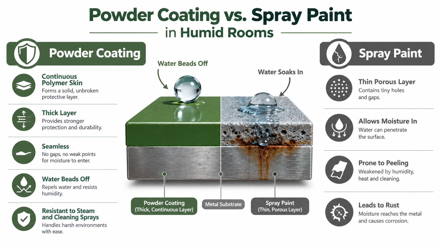
The finish isn't just a cosmetic color choice. Guidance for bathroom metalwork describes powder coating as a moisture barrier, and polyester-based systems are commonly recommended for damp conditions. Interior powder films around 2 to 3 mils, or 50 to 75 microns, are typically cited as adequate protection for climate-controlled spaces, while industrial humidity qualification can require testing for up to 1000 hours. These figures come from bathroom powder-coating guidance, and they show why coating quality is a performance question rather than a styling detail.
Read the finish like a buyer
Spray-painted tin may look convincing at first, but a thin or poorly bonded layer can allow moisture underneath. Raw galvanized metal can develop dull patches and corrosion at damaged areas. Unsealed aluminum won't rust in the same way as steel, but it can still stain, oxidize, or lose a clean appearance. Corners, drilled holes, cut letters, and folded edges deserve special attention because those areas are easiest to leave under-protected.
A simple sample check can help. Hold a sample piece in a humid bathroom or breathe across its surface and watch the condensation. On a sealed, continuous finish, moisture should sit as visible beads or a thin surface film. A porous or damaged coating may darken unevenly or allow moisture to cling around scratches. This isn't a laboratory test, but it can reveal obvious differences between a protected sample and bare material.
Use this buying checklist:
- Cured finish: Ask whether the powder coating is fully cured rather than described as painted.
- Covered edges: Confirm that exposed cuts, holes, folds, and corners receive the same protection as the face.
- Bathroom suitability: Look for care guidance or a warranty that specifically addresses indoor bathroom use.
- Cleaning compatibility: Use a soft cloth and a mild cleaner unless the maker provides different instructions.
For broader care ideas, this guide to protecting metal from rust offers useful context. The most durable-looking sign still needs sensible cleaning and protection from standing water.
Sizing, Typography, and Personalization That Read Clearly
A sign can be beautifully made and still fail if the lettering disappears from the doorway. Size should follow both the wall and the distance from which people will read the message. Measure the furniture first, then the sign area, and leave enough breathing room that the piece doesn't look wedged into place.
Match the sign to its position
Above the toilet, a sign often looks balanced when its width is roughly two-thirds of the vanity width. Leave 6 to 10 inches above the tank so the piece doesn't appear to sit directly on the plumbing fixture. This arrangement works best when the sign's lower edge stays clear of the tank lid and the upper edge doesn't crowd a shelf or artwork.
Over a towel rack, preserve 2 to 3 inches of clearance between the sign and the top of the rack. Towels rise, shift, and bunch as people use them. If the lower lettering sits behind the fabric, the sign's message becomes decoration that no one can read.
A compact powder room needs more restraint. Treat the wall like a postage stamp and consider a sign under 16 inches wide, especially when the door casing, mirror, and toilet already occupy most of the sightline. A narrow vertical layout can work better than a wide plank when the available wall is tall but slim.
| Placement | Width | Letter Height | Hang Offset | Typography Note |
|---|---|---|---|---|
| Above toilet | About two-thirds of vanity width | Use a clear, open letterform | 6 to 10 inches above tank | Serif type suits a traditional farmhouse look |
| Over towel rack | Slightly narrower than the rack or wall zone | Keep wording visible above fabric | 2 to 3 inches above rack | Avoid low lines that towels can cover |
| Small powder room | Under 16 inches wide | Favor larger, simpler characters | Keep clear of casing and mirror | Short phrases work better than dense text |
Make custom wording easy to read
For serif fonts, plan for at least 1 inch of letter height per 6 feet of viewing distance. Hand-lettered scripts need 20 percent more height to stay legible because their connected strokes and decorative curves can close up from across the room. If you're unsure, choose a shorter phrase in a sturdy font rather than shrinking a long message until it becomes visual texture.
Personalization needs the same discipline. Keep family names to 10 characters and house numbers to four digits when possible, then request a digital proof before production. Check kerning, line breaks, punctuation, and last-name centering on screen. A proof catches an awkward gap before the maker cuts or prints the final sign.
Mounting a Sign So It Stays on the Wall
Weight matters more than farmhouse style. A light canvas print and a heavy steel plaque may look similar from across the room, but they place very different demands on drywall. Start by weighing the sign, then identify whether you're fastening into a stud, drywall, tile backer, or another surface.
For gypsum board, anchor capacity varies sharply by fastener type and board thickness. Practical guidance lists light-duty self-drilling anchors at roughly 30 to 75 pounds in standard 1/2-inch to 5/8-inch board, while toggle-style anchors can exceed 200 pounds, depending on the product and installation. Those ratings aren't permission to hang any sign at the maximum number. They're reminders to choose hardware based on the actual substrate and include a safety margin.
Build a reliable load path
For a decorative sign, two mounting points usually distribute force better than one central fastener. A sign wider than 12 inches or one mounted on stand-off hardware creates torque that can pull outward from the wall. Built-in D-rings or keyhole slots help spread the load across the back, while a French cleat or dual-rail system suits signs over 8 pounds or wider than 24 inches.
Thin plywood under 1/2 inch can split around a hanger point. Add a backer block or use hardware that distributes pressure across a stronger section of the frame. In a humid bathroom, choose corrosion-resistant components such as stainless steel or glass-filled nylon, especially when the wall includes moisture-resistant board. These materials reduce the risk of hardware deterioration and galvanic problems in damp conditions.

Stand-off hardware gives metal and canvas a deliberate gallery-like gap. A 1-inch gap can cast a small shadow and keep the sign from looking pasted onto the wall, but it also increases strain, so use paired fasteners and appropriate anchors. If you're considering a removable solution, a magnetic hanging kit may suit a compatible lightweight sign, provided its load rating matches the product.
For a visual walkthrough of the mounting sequence, watch this demonstration:
Never trust a single central fastener for a sign over 2 pounds, and don't drill until you've checked for plumbing and wiring. In a bathroom, the cleanest-looking installation is the one that stays level, holds securely, and doesn't create a hidden repair problem.
Styling a Bath Sign Without Dating the Room
The farmhouse look has become more selective. Design coverage for 2026 describes classic farmhouse bathrooms as increasingly overused, with rooms moving toward warmer neutrals, richer materials, texture, and personalization. The useful response isn't to abandon rustic character. It's to remove the obvious extras that make the room feel staged around a theme.
A sign should contribute one clear idea. Choose a single well-spaced phrase rather than layered typography, multiple borders, and several illustrations fighting for attention. Let the tile, mirror, vanity, and fixtures carry their own visual weight while the sign provides a quiet point of personality.
Make the farmhouse reference quieter
Try these adjustments:
- Replace distressed white: Consider matte black, soft sage, or warm clay when those tones connect with existing finishes.
- Reduce the motif count: One rustic reference feels curated. Several can make the room resemble a set.
- Simplify the lettering: A strong serif or relaxed hand-lettered treatment usually feels more current than stacked decorative fonts.
- Pair hard and soft surfaces: A metal sign gains warmth beside linen towels, a woven basket, or a simple ceramic vessel.
- Limit the theme: Keep farmhouse touches to a small handful of intentional elements, then edit anything that repeats the same idea.
A frameless mirror or plain ceramic vase can anchor the sign without competing with it. If the wall already has busy tile, choose a sign with a quiet background and strong negative space. For help thinking through how tile and accent surfaces influence the room, this Western Bathroom Renovations tile guide offers useful visual planning context.
The target is a sign that looks like part of the bathroom, not a label announcing that the room follows a trend. A restrained phrase, tactile finish, and compatible color can preserve farmhouse warmth while leaving room for the design to evolve.
Coordinating With Towels, Fixtures, and Small Furniture
The sign sets the direction, but the surrounding objects decide whether the bathroom feels finished. Start with the sign's secondary tone, not its lettering. If a black sign includes a warm wood frame, muted brown towels may connect more naturally than bright black towels, which can make the wall feel overly literal.
Repeat the sign's metal finish once in the room. Black hardware can echo a black plaque through a faucet, sconce arm, or cabinet pull. Brass, nickel, and other finishes can work the same way, but they should have a clear relationship rather than appearing on every available surface.
Use a short editing checklist
- Pick one secondary tone. Pull it from the sign's background, border, frame, or small decorative detail.
- Repeat the metal finish once. Look for a faucet, drawer pull, light arm, or towel hook.
- Add one natural-fiber element. Cotton, linen, rattan, or a woven basket introduces softness without adding another printed pattern.
- Ground the wall at floor level. A slim ladder shelf, small bench, or basket can carry the sign's wood or metal character downward.
- Step back and remove competition. If another object demands attention before the sign, simplify the arrangement.
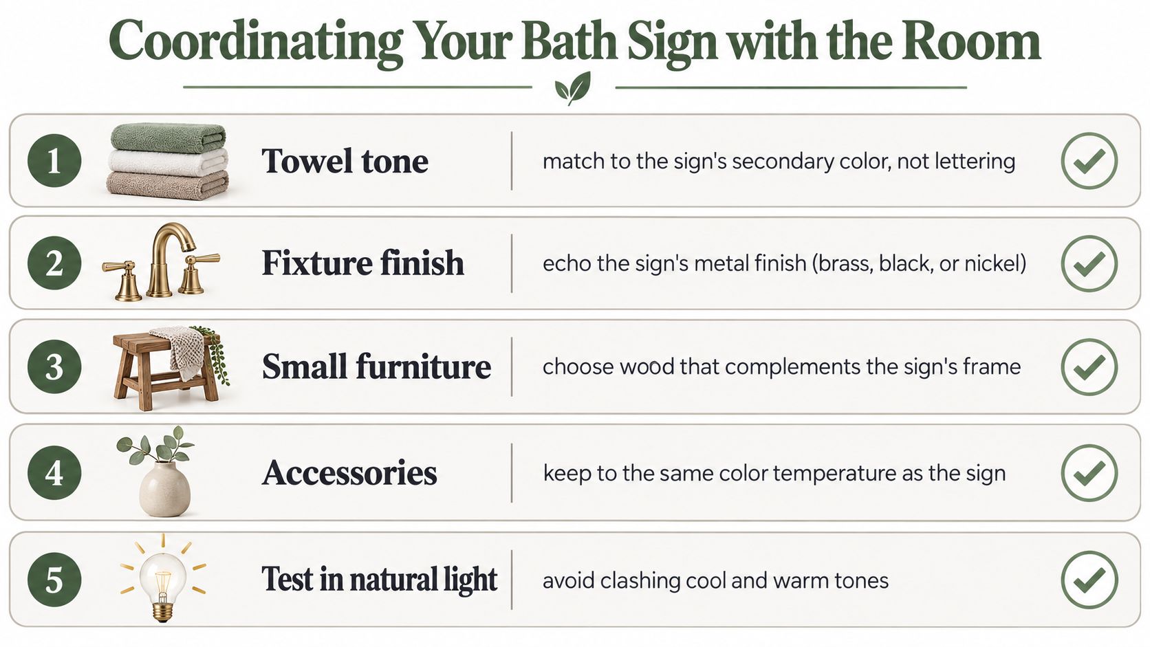
Natural light can reveal clashes that disappear under warm bathroom bulbs. Check the sign, towels, and fixtures at different times of day, particularly if one finish is cool grey and another is warm beige. A coordinated bathroom doesn't require matching every object. It needs repeated relationships that make the choices appear deliberate.
For one example of a product option in this category, Farmhouse World offers bathroom pieces such as the “Would Poop Here Again” Funny Bathroom Sign 6", along with other rustic bathroom signs. The small format can suit a compact wall where a larger plank would obstruct movement, but you should still verify the material, finish, and mounting details before placing it near direct splash exposure.
Farmhouse World offers personalized metal signs, rustic wall art, canvas and wood decor, and coordinating accents for rooms that need a consistent farmhouse direction. Visit Farmhouse World to compare bathroom sign formats, finishes, and complementary pieces before choosing the one that fits your wall and humidity level.


