

You're looking at the bare wall above a farmhouse sofa. The linen cushions, weathered coffee table and pale walls already feel relaxed, but you're not sure whether the room needs an ocean painting, a photograph or something more rustic.
Before choosing the scene, look at the wall itself. Does afternoon sunlight reach it? Does the room stay damp when the house is closed? Beach house artwork has to suit the air and light as well as the furniture. The motif determines its mood; the material and placement determine how comfortably it lives there.
Table of Contents
- Beach House Artwork Motifs and Palettes
- Canvas, Metal and Wood Compared for Salt-Air Rooms
- Sizing and Hanging Heights for Beach Walls
- Protecting Beach Art From Humidity and Sun
- Pairing Beach Art With Coastal Farmhouse Collections
- Personalizing and Rotating Art Through the Seasons
- Confirm Your Beach Art Plan Before You Buy
Beach House Artwork Motifs and Palettes
Start with the feeling you want, rather than a list of seaside objects. An open shoreline can make a living room feel spacious, while an aerial photograph introduces sharper shapes and a more contemporary character.
Beach artwork motifs by mood, palette and room
| Motif | Mood | Palette | Best Room |
|---|---|---|---|
| Open horizon and shoreline | Calm, airy | Deep ocean blue, sand, white | Living room above sofa |
| Aerial shoreline photography | Modern, graphic | Slate, sea-glass neutrals | Hallway or stairwell |
| Abstract tide lines | Quiet, layered | Blue-gray, linen | Bedroom |
| Plein-air sailboats and dunes | Relaxed, traditional | Sky blue, cream, ochre | Dining room |
| Driftwood and sea-glass still life | Rustic, farmhouse | Weathered wood, sage | Entryway or mantel |
| Anchor and rope nautical signs | Playful, literal | Navy, red, white | Kids' room or covered porch |
The room suggestions describe visual fit, not permission to expose a piece to weather. A nautical sign might look right on a covered porch, but its substrate, coating and hanging hardware still need to suit that location.
The motif sets the mood; the palette determines whether the artwork belongs beside whitewashed wood and linen. Look beyond the dominant blue to the smaller areas of cream, gray, green and brown, since those quieter colors often connect the picture to existing furniture.
Build the Coastal Feeling in Layers
Begin with the horizon. A broad, level division between water and sky gives your eye somewhere to rest and can work almost like another window above a sofa. A crowded composition of boats, figures and buildings creates a livelier effect, so choose it deliberately rather than expecting every beach scene to feel restful.
Next, consider reflective light. Pale water, wet sand and gradual changes in sky color can echo a whitewashed wall without disappearing into it. Darker water introduces contrast when the room already contains plenty of pale upholstery.
This living-room sketch shows how the artwork and furnishings can share colors without matching exactly.
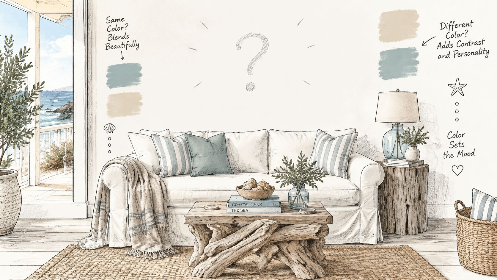
Finally, bring in texture. Visible linen weave, restrained wood grain or weathered-looking paint can connect a beach image to farmhouse furniture. You don't need a distressed frame, rough canvas and heavily textured image all together; choose whichever surface adds something the room lacks.
Keep Literal Motifs Under Control
Beach imagery has a long decorative history: Nationalmuseum's To the Sea! exhibition traces its development alongside seaside tourism from the 1870s through the first half of the twentieth century. That connection to leisure helps explain why a simple shoreline can feel coastal without additional symbols.
Styling rule: Let a single literal seaside motif lead the room. Use light, color and texture to carry the rest of the coastal feeling.
Stacking shells, anchors, stripes and rope around the same picture can make the wall resemble a souvenir display. Leave some ordinary farmhouse elements in place, whether that's an iron lamp, a rustic cabinet or a familiar metal sign.
For interiors that sit between waterside and country styles, these lake house wall decor ideas offer another way to think about relaxed imagery. Choose a motif family for your main wall before selecting its smaller companions.
Canvas, Metal and Wood Compared for Salt-Air Rooms
Material matters more than the subject when a room has humid air or frequent temperature changes. Use the environmental targets under humidity protection to judge the room before deciding whether a soft canvas surface or visible wood grain is worth the maintenance trade-off.
Artwork materials compared for coastal rooms
| Material | Main Strength | Weak Spot in Humid Rooms | Best Room |
|---|---|---|---|
| Canvas on stretcher bars | Soft texture, light weight, easy to hang | Sags and slackens as humidity swings | Large dry living room walls |
| Metal prints or signs | Moisture-resistant surface, crisp color, durable when properly finished | Steel edges can corrode if coating is poor; smooth finishes show fingerprints | Entryway, hallway, indoor porch-facing walls |
| Painted or whitewashed wood | Farmhouse grain and warmth | Warps, cups and cracks as it swells and shrinks | Mantel, shelves, dry interior rooms |
| Framed paper under glass | Accessible print options, easy to swap | Fades in sun and cockles in humid air | Seasonal rotation, bedrooms |
Choose the Surface for Its Weakest Point
Canvas can slacken when moisture changes. Its softness is useful above a large sofa because it avoids the reflections of glazing, but that benefit doesn't make it suitable for a damp wall. Inspect the stretcher construction and ask how the finished surface should be cleaned before ordering.
If you're comparing print formats, you can browse canvas printing options from The Print Warehouse Ltd to identify questions about edge treatments, framing and available formats. Judge those choices against the room, not just the image preview; farmhouse canvas wall art guidance can help with the visual side.
Poorly protected steel can corrode at exposed edges and fixings. Aluminum generally tolerates moisture better, but a metal print can still scratch, show fingerprints or reflect a bright window. Ask what the substrate is, whether the edges are finished and whether the mounting hardware suits coastal conditions.
Wood can cup, warp or crack as it gains and loses moisture. Paint and whitewash change its appearance, but they don't make an indoor wood sign weatherproof. A small sign often works better on a dry shelf, where you can inspect its back and move it easily.
For example, the 10x10 I Dusted Once. I'm Not Falling For That Again Sign is a wood piece with direct-to-surface printing and shelf or wall display options. Treat it as an indoor decorative accent, not as evidence that printed wood can tolerate salt spray.
Paper can cockle in humid air and fade in direct sunlight. Glazing protects against handling and surface dirt, but a frame isn't automatically a sealed enclosure. Use a mat or suitable spacers to keep the print from touching the glazing, and choose conservation-quality backing for work you want to keep.
Match Durability to the Location
For indoor walls facing oceanfront windows or porch doors, consider coated metal or properly glazed work first. Reserve canvas for controlled interior rooms where its texture matters, and wood for dry mantels, shelves and sheltered walls.
Paper reproductions make seasonal changes easier without requiring a different permanent installation. For renters, favor lighter pieces and reversible hardware rated for the artwork's weight and compatible with the wall finish.
Sizing and Hanging Heights for Beach Walls
Size the artwork against the furniture beneath it, not against the entire expanse of wall. As a visual starting point, leave a clear margin at each end so the furniture supports the composition rather than appearing smaller than it.
Artwork size and hanging height by setting
| Setting | Furniture or Wall Width | Artwork Width | Placement Rule |
|---|---|---|---|
| Sofa | Measure between the outside arms | Broad enough to relate to the seating, narrower than the sofa | Leave breathing room above the back without disconnecting the art from it |
| Console or dresser | Measure the top, excluding nearby furniture | Keep clear margins beside the frame | Leave room for lamps and objects beneath it |
| Single narrow wall | Measure the usable area between trim and obstructions | Choose a compact or vertical format | Center within the usable wall area |
| Mantel or shelf | Measure the display surface | Small signs or a restrained grouping | Lean or stagger securely and keep functional space clear |
| Stairwell wall | Follows the rise | Staggered pieces | Use consistent spacing that follows the stair rise |
A large wall doesn't always need a large picture. Door swings, lamps, switches and the view from adjoining rooms can reduce the area that actually works for display.
For grouped artwork, assess the outside edges of the whole arrangement. Small individual frames can create a substantial composition, but widely scattered pieces often look unrelated rather than intentionally generous.
Test the Shape Before You Drill
Use painter's tape to outline the proposed frame on the wall. Test the tape in an inconspicuous spot first, especially on delicate paint, wallpaper or textured finishes.
Then sit where you normally sit and look at the outline. Stand in the doorway as well. If the composition looks right only when you're directly in front of it, reconsider its width or position.
A picture above a sofa should feel connected to the sofa, not centered in the empty wall above it.
Mark the frame's actual hanging points separately from its outer dimensions. A wire, sawtooth hanger and rigid mounting plate place the fixing in different positions, so measuring only the frame height can produce an unexpected result.
Adjust for the Architecture
- High ceilings: Raise the composition only enough to balance the room. Don't pull it so far upward that seated viewers have to tilt their heads.
- Stair walls: Follow the stair's rise with an orderly sequence. Check the arrangement from the landing and from below before fixing anything.
- Gallery groups: Keep the gaps visually consistent. Lay the arrangement on the floor first, then transfer its outer shape and individual fixing positions to the wall.
For standalone artwork, comfortable viewing height matters more than aligning it with an unrelated door frame. Over furniture, the relationship to that furniture usually deserves priority.
Protecting Beach Art From Humidity and Sun
The sunniest wall in a beach house can look like the obvious place for an ocean painting. It may also expose that painting to the strongest light and the greatest surface-temperature changes.
Stable conditions matter more than a coastal label. According to the Western Australian Museum's conservation guidance, a useful target is approximately 15–25°C and 45–55% relative humidity, with daily fluctuations limited to about 4°C and 5 percentage points of relative humidity; humidity above 70% increases mold and corrosion risk, while levels below 40% can make paper and textiles brittle.
Those are preservation targets, not a promise that nothing can deteriorate within them. Light exposure, previous damage, coatings and the way a piece is framed also affect its condition.
Check the Wall, Not Just the Thermostat
Open windows, sea air and air-conditioning cycles can produce changing conditions around an artwork. An exterior wall may also behave differently from the middle of the room, particularly behind a tightly fitted frame.
Place a digital hygrometer near the intended display area and observe it across ordinary household routines. Check after windows have been open, during wet weather and when the house has been closed, rather than relying on a single comfortable afternoon.
The relationship between temperature, moisture and placement matters even when the picture itself looks undamaged.

Beach room risks and placement rules
| Room | Main Risk | Placement Rule | Protection |
|---|---|---|---|
| Oceanfront living room | Direct sun and salt air | Keep out of direct sunlight and away from open exterior doors | UV-filtering glazing or blinds |
| Screened porch | Humidity and temperature swings | Use the house-side wall only for suitably rated decorative pieces | Properly coated metal or weather-rated glazed construction; no bare canvas |
| Bathroom | Steam and condensation | Keep vulnerable artwork out entirely | No display protection recommended as a substitute for relocation |
| Sunroom | Heat and glare | Prefer the least sun-exposed wall; verify actual sun movement | Compatible UV-filtering window film and shading |
| Bedroom near AC vent | Airflow drying and temperature shifts | Keep clear of the direct air stream | Suitable standoff spacers where appropriate |
Use Protection Without Overestimating It
UV-filtering glazing reduces part of the light-related risk, but it doesn't make direct sunlight harmless. Blinds and a better wall position remain useful because visible light and heat still matter.
Likewise, a screened porch isn't an indoor room just because it has a roof. Glazing alone doesn't make a paper print porch-safe, and an interior-facing porch wall still experiences outdoor humidity.
Preservation priority: Move vulnerable artwork away from a damaging location before adding accessories intended to protect it.
Renters can use compatible removable window film, suitable standoff mounts and interior-wall placement without undertaking a renovation. Check film compatibility with the window manufacturer, and don't use spacers to disguise an existing condensation problem.
For broader comparisons of cleanable surfaces and maintenance demands, the Interiors by DeX material guide provides useful context. For metal pieces, guidance on protecting metal from rust helps distinguish surface care from a coating failure.
If the house regularly becomes damp while empty, address that with suitable HVAC operation or dehumidification. Changing the image won't solve an environmental problem.
Pairing Beach Art With Coastal Farmhouse Collections
In a dining room with a dark timber table, black pendants and pale upholstered chairs, the artwork can either soften those contrasts or make them feel sharper. Choose its effect based on the room's existing surfaces, then repeat one color from the piece in a small accessory, such as a runner or candle holder.
Choose Contrast or Softness Deliberately
A blue-gray abstract with linen-colored passages can bridge dark wood and pale upholstery, giving the room a softer transition. A high-contrast image, by comparison, adds definition and makes the arrangement feel more structured. The artwork's motif shapes its look, while its material and position in the room affect how well it lasts in salt air.
Use the same decision in other rooms. In a bedroom with pale bedding and weathered furniture, a piece with gentle tonal shifts can keep the walls from feeling stark. In a living room with dark cabinetry and a graphic rug, a more defined image can echo those edges and hold its place visually. In either case, carry a color from the art into one smaller textile or accessory rather than repeating it across every surface.
For a furniture-led view of these choices, Tyner Furniture's guide to bring coastal style into your interiors considers the room beyond its walls.
Coordinate Finishes With Care
A frame can relate to black cabinet hardware without copying it exactly. Pale oak and weathered wood can also work together when their undertones suit the surrounding furniture. Check the finish against nearby surfaces in the room's natural light, since a strongly orange frame may feel out of place beside gray-washed wood.
Use a practical checklist before choosing a piece:
- Longevity: Pick a subject you will still want when smaller accessories change.
- Repairability: Look for construction that allows damaged hardware, backing or glazing to be replaced.
- Replaceable frames: Standard, accessible framing components make later changes easier.
- Documented materials: Ask for recognized wood certification and specific finish details rather than relying on a general eco-friendly label.
- Lower-emission finishes: Look for clearly identified low-VOC options where finishes or coatings are involved.
- Meaningful subject matter: Choose a genuine connection to place or marine stewardship, rather than wildlife imagery used only as decoration.
Let related colors connect the pieces, while scale, texture or detail gives each one its own role. That keeps a collection coordinated without making every frame or surface look identical. In a coastal room, those choices set the mood on day one; suitable materials and placement help the artwork keep its place over time.
Personalizing and Rotating Art Through the Seasons
Plan seasonal changes around the mood of the room, not a requirement to replace everything. The calendar below suits a Northern Hemisphere setting; adjust it to your local seasons and the way you use the house.
- Spring, March to April. Introduce pastel shorelines and dune grass in sage, blush and sand. These gentler colors work well with lighter bedding and fresh greenery.
- Summer, May to June. Choose bright sailboats, clear water or sea-glass imagery in cobalt, white and yellow. Use the brighter notes in smaller accents if the room already receives strong daylight.
- Autumn, September. Bring in driftwood studies and storm-light waves in slate, rust and cream. These subjects can complement warmer textiles without turning the room into a different decorating theme.
- Winter, November to December. Use quiet fog, distant horizons and gray tide lines in navy, gray and linen. Subtle images leave space for seasonal decorations elsewhere in the room.
Give Personalized Art a Lasting Role
A family name, surname, meaningful date, monogram or beach house name can give a metal sign a more permanent purpose than seasonal imagery. An address-style plaque can serve a coastal entry, provided its finish and hardware are appropriate for the exposure.
Choose wording that will still make sense if you move furniture or change the room's colors. A simple house name is easier to integrate over time than a design tied closely to a particular holiday or temporary decorating scheme.
These examples show the kinds of details you might personalize.

Before ordering, check the options on the individual listing. Don't assume that every design offers the same colors, sizes, proofing process or outdoor suitability.
Make Swaps Easy to Repeat
Keep a permanent anchor piece and rotate the smaller supporting work. That preserves the room's identity and avoids repeatedly making new holes.
- Use compatible formats: Similar outer frame dimensions let different images occupy the same position.
- Protect stored work: Place small framed pieces flat in individual breathable protective sleeves or padded boxes, with nothing pressing on the glazing.
- Choose a dry storage location: Avoid damp cupboards, attics and unconditioned garages.
- Record the arrangement: Keep a photograph of the display and label its hardware so you don't have to reconstruct it from memory.
- Set a calendar reminder: Pick a swap date that fits your household routine rather than waiting until the room feels unfinished.
A moving-image reference can also help when you're considering how a display will feel in use.
Inspect each piece as you take it down. New rippling, staining, loose fixings or corrosion deserves attention before the artwork goes into storage.
Confirm Your Beach Art Plan Before You Buy
A beach print may look right on a product page, yet feel out of place once it meets the room's light, wall and salt air. Check those conditions before ordering. Screen colors, cropped photographs and styled displays can hide frame depth, reflective surfaces and mounting requirements.
Resolve the Details That Affect the Purchase
Keep a note of the usable wall dimensions, proposed fixing method and any material questions that remain. Include a photograph taken in ordinary daylight, with the rug and nearby furniture visible, so you can compare the artwork with the room it will occupy.
For a reproduction, confirm whether the listed dimensions refer to the printed image, canvas or complete framed piece. For metal, ask about the substrate and finish. The word “durable” alone does not explain how a piece will hold up in its intended location.
Check where the artwork will hang, what light reaches it and how much salt air and humidity it will encounter.
Take These Final Actions in Order
- Select the anchor and check its surroundings. Choose the motif and material together, then compare its palette with the rug, textiles and candle holders already in the room. Farmhouse World's Coastal Farmhouse collection offers wall art alongside rugs, textiles and candles for browsing coordinated accents.
- Check purchase details before placing the order. Confirm the dimensions, finish, hanging requirements and any material information that could affect placement or care. For a personalized item, refer to the design details you have already reviewed and resolve any remaining uncertainty before ordering.
- Schedule the first smaller-art swap. Decide which supporting pieces may change and where the outgoing work will be stored. Planning the arrangement in advance helps keep the display manageable and gives you a place for each piece when it is rotated.
Keep the order confirmation and care instructions with your display notes. They give you a reference for replacement hardware, cleaning guidance or a matching frame later.
Before buying, confirm that the piece fits the wall, suits its light and location, and uses materials appropriate for the room's air and moisture.
Farmhouse World offers rustic wall art, personalized metal signs and home accents for farmhouse interiors. Visit Farmhouse World to compare a coastal anchor piece with smaller wood or metal accents, keeping your wall measurements and room conditions beside you as you choose.


